PROJ #202602
I built this because I noticed something nobody was solving.
I run a service business. I have clients — Cameron who pays $2,000/month for content, Mario who needs social posts by Friday, Abdallah who's waiting on an SOP I promised two weeks ago. When I open any productivity app, none of them know about these people. They show me tasks. Checkboxes. Kanban columns. They're organizing work that already exists instead of answering the only question that actually matters.
Who am I about to let down?
I spent three months watching how I actually worked. Not how I wished I worked. How I actually worked. And I found that every catastrophe — every lost client, every damaged relationship, every 2am panic — traced back to the same root: a promise I made to a real person that slipped below the surface of my system. The task was there. The person was invisible.
Commitments to real people should be the primary data structure. Not tasks. Not projects. Promises.
This is a structural claim, not a feature request. It changes what the database schema looks like. It changes what surfaces first on every screen. It changes how AI prioritizes your morning. It changes everything downstream.
If you put commitments at the top and tasks below, every screen in the app reorganizes itself around human relationships instead of productivity theater.
I also had two other convictions that I couldn't find in any existing tool. First: AI should speak first. Not sit in a sidebar waiting to be asked. It should tell me what I need to know the moment I open the app, the way a great assistant would when you walk into the office. Second: the system should get better when I neglect it. Every productivity app punishes absence with debt — overdue tags, red badges, guilt. I wanted something antifragile. Miss a week and the important things should float up, not drown in noise.
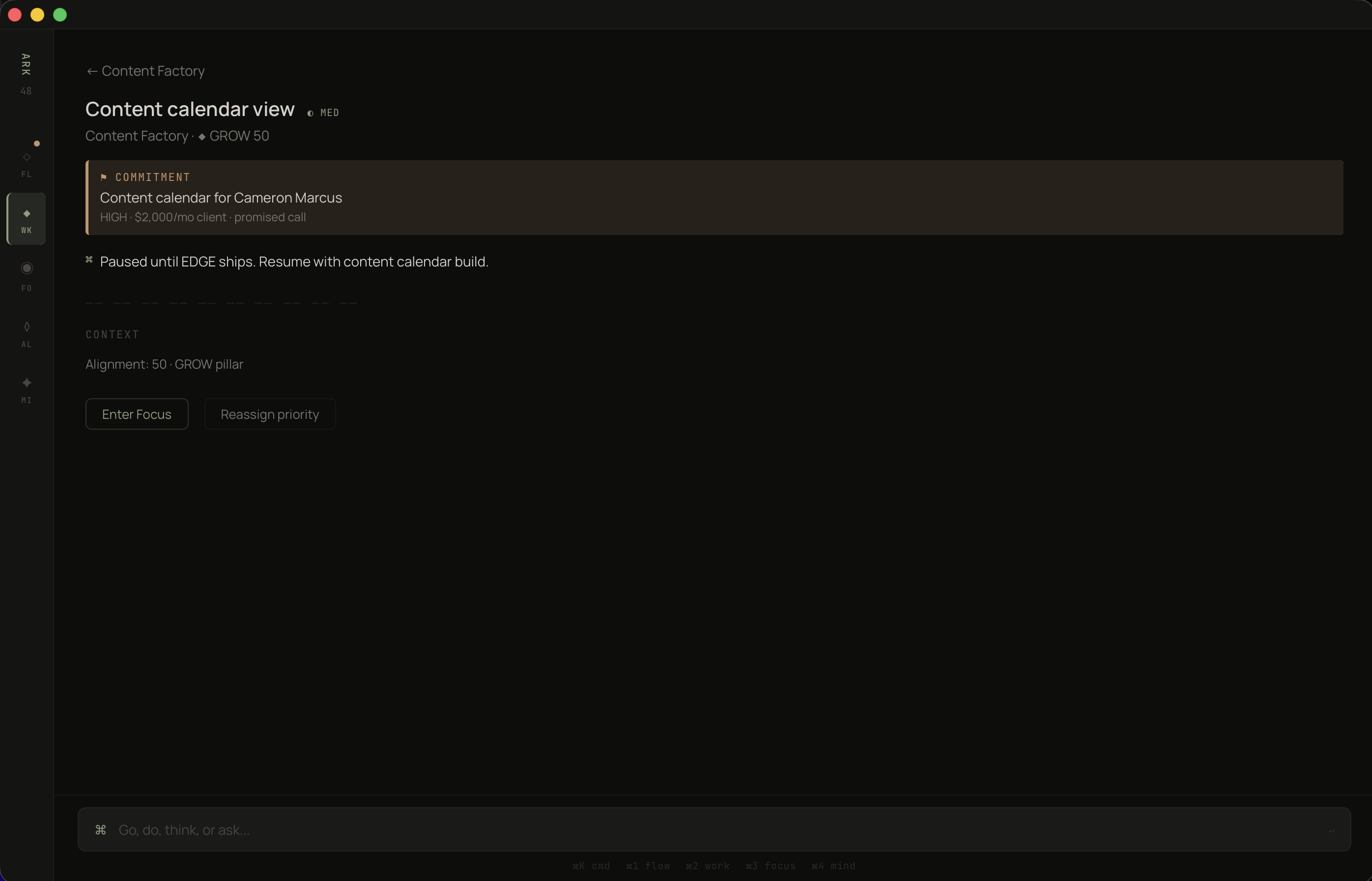
The first design decision was the most consequential. On every project screen, commitments sit above tasks. Not beside them. Not in a tab. Above. This isn't cosmetic — it's a statement about what matters. When you open Content Factory, you see: I promised Cameron a content calendar on a call. It's one day late. Below that: the tasks that serve that promise. Each task knows which commitment it exists for.
The hierarchy is the product.
Look at the right side of the commitment block: "due 1 day late, 0%." That's not task completion. That's promise completion. The red dot isn't decorating — it's a signal that Cameron Marcus, a real person who pays you $2,000/month, is waiting. Every other productivity app would show you a task list. This shows you who you're failing.
And the actions are at the commitment level, not the task level. [Enter Focus] and [Renegotiate]. Because the real decision is never "which task do I do next." The real decision is "do I keep this promise or renegotiate it honestly?"
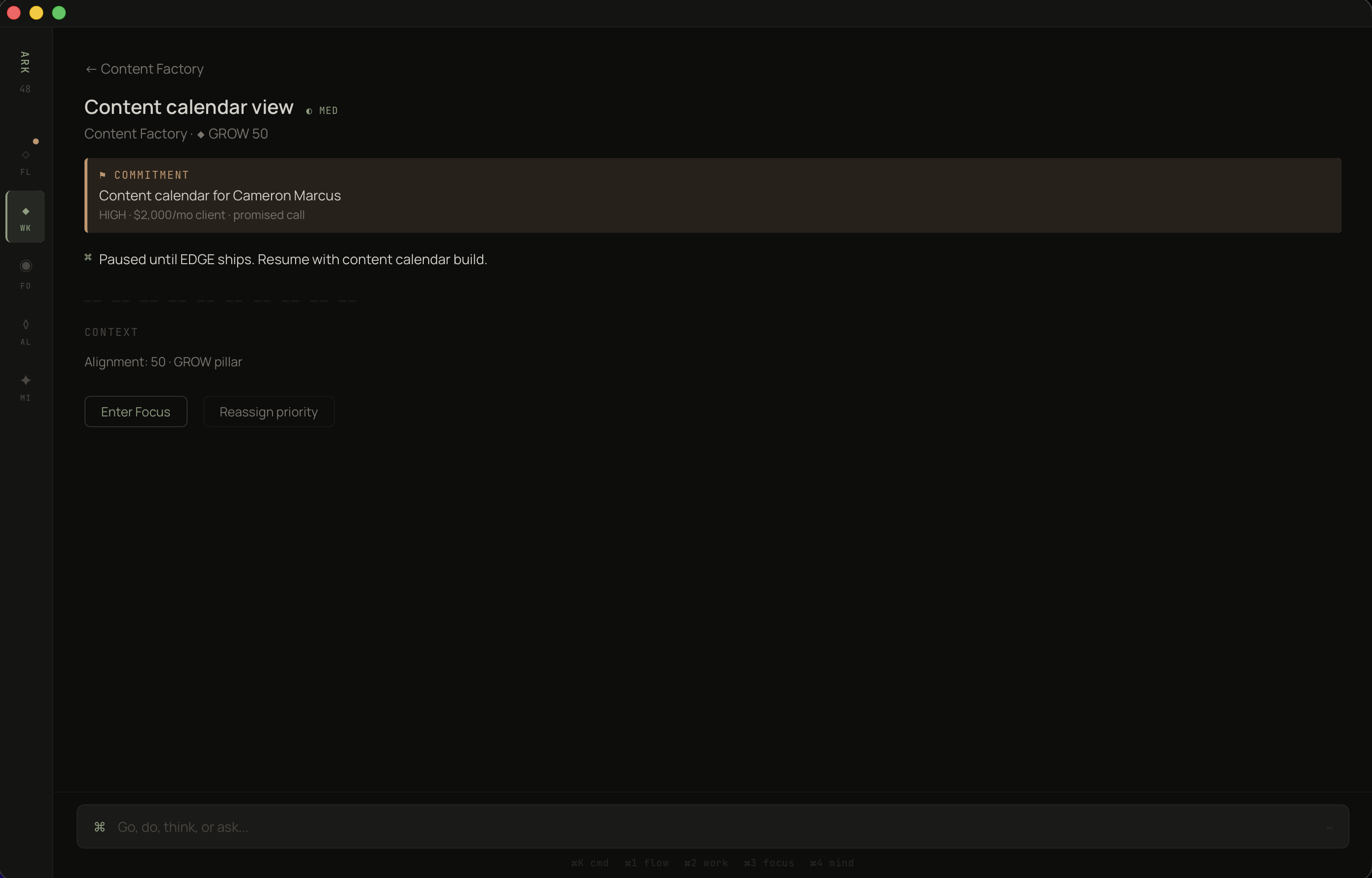
Commitments surface first. Tasks inherit their urgency from the promises they serve.
Most apps let you drill into a task and lose all context about why it exists. You're staring at "Content calendar view" and you've forgotten who it's for, what's at stake, when you promised it. Three clicks deep and the person is gone. I refused to accept that.
In ARK WORK, every task carries its commitment like a banner. You cannot look at a task without seeing the human obligation above it.
The warm-bordered block is the only colored container in the entire app. One exception, one reason.
Once commitments are the core unit, the project list needs to answer a different question. Not "what's in progress" — every app does that. The question is: "where is the tension between what I said I'd do and what I'm actually doing?"
I have four projects. GRATIS is at 96% alignment with 4 of 5 tasks done. Content Factory is at 45% alignment with 0 of 3 tasks done — and two active commitments totaling $2,500/month. Which one needs my attention? The numbers tell the story without me reading a single word.
The AI one-liner at the top does something subtle: "GRATIS has momentum. Content Factory is stalling." It's not summarizing. It's diagnosing. It read the commitment health, the task velocity, the alignment scores, and produced one sentence that tells you where to look. That sentence replaces thirty minutes of scanning dashboards.
And each project shows its alignment pillar — BUILD, GROW — because I realized you can't evaluate projects in isolation. You need to know if the thing you're working on is even connected to what you said matters this quarter. A project can be 100% on track and still be the wrong project.
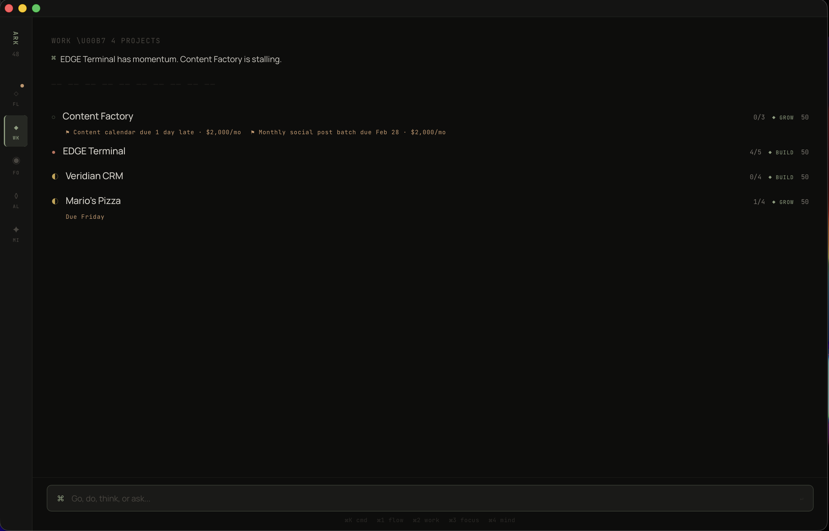
AI reads the portfolio and speaks first. Alignment scores create a scannable right edge.
I spent months saying BUILD was my priority — shipping GRATIS, closing my first paying customer. Then I tracked where my hours actually went. 80% BUILD, 20% GROW, 8% SHARPEN. I said SHARPEN mattered — exercise, reading — but I spent almost nothing on it. Every productivity app would let me keep that lie going forever. I needed a mirror.
The alignment view is the most honest screen in the app. Trust Score: 80% on-time delivery across 6 active commitments. Four are overdue, two are on track. Then the three pillars — BUILD, GROW, SHARPEN — each showing what I declared vs. what I actually did.
The visualization is deliberately primitive. Filled blocks vs. empty blocks. No charts. No curves. No color-coding. Just: you said this, you did that, here's the gap. I tried radar charts, stacked bars, progress rings. They all obscured the one thing I needed to see. The simplest representation won because the insight is simple: are you spending time where you say it matters?
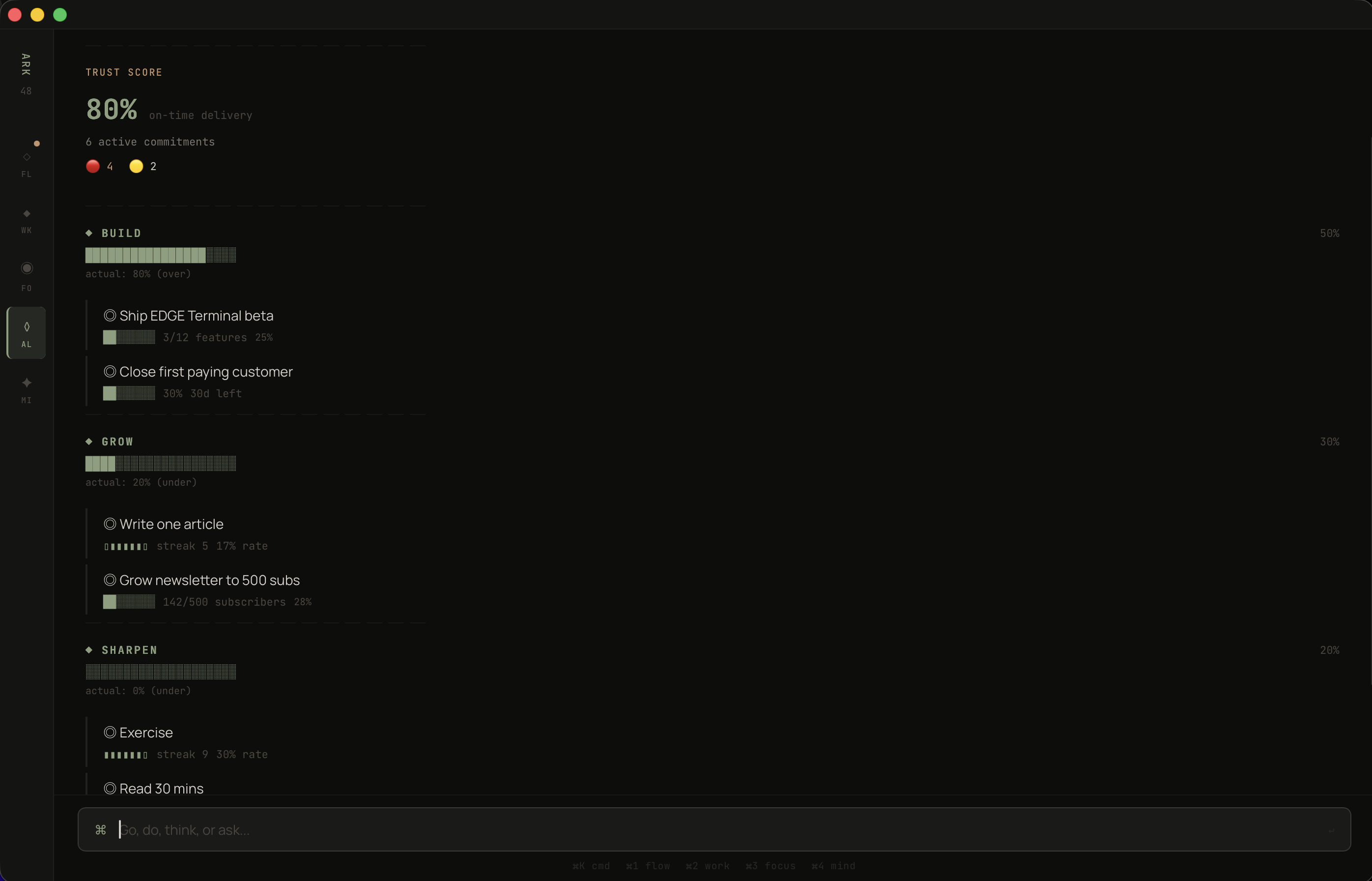
Declared allocation vs. actual hours. The gap between those two bars is the only strategic metric that matters.
Goal trackers are isolation chambers. You set a goal — "ship GRATIS beta, 12 features" — and then you manually update it. The goal sits in one place. The work sits in another. The ideas you scribbled sit in a third. Nothing connects.
I wanted a goal that could see across the entire system. What projects serve it. What seeds could contribute. Whether the pace is on track. Not because I wired up the connections manually, but because the data model makes it structural. Projects declare their pillar. Goals belong to pillars. The connections are automatic.
"Ship GRATIS beta" — 3 of 12 features, 25%, behind pace. The AI doesn't soften it: "Behind pace. 2 projects serving this goal. 2 MIND seeds could contribute." It sees GRATIS and Veridian CRM both feeding BUILD. It sees two ideas in the MIND inbox — the SOP for Abdallah and the GRATIS split-screen concept — that could accelerate progress if promoted.
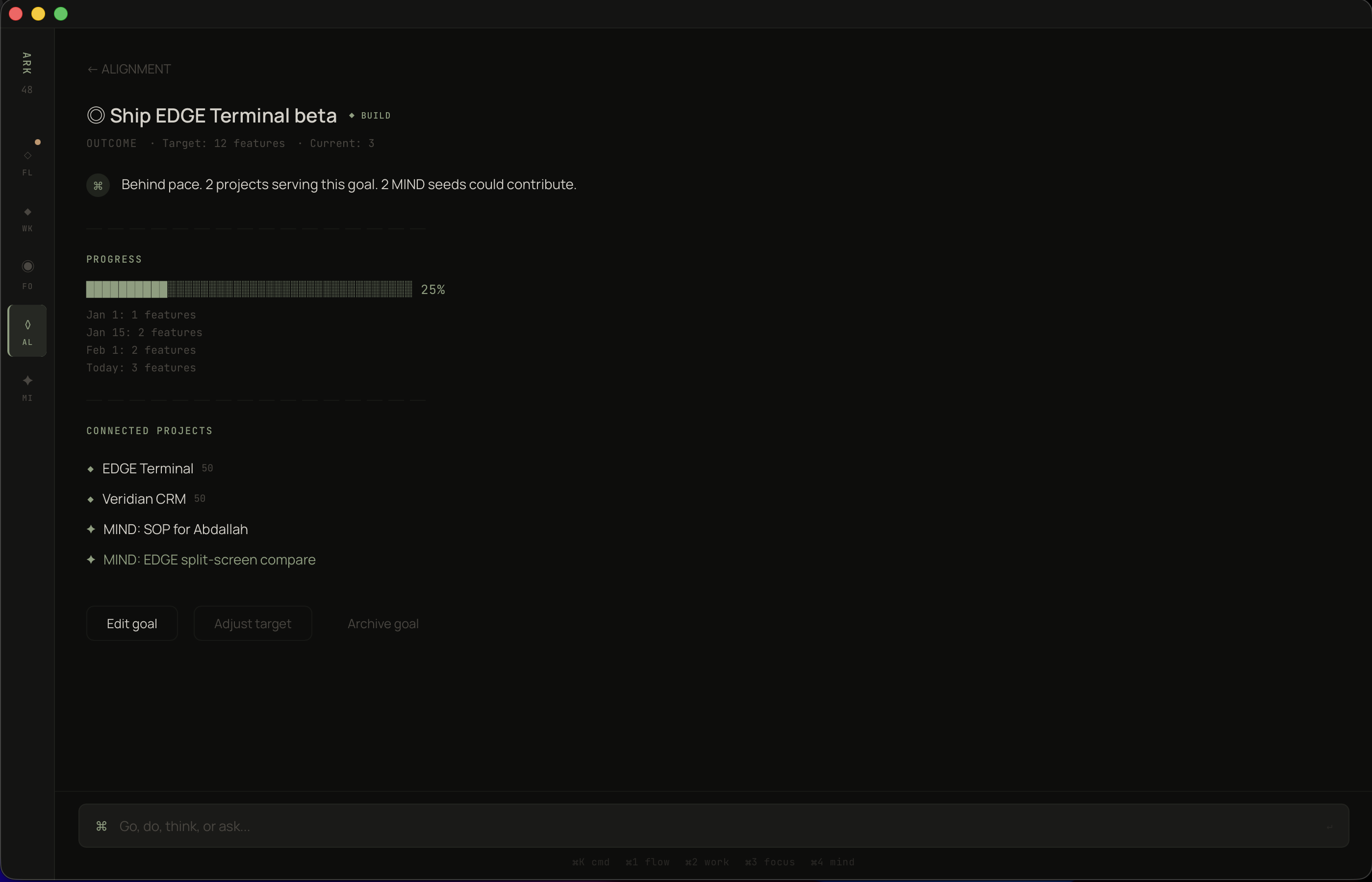
One goal. Two projects feeding it. Two unborn ideas that could contribute. The system sees the full picture.
Every capture tool has the same problem: it's a graveyard. You put things in. Nothing comes out. The inbox grows. Guilt grows with it. After three months you declare bankruptcy and start over.
I studied how ideas actually behave and realized they have temperature. Some are hot — someone's waiting, there's urgency. Some are warm — interesting, growing, not ready. Some are cold — they felt important at 2am but they weren't. The system should know the difference and treat them accordingly.
MIND mode uses five orbits: CLOSE, NEAR, FAR, SOMEDAY, COMPOSTING. Items don't stay still. "SOP for Abdallah" started as a quick note and migrated to CLOSE because a real person is waiting — the system detected the person connection and escalated it automatically. After 14 days, the AI asks: "Promote to WORK?"
Meanwhile, "Productized Automations" sits in NEAR — it has revenue potential but no commitment attached. It's growing. It's not ready. And the system respects that.
Items in COMPOSTING self-destruct after 90 days untouched. This is the feature I'm proudest of. Not because it's technically complex — it's a timer — but because it reverses the fundamental assumption of every capture tool. Most tools say: everything you capture is worth keeping. This one says: prove it. If you don't touch it in 90 days, it wasn't important. The system gets cleaner over time instead of noisier. That's antifragile.
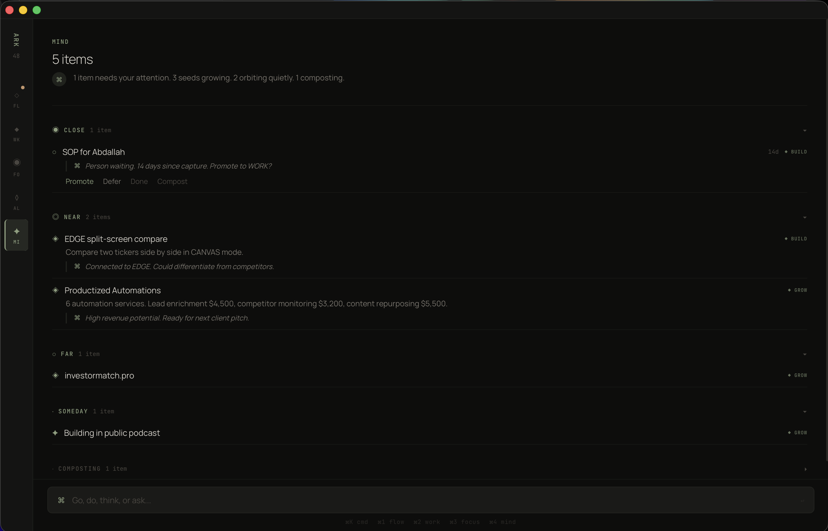
Five orbits. Close demands action. Composting self-destructs in 90 days. No guilt, no bankruptcy, no maintenance.
After the core was working, I identified five structural holes that no existing tool addresses. Not features. Structural failures in how productivity software thinks about work.
Every app helps you manage work after you accept it. None help you decide whether to accept it. The Gate activates when you're above 75% capacity and someone asks for something new. It doesn't block you. It shows you what would have to move: "You'd push Cameron's calendar by 2 days to fit this." Now you're making an informed decision instead of an optimistic one.
I tracked my estimates for a month. My content work took 1.8x what I estimated. My technical work was accurate. The problem was never laziness — it was systematic miscalibration that nobody was measuring. ARK WORK records predicted vs. actual on every focus session. After 30 days, your risk scores are calibrated to your actual bias pattern. Every missed deadline makes the next estimate more accurate. The system gets smarter from your failures.
I had eight metrics. Commitment health. Alignment ratio. Trust score. Pillar distribution. Task velocity. Focus hours. Streak counts. Estimation accuracy. I couldn't hold them in my head. Nobody can. So I compressed them into one number: 0–100. Commitment health weighted at 40%, alignment at 30%, momentum at 30%. One number in the morning briefing. Above 70, I'm building. Below 50, something structural is broken. I don't need to figure out what — the app will tell me.
Every productivity tool helps you add work. Name one that tells you to stop doing something. Once per week, the system surfaces the lowest-value project: hours spent, alignment score, whether anyone is waiting. If you keep it, you write one sentence explaining why. That sentence is the point — it forces articulation. Projects with commitments are never candidates because a person is depending on you. Everything else is fair game.
People quit streaks at day 20. They leave clients after 5 months. They abandon habits right before the exponential curve bends upward. The reason is always the same: compounding is invisible. Once per month, the Compound Map shows you what's accumulating. "Cameron: 6 months, 100% on-time, 2 referrals." "Article streak: 45 days, follower growth 3x." You protect what you can see. And you can't see compounding without a system that tracks it.
Three constraints governed every visual choice.
Cards create visual noise. Every card is a boundary that separates content from content. I eliminated all containers except one — the commitment block — and built the entire hierarchy from typography weight, text size, spacing, and hairline rules. If I can't communicate importance with type alone, the information architecture is wrong.
Every mode opens with an AI-generated one-liner in a distinct voice: "GRATIS has momentum." "1 item needs your attention." "Behind pace." These aren't summaries. They're diagnoses. The AI read the entire state and produced the one sentence you need. If you closed the app after reading that sentence, you'd still know what to do.
Every screen was tested against a tired person at 5pm. Could they extract the meaning in under two seconds? The alignment bars are filled blocks vs. empty blocks because that's faster than percentages. The project list puts scores on the right edge because that's where the eye scans. The MIND orbits use single words — CLOSE, NEAR, FAR — because spatial metaphors process faster than labels.
The hard part wasn't building it. The hard part was resisting the urge to add things.
Every productivity app fails the same way: it starts simple, users request features, complexity accumulates, the new user experience degrades. I wrote a rule on my wall: if the user has to organize it, we failed.
That rule killed thirty features. Manual tag management — dead. Custom views — dead. Inbox sorting — dead. Every time I caught myself building something that required the user to maintain it, I asked: can the system infer this? Can the AI handle this? Can the data model make this automatic? Almost always, yes.
The other thing I learned: design for the person running the business at 5pm on a Friday with three missed calls and a client email they haven't read. Not the person at 9am Monday with fresh coffee and good intentions. If the app works for the tired version, it works for everyone.
Tauri 2.x · React 18
TypeScript 5 · SQLite
Claude API
Tier 0 — code only: $0, <5ms
Tier 1 — Haiku: $0.0003/call
Tier 2 — Sonnet: $0.006/call
Tier 3 — Sonnet extended: risk analysis
$7.48/mo per user at full usage
85% margin at $50/mo
54 components · 30 screens
18 TypeScript interfaces
12 state stores
11 proactive AI triggers
6 multiplier-specific prompts
Commitments are first-class entities
with their own table, not a tag on tasks.
Person → Commitment → Task →
Project → Pillar → Goal
The database is the product.
The UI is just a window into the graph.
ARK WORK is a personal tool. I'm the beta tester. Some of this is built. Some of this is designed. All of it is specified down to the TypeScript interface level.
When it survives my own workflow — when every design decision holds up against real clients, real deadlines, real chaos — it ships as an ARK product. Not before.