I design software, prototype it in code, and write down every decision.
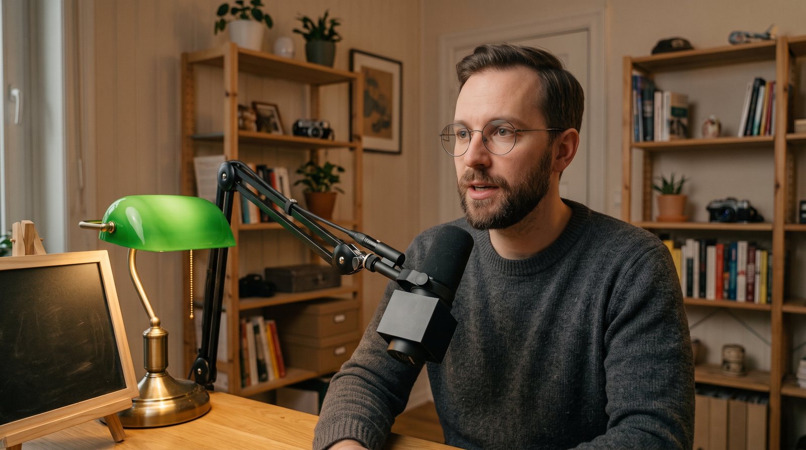
Product designer and design engineer in Winnipeg. Four years of independent practice and hundreds of screens, most of which never make it here. I have been the only designer on everything I have made. Now I want a team: critique, a design system I didn’t write, and engineers who push back.
Open to product design and design engineering roles · full-time or contract · remote
Active work · Q4 2026
Hundreds of screens over four years. This page shows only the projects I’m working on this quarter.
Refreshed every quarter · next refresh January 2027
The same judgment runs through all of them: one colour that means one thing, screens that never scroll, names that are places and words that are instructions, decisions that arrive with their evidence, and a willingness to reverse a call the same afternoon it stops being true. Every product decision is written down with its date — and its reason, when I had one. The ledger is public.
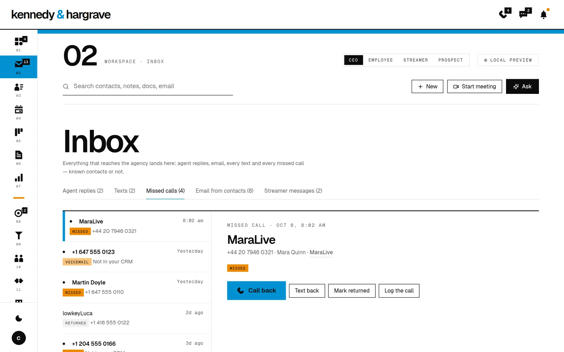
An operating system for one founder: his day, his businesses, his people, and three AI colleagues who live in it. I designed it in one week. This is the whole tour, from the door to the last room, with the reason for every choice.
Role
Product, interaction and visual design; the language; the AI architecture; the prototype
Team
Just me, with Claude as a pair
Scope
34 interactive screens · five modes · four kinds of user · 14 specification documents
When
1–5 October 2026. Designed in five days; the rebuild is in progress
Nine seconds. I type login. The house recognises me, the screen turns red for less than a second, and the window I logged in with grows into the terminal I will work in. Watch the window. It never leaves.
For a year I ran my life and my businesses from a system I had designed myself. I called it HQ. It worked. And it was exhausting.
Eight AI agents with names. Dozens of surfaces. A dashboard for everything. Every morning began with the administration of the thing that was supposed to save me from administration.
So I started again, from one sentence.
The person operates intentions, not the database.
That sentence is the whole product. The AI reads, files and connects. The screen shows the one thing that matters now. Everything else sits one gesture underneath. Old software with a chatbot in the sidebar is the thing MÄISON refuses to be.
I designed it between Thursday 1 October and Monday 5 October 2026: thirty-four working screens, a constitution for every word on them, a permission model for three AI colleagues, and a build plan in eleven phases. I wrote down every decision as I made it, including the ones I reversed the same afternoon. The whole ledger is here.
5days, from the first sketch to the build plan
34interactive screens, desktop and phone
193numbered product decisions, inside a ledger of a thousand
14specification documents for the build
Before the tour
Ten things I wanted and could not find in anything I use.
So I designed them. Each one is in the prototype, and each one is explained below.
A login window that becomes the product.The object you sign in with is the object you think with.
A colour that is a state machine.Red means this waits on you, and only your answer turns it black.
An operating system where nothing scrolls.Every screen is a whole, fitted to the window you actually have.
AI that may start a conversation but may never interrupt one.No notifications, anywhere. That is a rule, not a setting.
A home screen you can read from across the room.Red while something is yours. Grey when nothing is.
Search that shows how it understood you.And makes the thing when it cannot find it.
why › under every sentence the AI writes.Each claim beside the thing that produced it.
Three AI colleagues whose roles are the permission model.You can tell what each may do from what it is for.
Procedures that revise themselves, with the evidence.Every version says what changed and what proved it.
A person’s page that remembers what you promised them.Open promises stay red until they are kept.
Three ideas hold it up
One record.Every fact lives once, with its source and who may see it. Screens are windows. Agents are colleagues. The record is the house.
One red.#e2231a, and it means one thing. Everything else is black, white and a ladder of greys. Dark only; there is no light theme.
Three motions.Around: shift and scroll. In and out: ⌘ or Ctrl and scroll, Esc to return. Language: say what you want at the $. The same in every room.
Most products put a form in front of the product, which makes the first second the least like all the others. I wanted the first second to be the product.
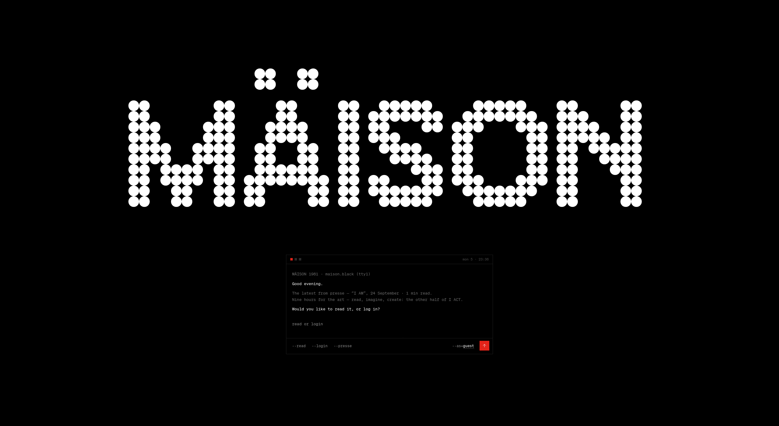
The door. The name in the dot face, as large as the screen allows, and one small terminal. It says good evening. It gives the latest piece of public writing in two lines. Then it asks one question: Would you like to read it, or log in?
There is no password. There never will be. You give an email or a phone number and the house sends a one-time link, good for ten minutes on this device. Or you touch a passkey. The first version sent a six-digit key. It lasted two days.
Look at the foot of that small window. --read --login --presse. The options are written as flags, because that is what they are. And that small window is not a login form. It is the terminal from the first room of the house, at a smaller size: the same three squares and the time, the same toolbar, the same dot face for what you type.
I did not design that on purpose. I noticed it.
The instinct
The login window was the right size the moment it was Ëtude’s terminal, small. I didn’t design the transition; I noticed the two objects were already the same one, and let the window grow into itself.
What happens in those nine seconds
It is a geometry problem, not an effect. The red moment holds for 700 milliseconds, for everyone the house knows. The window’s lines fade in 160. A copy of the window is placed at its measured position and animated, left, top, width and height, over 420 milliseconds to exactly where the terminal of the next room sits: centred, 1180 by 248, computed with that room’s own layout arithmetic so the handoff is exact to the pixel. The field settles from #000000 to #0e0e0e. The toolbar fades in at the foot. The room assembles around a terminal that is already in place.
About 1.3 seconds, door to table, and there is no frame in which two different objects are on screen.
Clients and contractors get a plain fade to their own page. Their pages have no terminal to grow into, and motion with no referent is decoration.
Four doors in one Saturday
The door you see is the fifth. On 3 October it changed four times, and the log has all of them.
An editorial red poster, with a masthead, captions and four lines on who may enter.
Red, the name and a terminal, nothing else. The masthead, the captions and the footer went.
Black, with red as the founder’s ritual. The log says it exactly: red is not spent before anything has happened. The door went black; the screen turned red only when it recognised me.
Red for everyone. The last change that day. The log again: red is the moment of being known, for anyone the house knows. A client gets the same 0.7 seconds I do.
Two days later it learned to greet you and ask, and the exit I had built and liked, the window sliding down to become the command bar, was replaced by the window growing in place. The old one made the bar the hero. The new one says what is true.
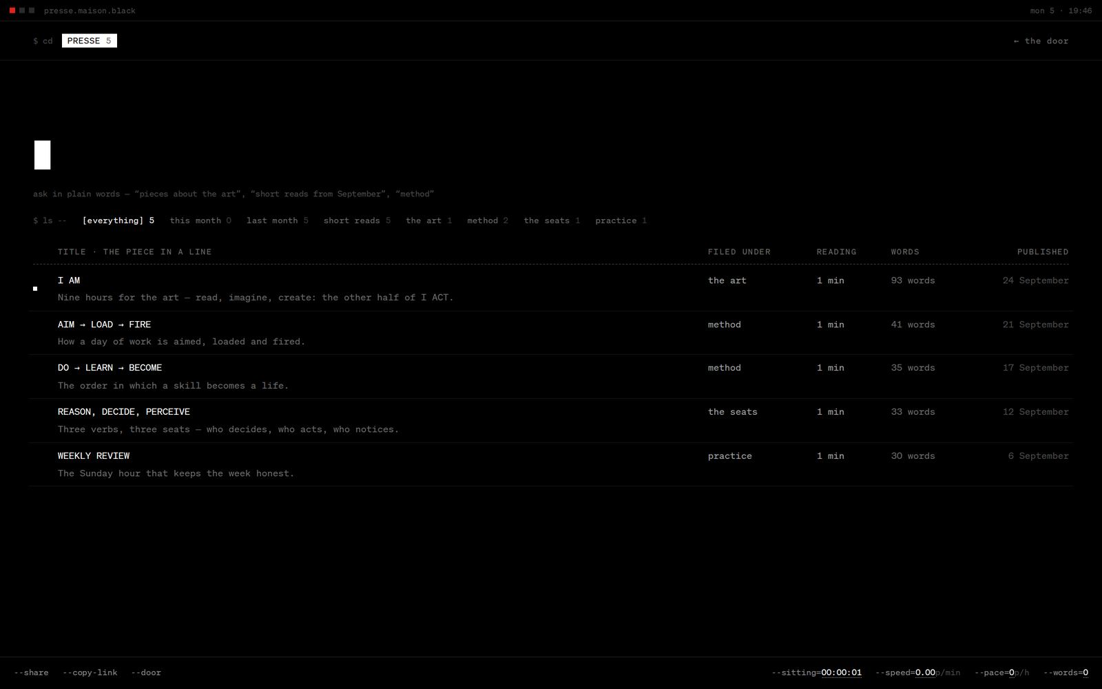
Type read instead. The same window empties, keeps its title bar, and grows to fill the screen. The public writing of the house lives inside one terminal. A stranger and the founder are handed the same object.presse.maison.black. The door’s window, at full size. The search reads plain words, short reads from September, and shows how it read them. At the foot, a reading meter written as flags: --speed=0.42p/min --words=93.02 · Ëtude
You land in a room with nothing in it.
Not a dashboard. Not a feed. A terminal and a cursor.
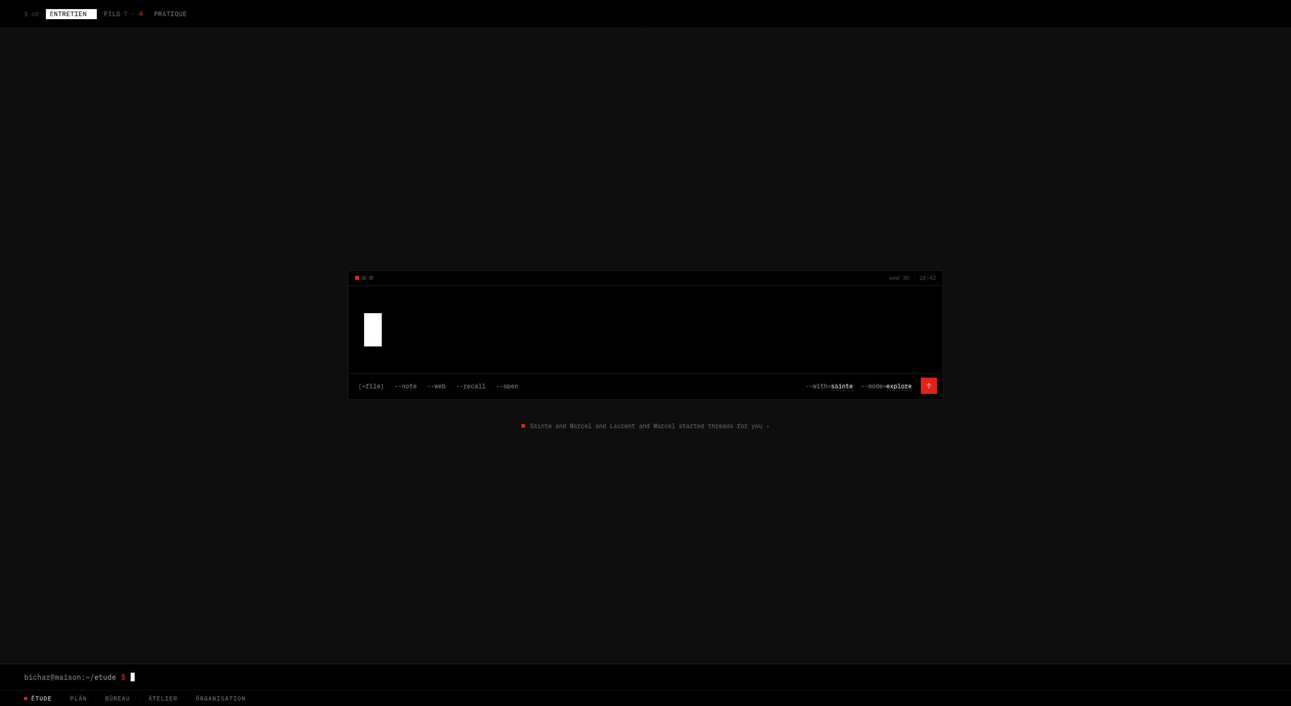
Ëtude, on arrival. One window, one white block. The composer’s options are flags: [+file] --note --web --recall --open, and at the right --with=säinte --mode=explore. Beneath, one quiet line with a red square: the colleagues have started threads for you.
The first thought is typed large, in the dot face, eighty-four pixels and shrinking as the line fills. Press Enter and the window widens, settles at the foot of the screen, and the conversation opens above it. The same object, again, changing size.
There are four ways to be answered, and you choose: explore (one question deeper), decide (options and their cost), vent (just listen), learn (what I expected against what happened). More than one colleague can sit at the table. @märcel gives one of them the floor while the others wait.
The AI may speak first. It may never interrupt.
This was the decision that removed the most. A colleague that needs me, to clarify, confirm or choose, opens a thread with one question and waits. It shows as a count beside a word and one line under the window. It is never pushed. There is no status bar and there are no notifications anywhere in the house. What needs me lives in places I go to on purpose.
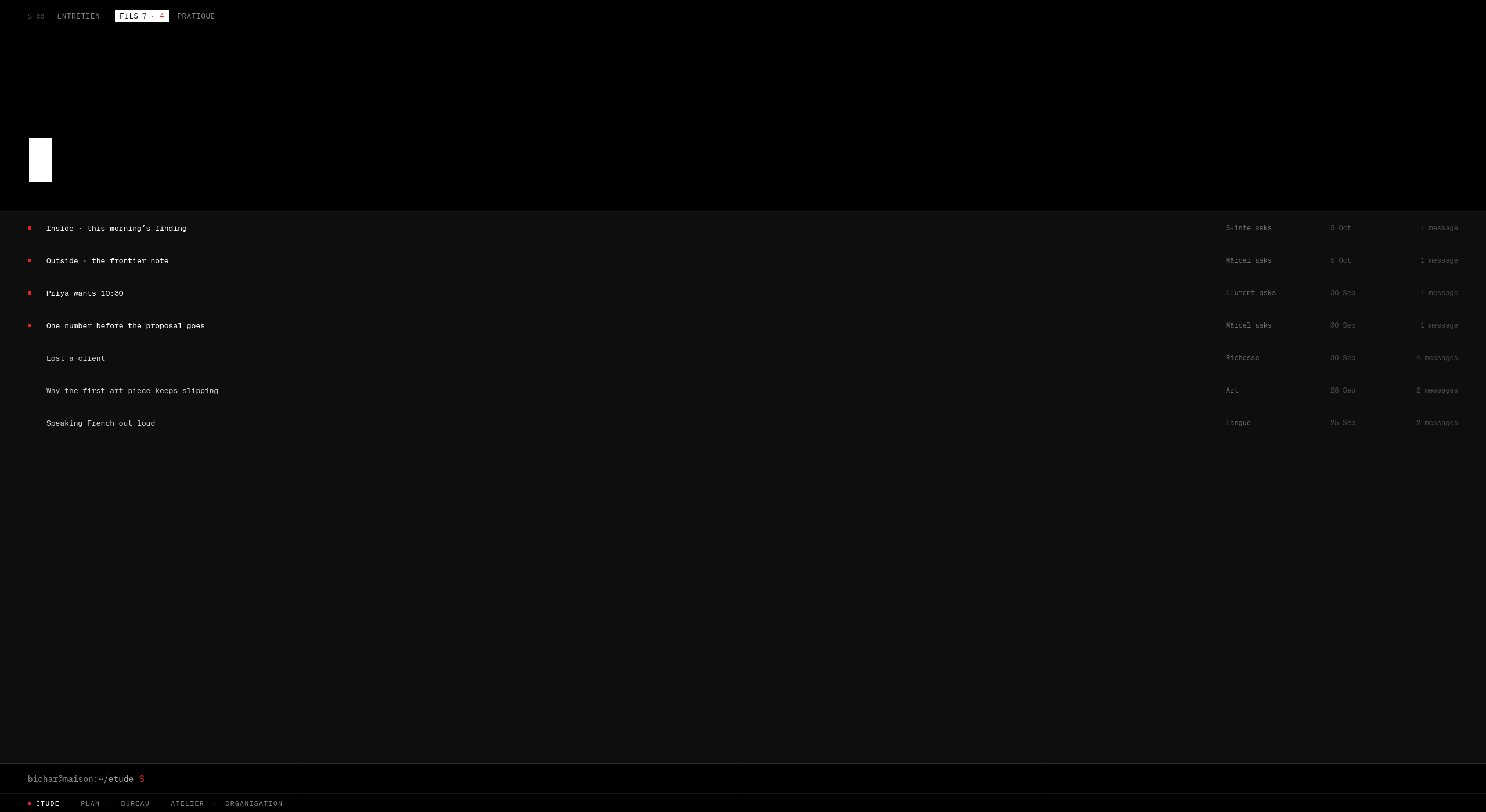
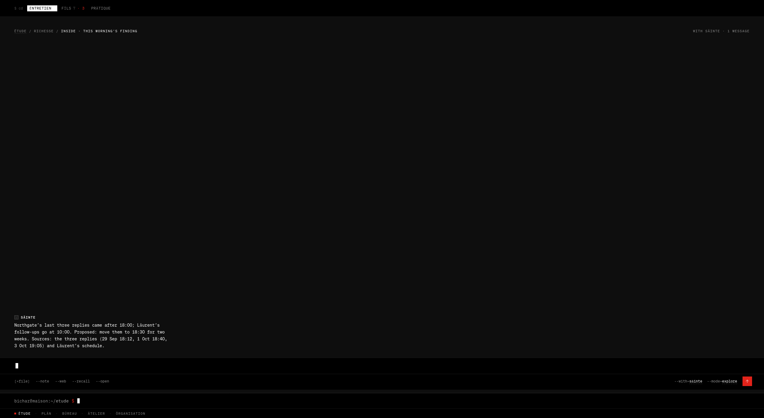
Fïls, the threads. Seven, of which four carry a red square. Those four were opened by the colleagues, not by me: Säinte asks. Märcel asks. Läurent asks. Each is one question waiting for one answer. When I answer, the colleague closes it in a line: Confirmed 10:30 with Priya by text.This morning’s finding. Before I wake, Säinte picks one question about the business from what changed overnight and leaves one answer: Northgate’s last three replies came after 18:00; Läurent’s follow-ups go at 10:00. Proposed: move them to 18:30 for two weeks. Then the sources, with their timestamps. An observation, an experiment, and the evidence. Every morning.
Provenance is not a feature
Anything the AI says about my world has its sources one step beneath it. The mark is two words: why ›. Under the sentence on the home screen. Under the decision at the top of the day. Under every answer a client gets. Extreme compression at the surface; unlimited inspection underneath. I can only delegate to something I can check.
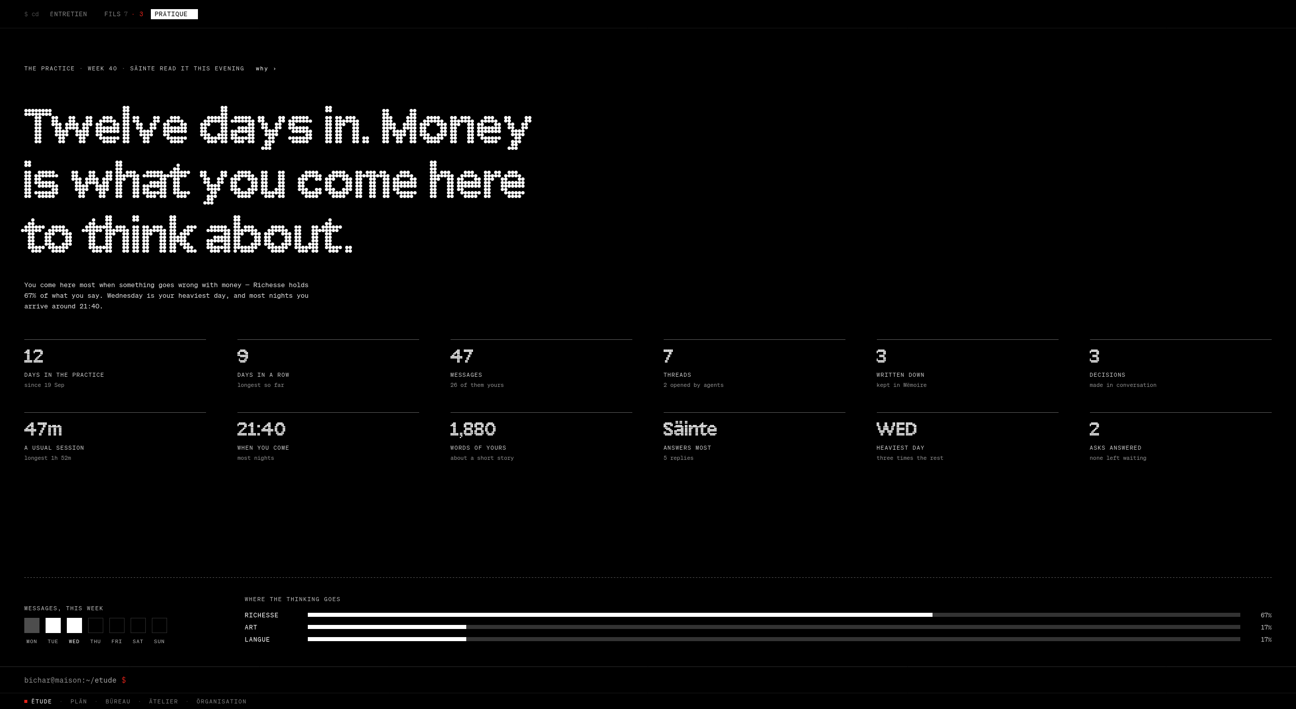
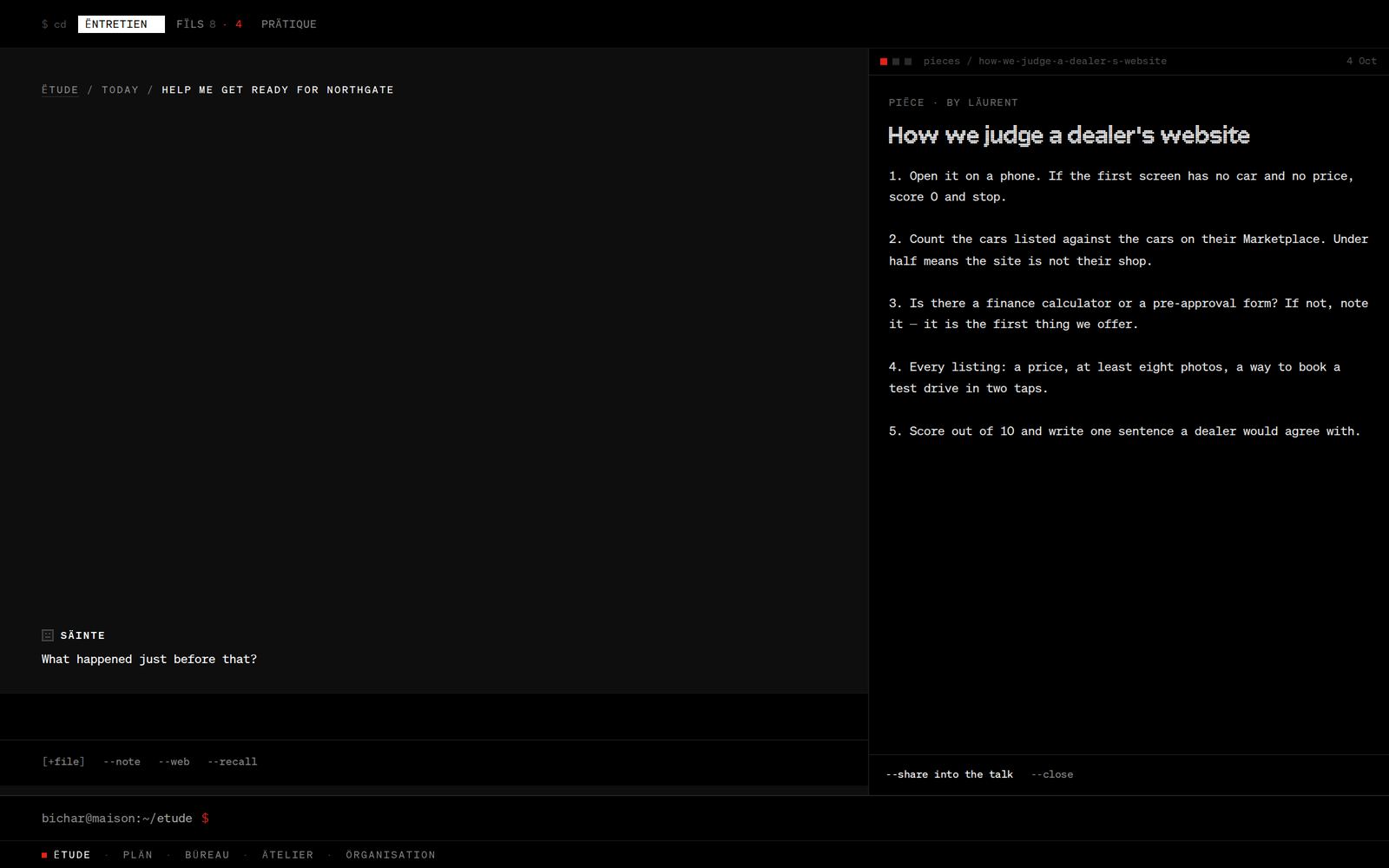
Prätique. The house reads my own thinking back to me. Twelve days in. Money is what you come here to think about. Sixty-seven per cent of what I say here is about money. Wednesday is my heaviest day. Most nights I arrive around 21:40. And beside the kicker, the two words that make it trustworthy: why ›.--open. Any note, notebook entry or journal page opens beside the conversation, and --share into the talk puts it in front of the colleagues. They read what I read.03 · PLÄN
The work runs until it needs a yes.
PLÄN holds the projects the colleagues are working. I do not manage it. I answer it.
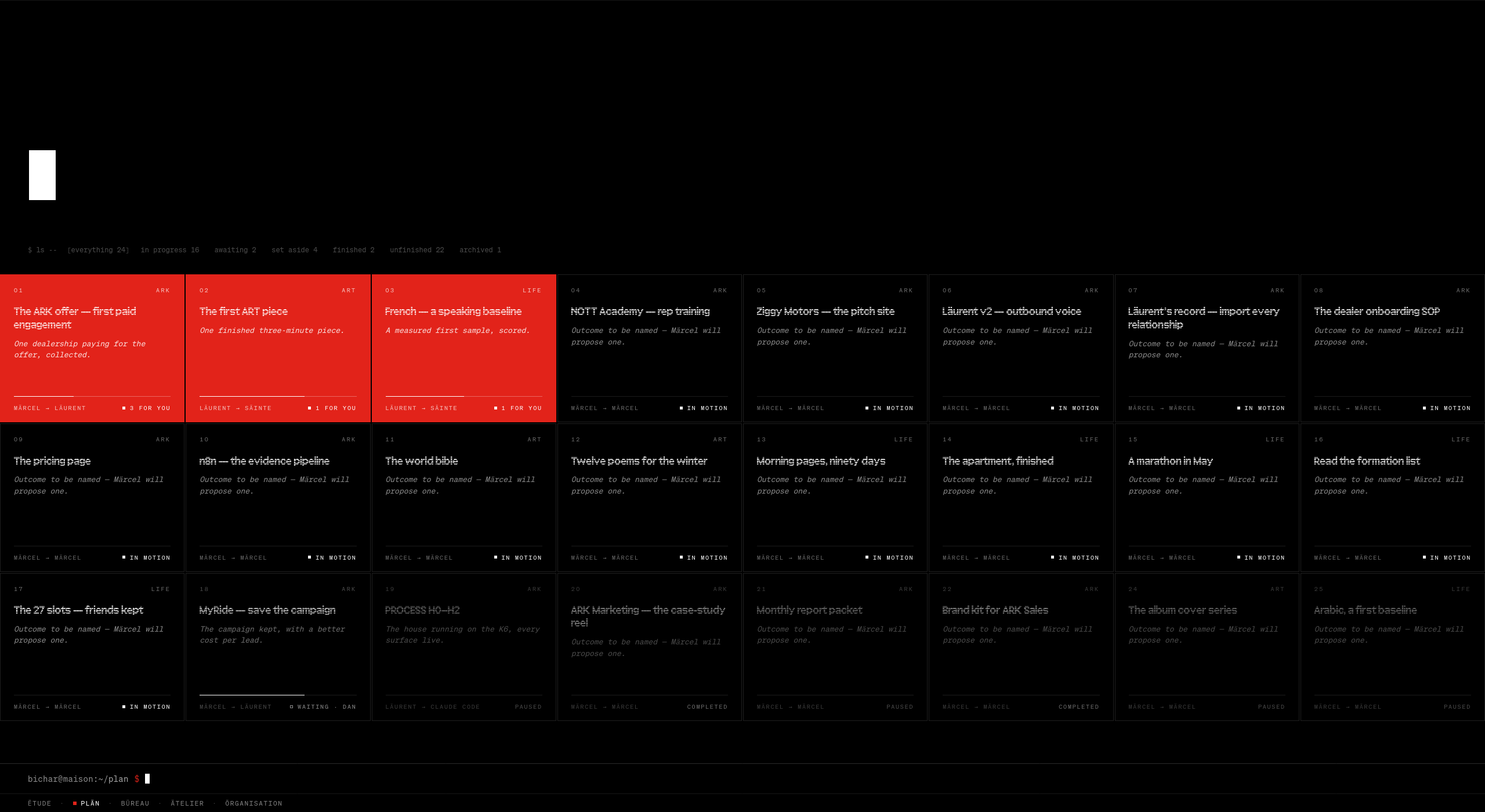
The portfolio. Twenty-four projects. Three are red. Red here is not a priority or a status: it means the project cannot move until I say something. The rest are moving, waiting or set aside without me. The white block at the top is a search. Type a name and Enter opens it. Type a name that does not exist and Enter makes it.
Nothing scrolls, and here is the arithmetic
Scrolling hides the end of things. You never know how much is left, and a long page quietly becomes a feed. So every screen in the house is a whole. Declaring that was easy. Keeping it once the data grew was the design.
The grid reads its own top edge. Its height is the window, minus that edge, minus 84 for the command bar, minus 40 for the pager. Columns are ⌊(W + gap) ÷ (minW + gap)⌋, rows likewise, with a minimum size per kind of card: projects 300 × 220, canvases 300 × 240, seeds 380 × 280. With fewer cards than room, a second pass chooses the arrangement that keeps a card’s shape. For each possible column count it scores |ln(card ratio ÷ ideal ratio)| + 0.5 × empty cells, and the lowest wins. The weight on empty cells is heavy on purpose. The half-filled bottom row was the thing I could not stand.
What does not fit is in pages, or one level deeper. A laptop gets fewer rows. A tall monitor gets taller cards. Nobody gets a scrollbar.
What it cost. For a day I let shift-and-scroll turn the pages. It worked, and it broke a gesture that already meant around. Withdrawn the same day. Two gestures, two meanings.
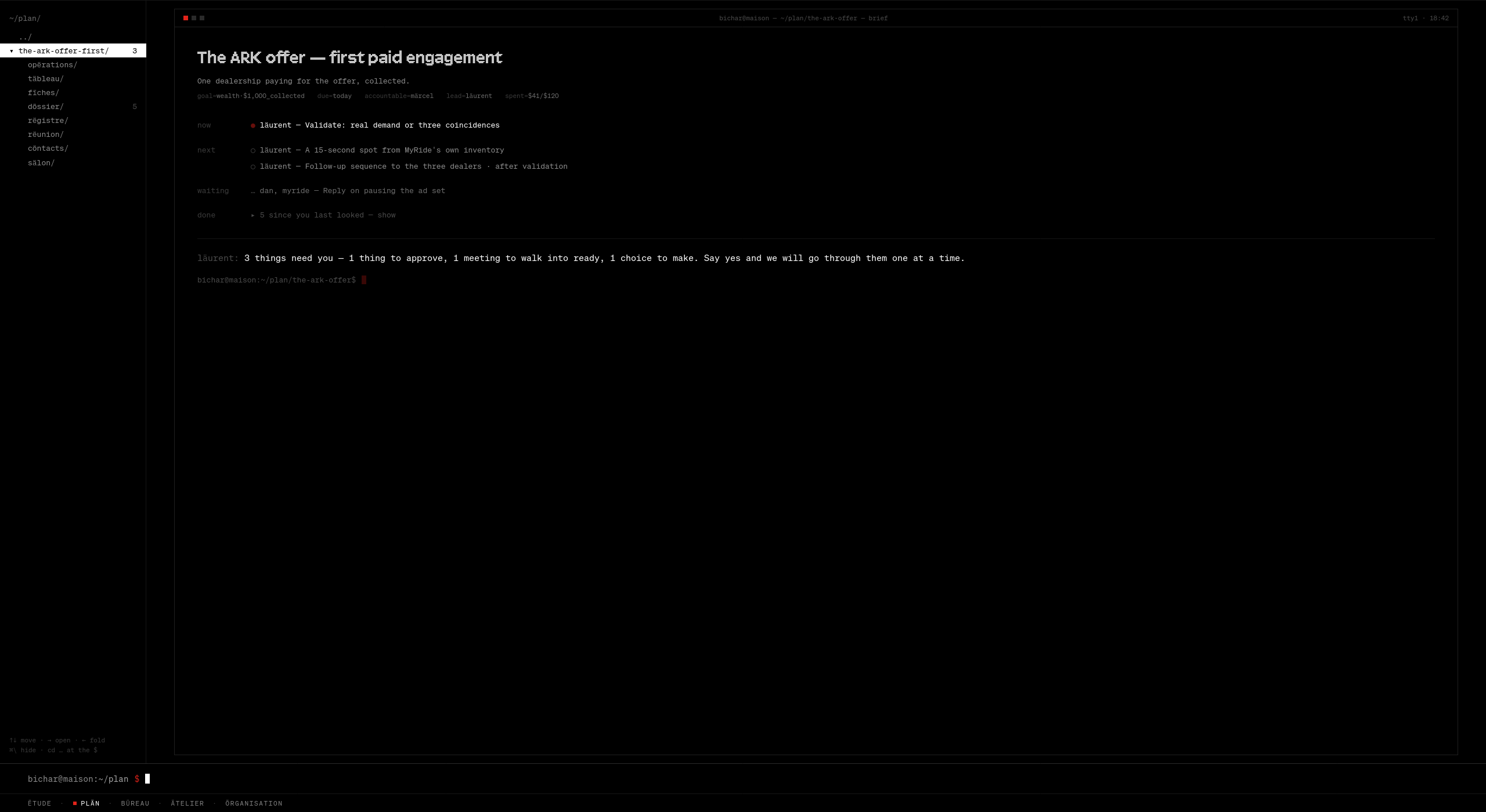
Thirty seconds inside one project. The search, the brief, the session at the foot, the work in three hands, the card table, the files, the worklog and the people. One tree on the left, eight folders, no tabs.A project is a terminal you work in. The title. The outcome in one line. Then now, next, waiting, and done folded to a single dim line. And at the foot, the lead speaks: 3 things need you. Say yes and we will go through them one at a time.
That session is the part I would defend in any room. Each question arrives alone: ? 1 of 3 · approve · märcel, the question, a note, and how to answer it. Yes or no. Done or later. Per car, or a monthly fee. My answers stay in the log with the colleague’s acknowledgement. And when the last one is answered, the project says: Thank you. That was everything. We are done for today.
Then it asks nothing more that day. Software that knows when to stop asking.
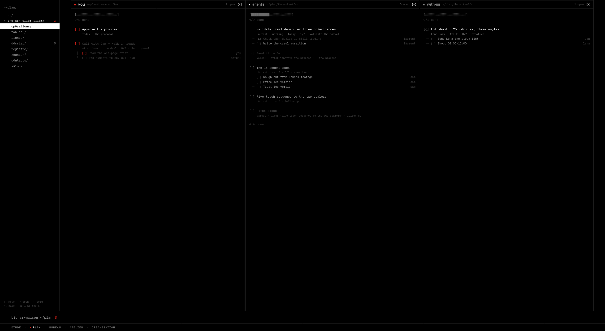
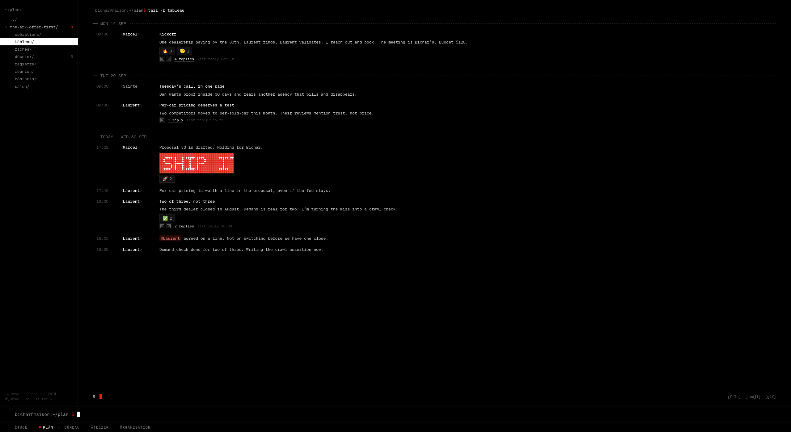
Opërations: three hands. Mine, the agents’, and the people working with us. Progress is drawn the way a terminal draws it. My two open tasks are the only red on the screen.Täbleau: the room, as tail -f. Threads, reactions, @mentions, and a dot-matrix SHIP IT. The log says it in so many words: messages are cards, and they are allowed to be fun.
One rule here looks small and is not. A meeting exists only inside a project. I can schedule one from the calendar in a sentence, meeting with Priya fri 3pm about the ark offer, but if the sentence names no project the calendar asks which one. A meeting that belongs to nothing cannot be made. Every meeting therefore has one link, which is its invitation, its room and its record.
04 · Bureau
The screen tells you the truth before you ask.
Bureau is my own day. Its home has two states, and you can tell them apart from across the room.
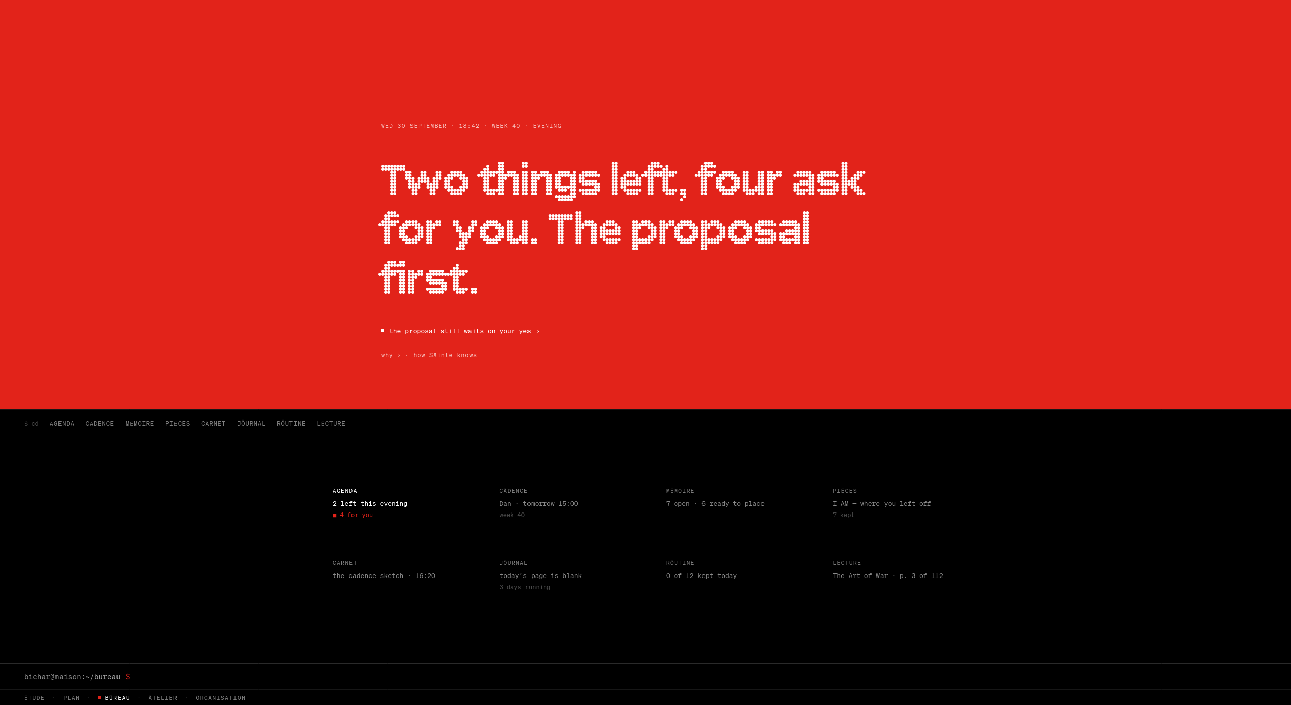
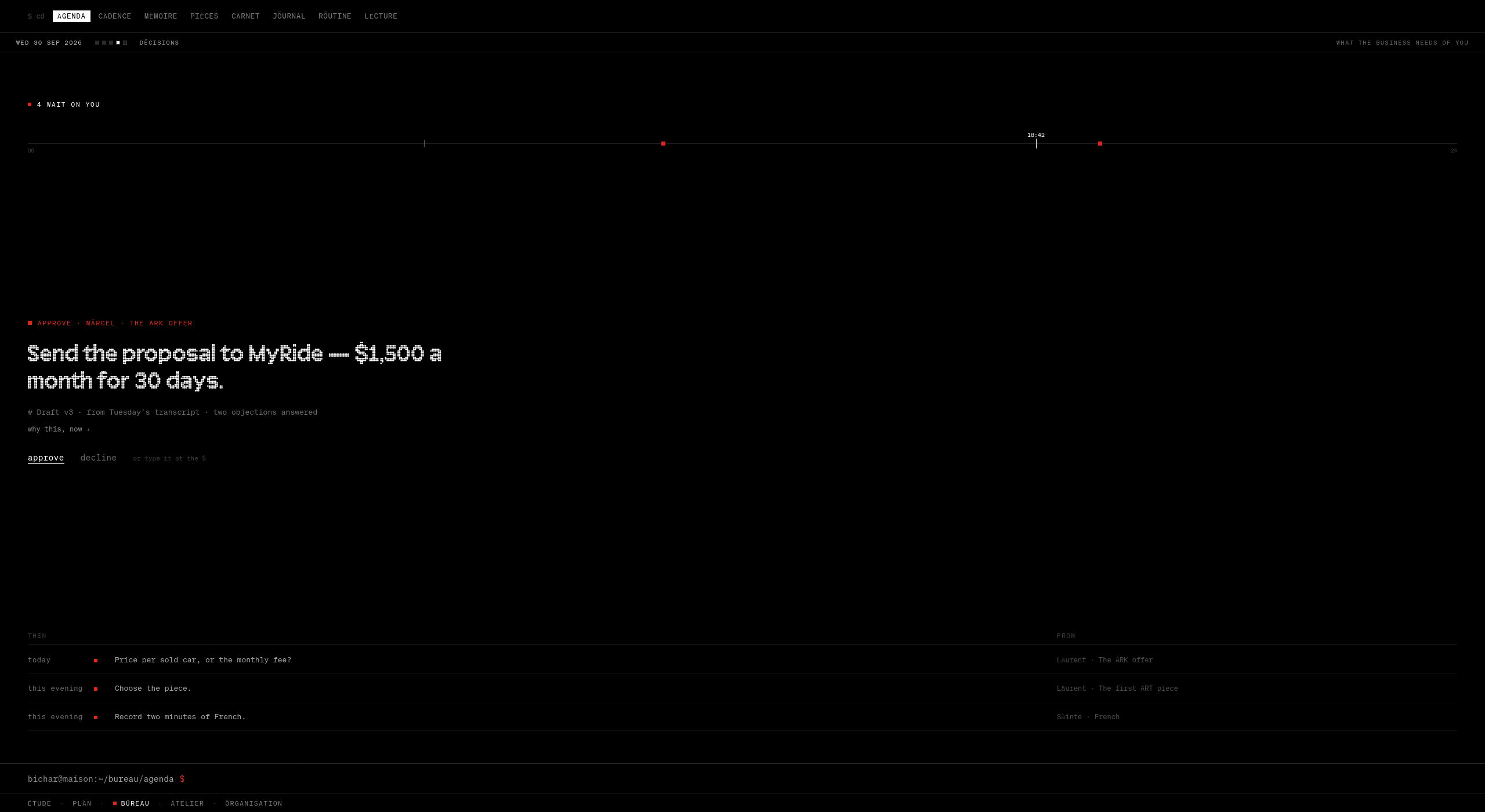
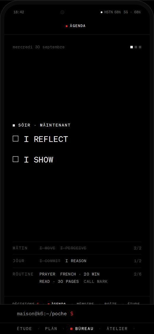
Bureau, 18:42 on a Wednesday. The top half is red because something is mine to do. When nothing is, it is grey. The sentence is written by Säinte from the day itself: Two things left, four ask for you. The proposal first. Under it, why ›. Below the bar, eight surfaces, each with one line of where it stands.
No bell. No badge list. No inbox of notifications. The only thing on this screen competing for my attention is the truth about my day, set in type large enough to read standing up.
Two morning notes from the colleagues lived on this screen at first. They moved to the conversation room, where they can be answered. This screen has one job.
Two and a half seconds. Choose a surface and the bar of names rises to the top and becomes the navigation. The shell does not change screens under you. It moves, and you move with it.Dëcisions. Four things wait on me, drawn as four marks on the line of the day. One is in full ink: Send the proposal to MyRide: $1,500 a month for 30 days. Its evidence sits underneath, draft three, from Tuesday’s transcript, two objections answered. Then two words. approve. decline. Or type it.
This surface was first called Ättentes, awaiting. On the fifth day I renamed it Dëcisions, on the desk and on the phone, because everything in it asks for a yes, a no, or a word. The name should say what you are there to do.
The rule that shapes it comes from Kenya Hara, and it is the first principle in the design document: one thing in full ink. Every screen has one thing that matters most, at full white or in red. Everything else steps back into grey. If two things are in full ink, one of them is wrong.
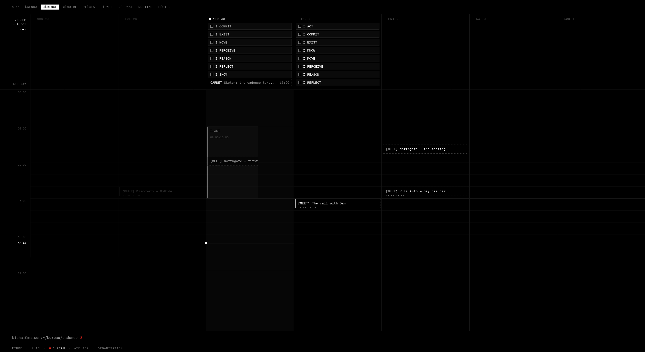
Cädence. A calendar with no chrome at all. The past sits at 38 per cent. Today is lifted, with a line at now. Meetings are dashed because they belong to projects and open there. To add something, say it at the $: thu 3pm call Dan.Zoom is the view. There is no Day / Week / Month switch. Pinch, or hold ⌘ and scroll, and the day becomes the week becomes the month. The range rises once in the dot face, then gets out of the way.
Piëces: writing, with colleagues who write too
Piëces is where I write. On the fifth day it became where the three colleagues write as well, and that changed what it is.
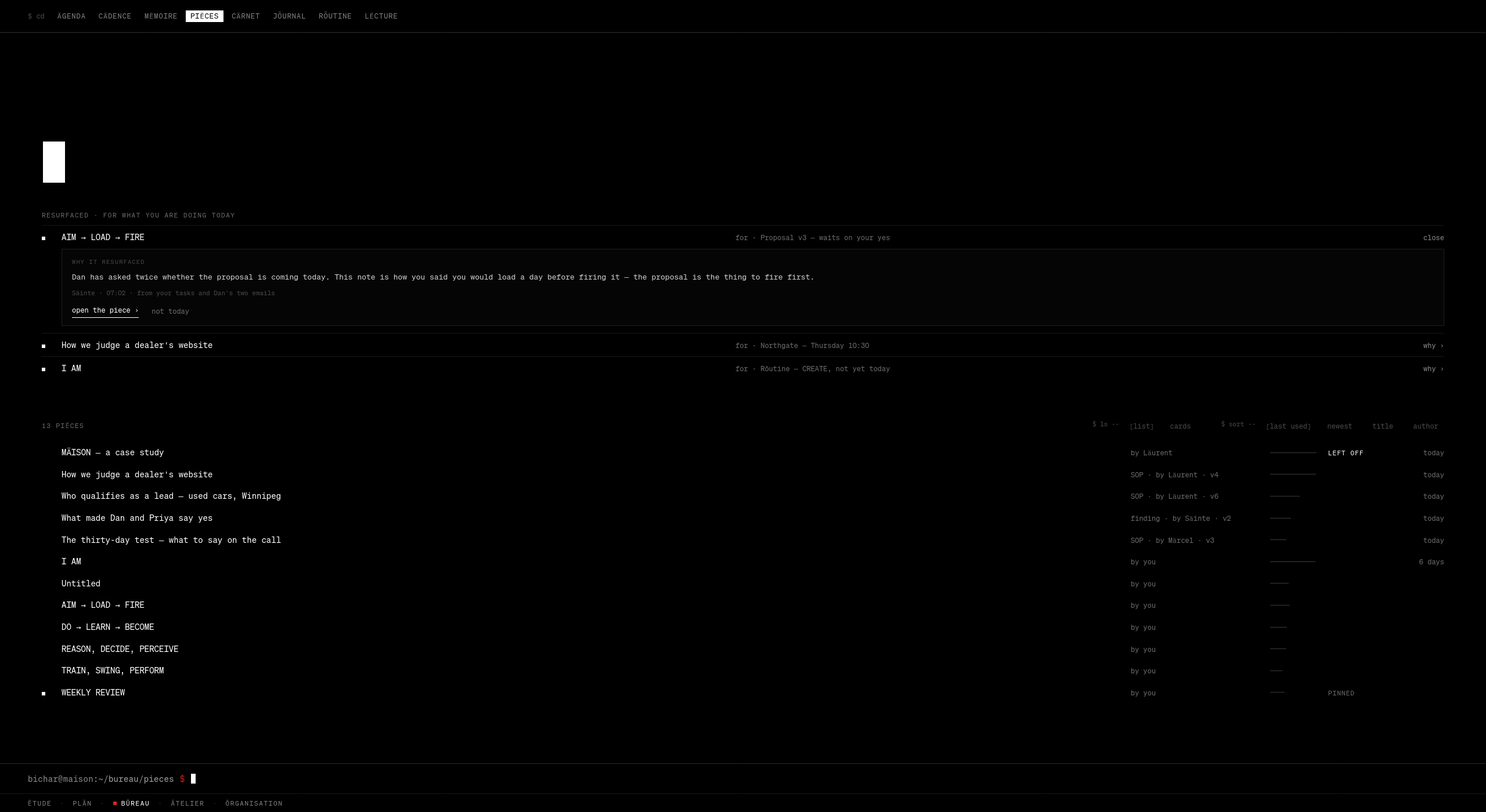
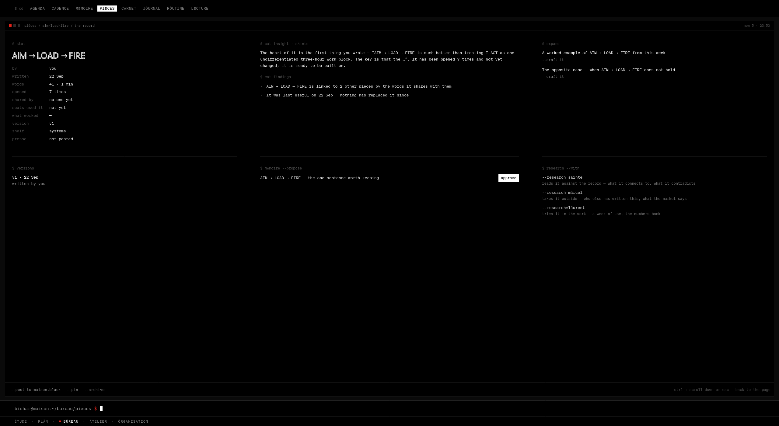
Resurfaced, for what I am doing today. Three notes, each with its reason. The first is open: Dan has asked twice whether the proposal is coming today. This note is how you said you would load a day before firing it. Found by Säinte at 07:02, from my tasks and Dan’s two emails. Below, the index says who wrote each piece: SOP · by Läurent · v4.
The colleagues keep the procedures they work from here: how to judge a dealer’s website, who qualifies as a lead, what to say on the call. Each one carries a version log, and every version carries its evidence. Version four of the website procedure added a finance-calculator check, because twelve of the fourteen dealers who booked had none. Version three dropped page speed, because in sixty-one scores it never once changed a decision.
That is the design rule for everything the AI produces: it shows its work, and then it shows the work behind the work. My own pieces are never revised without asking.
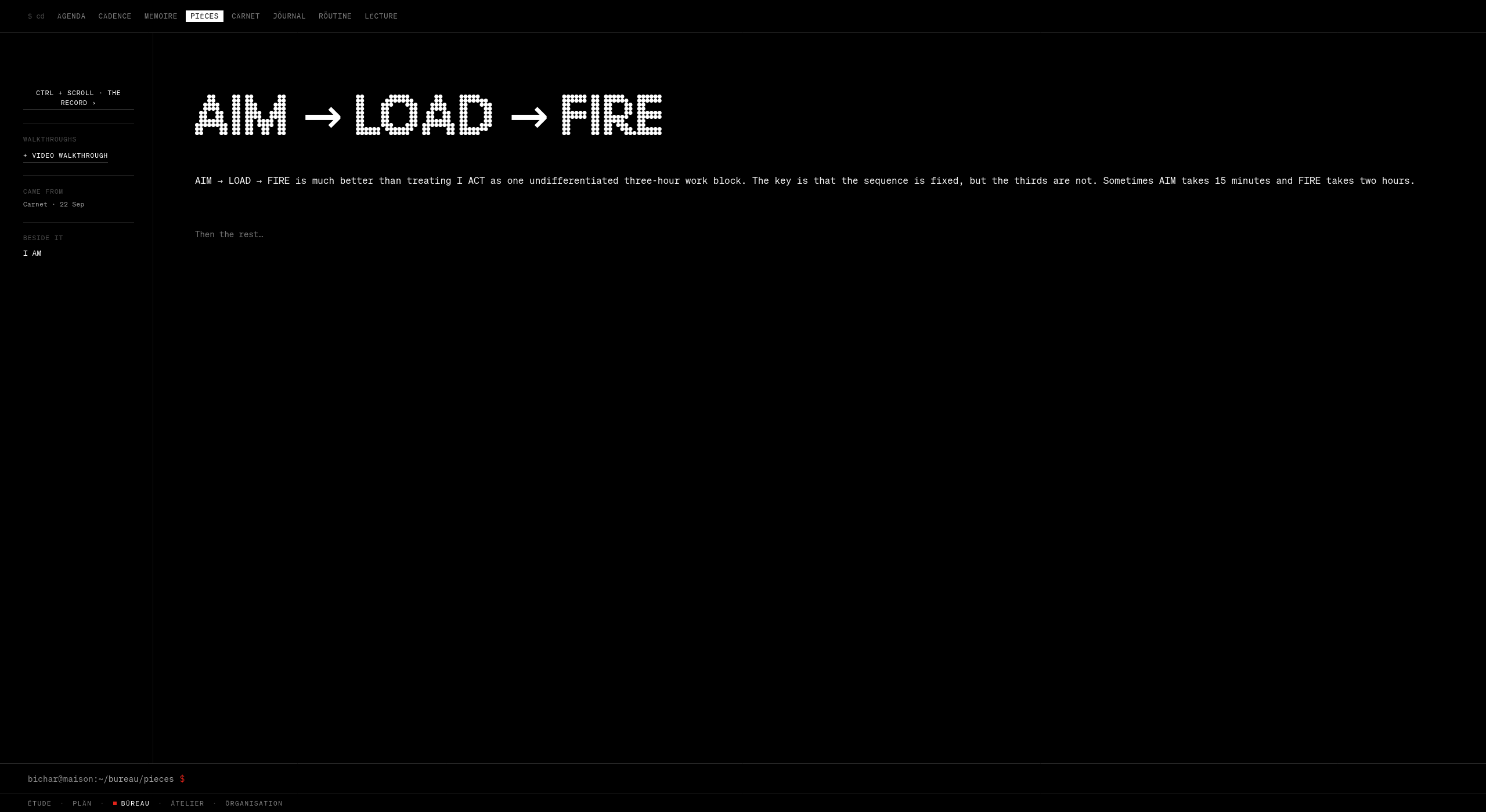
A piece. The margin keeps three things and nothing else: walkthroughs, where it came from, what it sits beside. It used to hold every number about the note.Its record, one level in. Opened seven times. Säinte’s reading of it. Versions. One sentence proposed for memory, with one button: approve. And research I can hand to any of the three.
The instinct
Everything I added to the note’s margin was useful, and the margin got worse with every addition. The margin keeps three things; the rest is one gesture away, and the page breathes again.
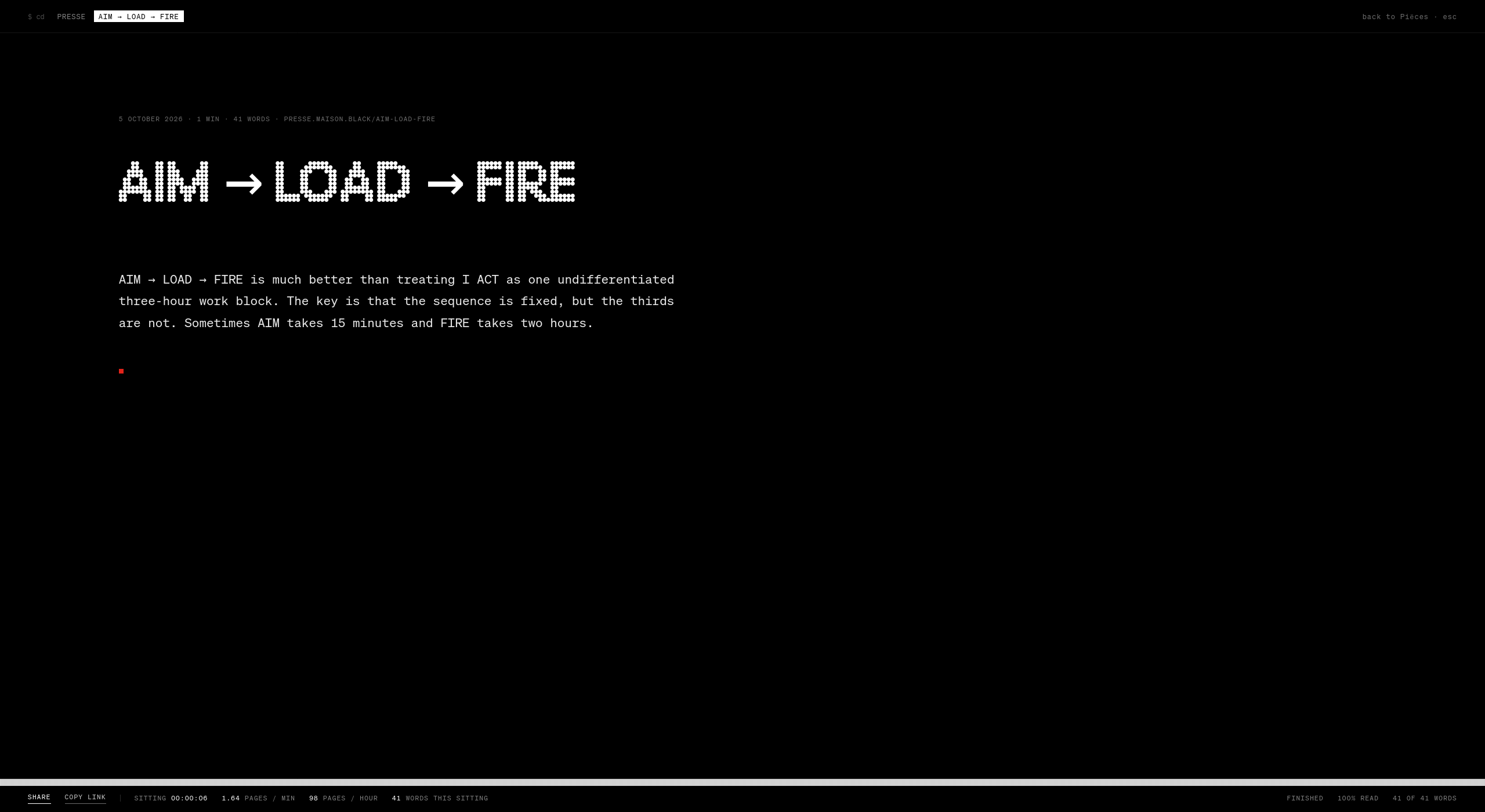
From index to print. Search the index, open the reason a note came back, open a procedure a colleague wrote, step out to the index, and read a piece as the public will.Posted. The same piece at presse.maison.black, white on black. At the foot, a sitting meter: six seconds, 1.64 pages a minute, 41 of 41 words. Publishing is one of the things that always asks me first.
Lëcture: emptiness that scales
A reading shelf is lovely with ten books and unreadable with a thousand. The first shelf had one row, and it was built for ten.
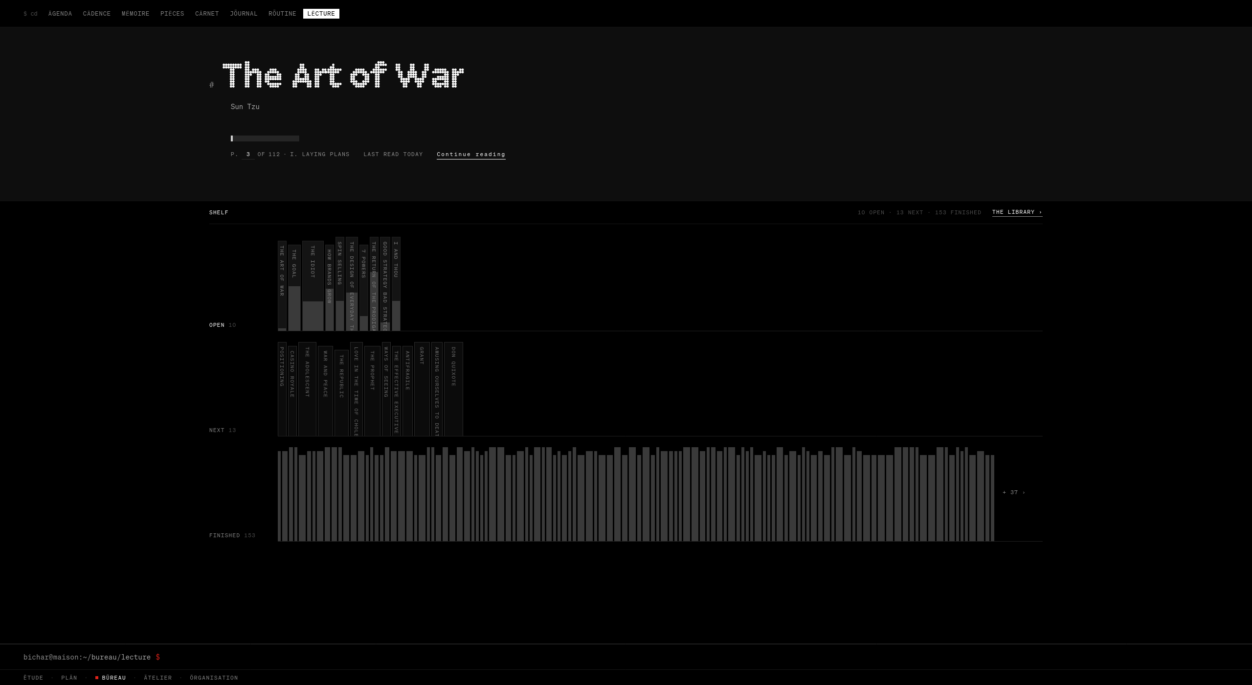
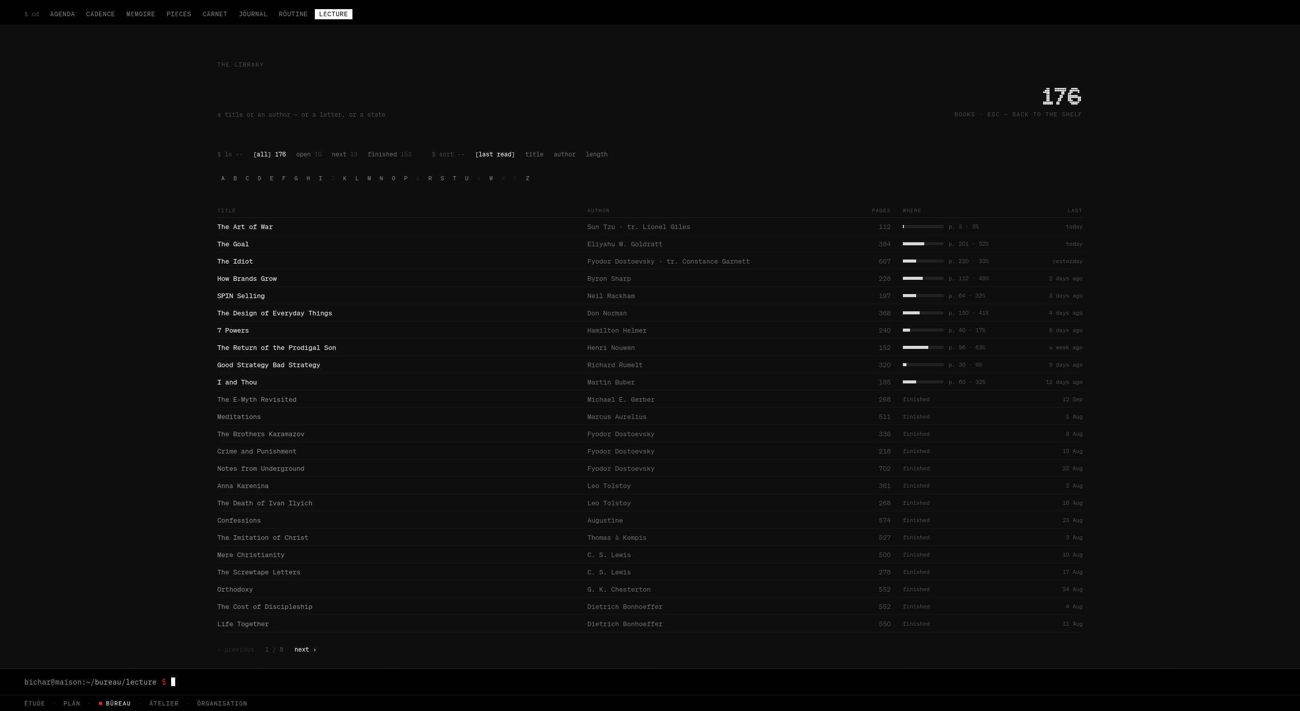
Lëcture, after Kenya Hara. Emptiness as capacity, not absence. Three rows: open, next, finished. The ten open books keep their titles and fill to the page I am on. The 153 finished go to bare spines, titled only under the pointer, and the rest are counted: + 37 ›.
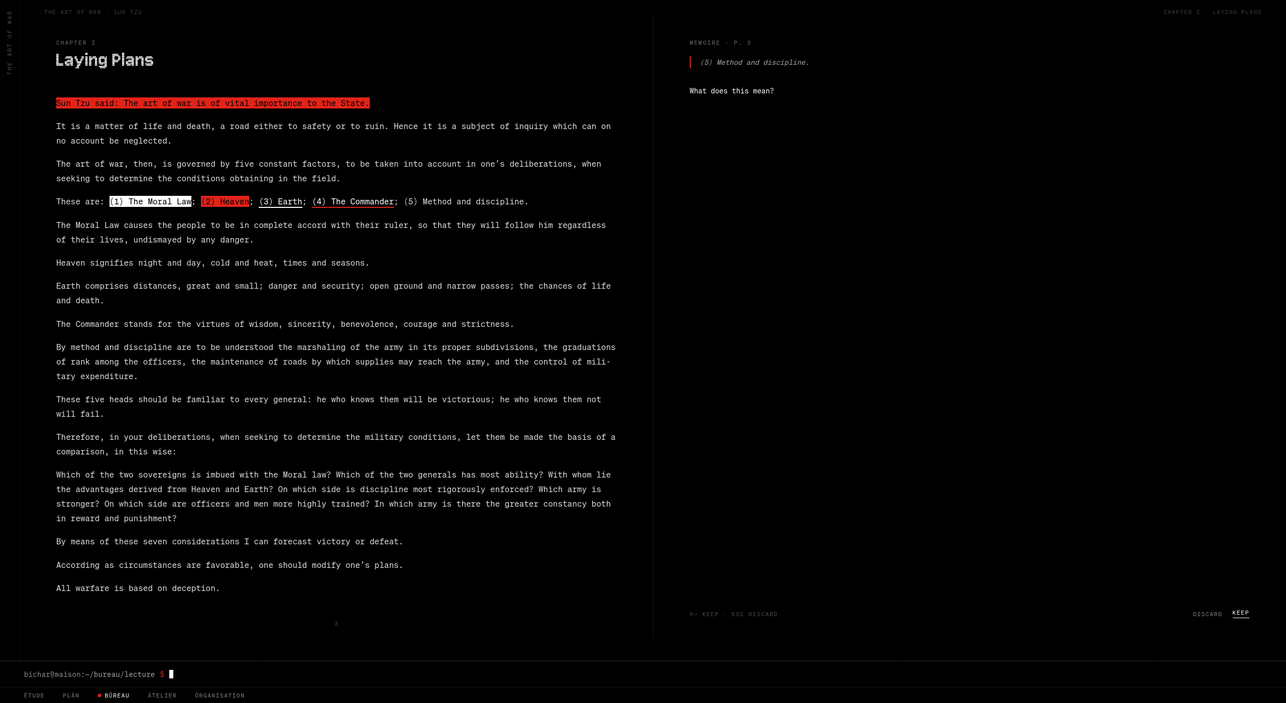
The reader. Pages turn; they do not scroll. Mark a line and send it to Mëmoire with a thought attached: What does this mean?The library, one level in. 176 books in the prototype; built for thousands. States, sort, and the alphabet as one quiet line. Page one of eight.
The whole marking toolbar. Two kinds of mark, each in white or red, and a way to memory. Five choices. A reader does not need a sixth.05 · Ätelier
A canvas that gathers the house around one goal.
Everything I have read, written and decided is already in the record. Ätelier is where it gets used.
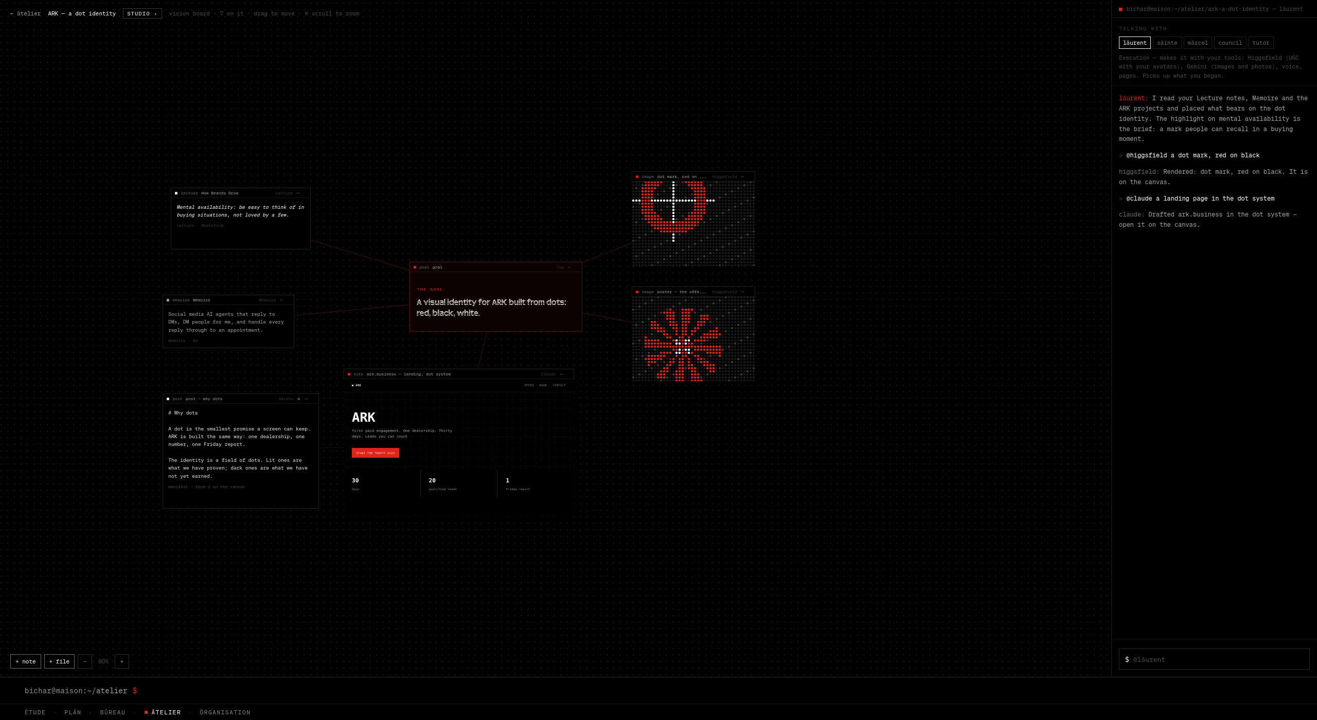
One goal, and what bears on it. In the centre: a visual identity for ARK built from dots: red, black, white. Around it, placed by Läurent: a highlight from How Brands Grow, a thought from Mëmoire, a post, a live landing page, two rendered marks. On the right, the colleagues and the makers they can summon by name.
A new canvas starts blank. gather, followed by a goal, reads across my books, my notes, my writing and my projects and places what bears on it around the goal. Each window says where it came from. A red line joins it to the goal.
A post on the canvas is a master. One gesture makes a render per medium, essay, newsletter, carousel, short. Edit the master and the renders are marked drift, with a way to regenerate. Every made thing carries a manifest of what it came from.
And one principle I wrote down early and kept: honest stand-ins. Where the prototype cannot reach a real service, it says so on the screen in one quiet line. The images on this canvas are dot-matrix placeholders and are labelled as such. A prototype that fakes a result as real has taught you nothing.
06 · Örganisation
Red is not a colour. It is a state machine.
Mail, texts, the phone and the people. This is where the one red earns its keep.
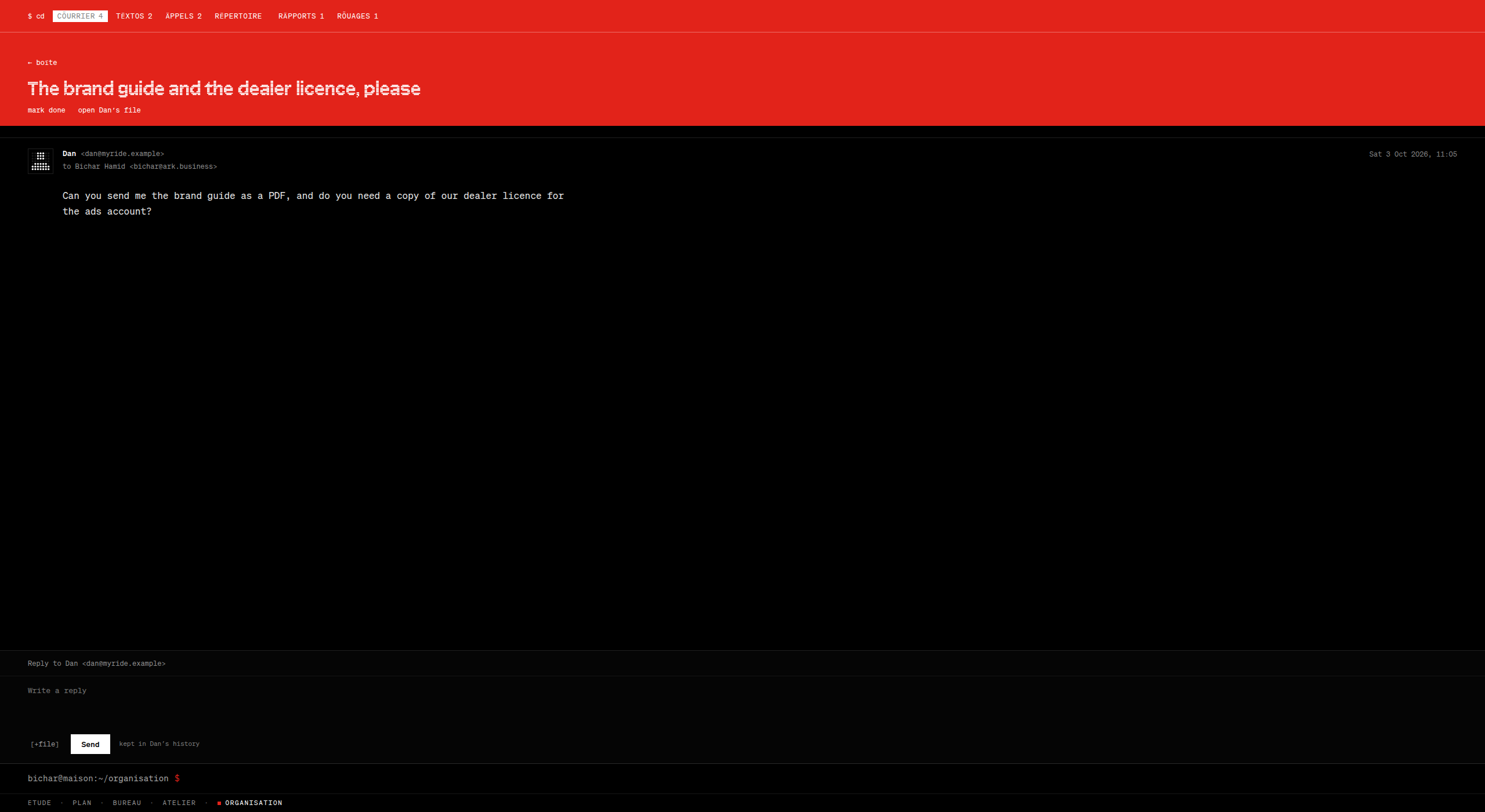
An email that waits on me. The bar and the title band are red. The message and the reply stay black, because you read in order to answer, and the cure should not look like the disease. Opening it does not clear it. Answering it does.
Where it came from. Two objects. The red TrackPoint in the middle of a black ThinkPad keyboard: one point of colour on a machine otherwise entirely about work, and you always know what it is for. And Braun’s ET66 calculator, where Dieter Rams allows one yellow key among the greys, and it is the equals sign. The colour marks the act, not the mood. MÄISON’s accent is literally ThinkPad red.
The options. Red as a theme: the first door was a red page, and it was handsome. Red as emphasis, sprinkled on anything important. Or red as one state with a strict set and a strict clear. I built the first two and lived in each. The theme spent the signal before anything happened. Emphasis reproduced the problem of every dashboard, where the eye learns to ignore the colour because it is everywhere.
So I wrote the state machine first, in one sentence: a thing is red while it waits on you, and only the act that answers it turns it black.
The mechanics. An email, text, call or voicemail carries needs while it is unanswered, unopened, missed or unheard. Opening does not clear it; a system that turns black because you looked is lying to you by Thursday. Then the area, by three failures. Whole page red: body text on saturated red fatigues inside a paragraph. Body black but the reply box red: the reply is the cure. Final: red on the 56-pixel bar and the title band, transition: background .4s ease, and nothing else. White on this red is about 4.5 to 1, right for labels and deliberately wrong for paragraphs, which is one more reason the body stays black.
What it cost. Three reversals in one afternoon, and an hour of red sender icons with white dots that were correct in theory and noisy in practice.
The instinct
When the red first filled a whole page I liked it. It was dramatic. Then I read the email on it and couldn’t. Drama and reading are enemies. The band stayed red; the body went black; I knew before I could explain why.
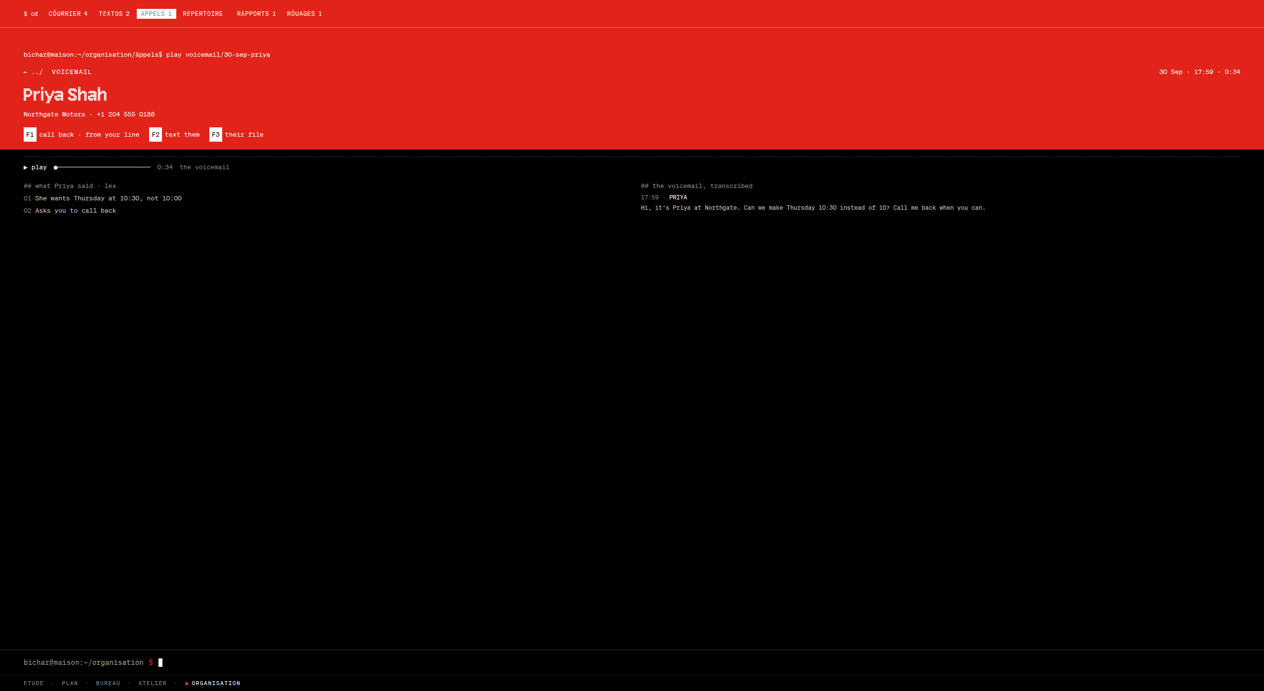
The same rule for a text.can u send the contract again? lost it. The band is red until I reply.And for a voicemail. Transcribed at home, never in the cloud. Two points on the left, the words on the right. F1 call back · F2 text them · F3 their file. Call back, and the red leaves.
A person, on one page
A contact card stores how to reach someone. A relationship lives in everything else: the thing they mentioned on a call, the promise you made in a meeting. So the person’s page is built as ammunition for the relationship, and every line of it is sourced.
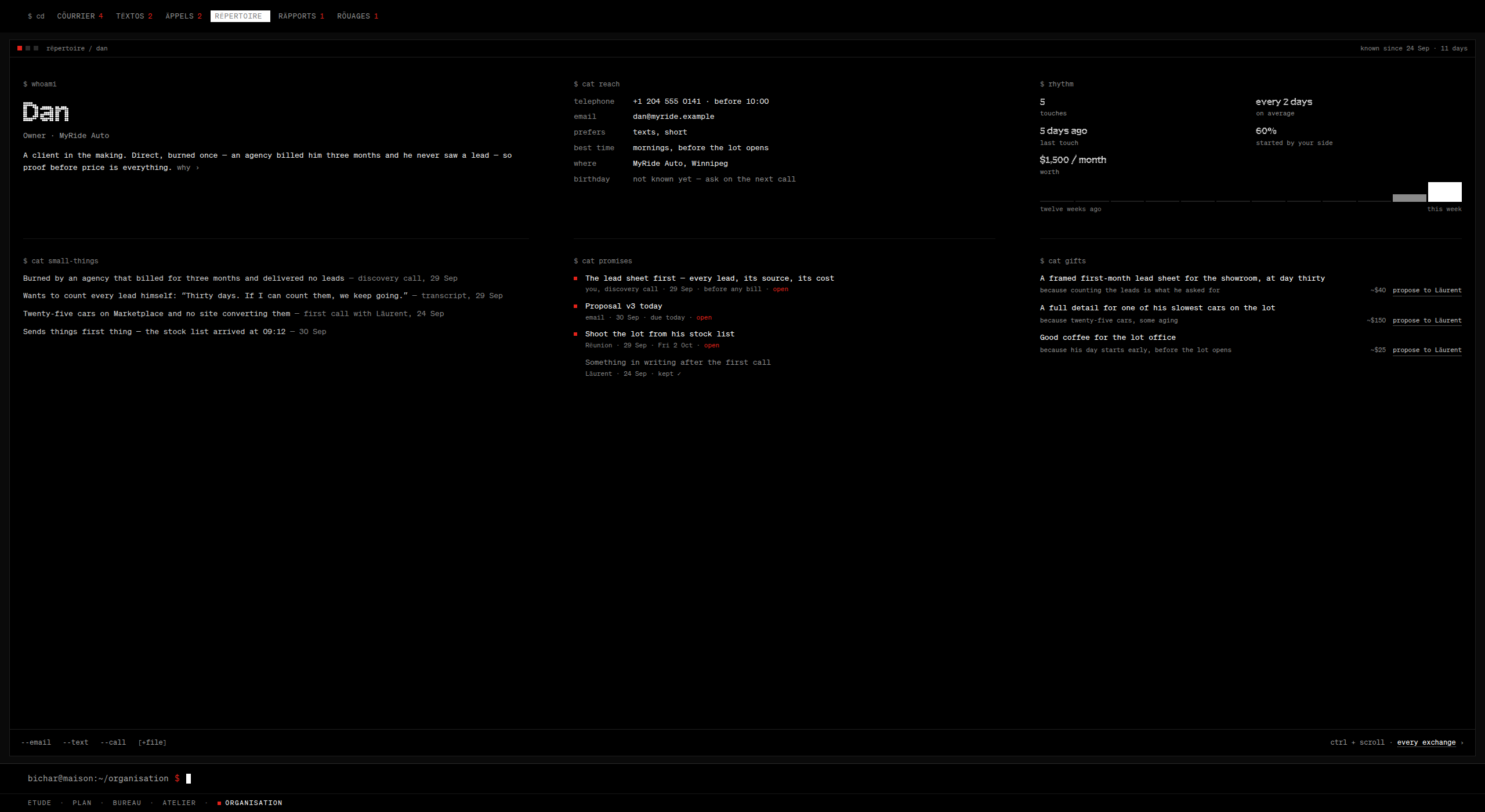
Dan, on one page.$ whoami: the relationship in two sentences, with why ›. $ cat reach: texts, short, mornings before the lot opens. $ rhythm: five touches, every two days. $ cat small-things: “Thirty days. If I can count them, we keep going.”$ cat promises: three still open, in red. $ cat gifts: a framed first-month lead sheet, because counting the leads is what he asked for.
Six panes and no scrolling. Every exchange with him is one gesture in, where the navigation bar itself becomes the kinds of exchange: all, email, texts, calls, meetings, documents, notes. One more level is the exchange in full. Out is the same gesture reversed.
The gift ideas are grounded in what he actually said. A colleague can arrange one. But only after I say yes, because spending always asks.
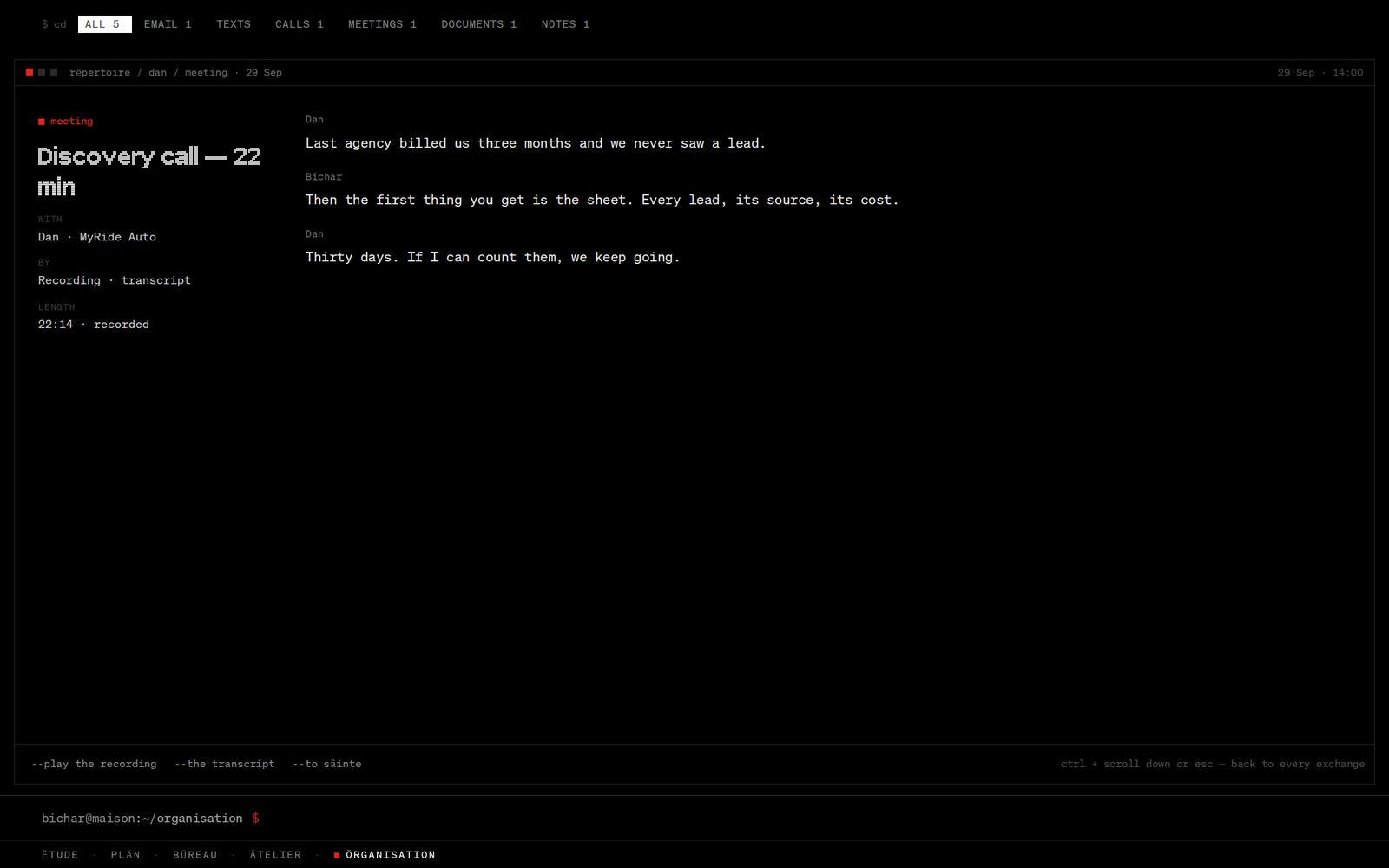
From a name to an answer. The list, the sheet, in to every exchange, in again to one email, the reply, and the red leaving the screen. Then a search typed in plain words.An exchange in full. A discovery call as its transcript, speaker by speaker, paged rather than scrolled, with the actions that belong to a call written as flags at the foot.
Search that shows how it understood you
Every search in the house is an object resolver. It finds the thing, or it offers to make it. And where the question is in plain words, it shows its reading of the question before it shows the answer.
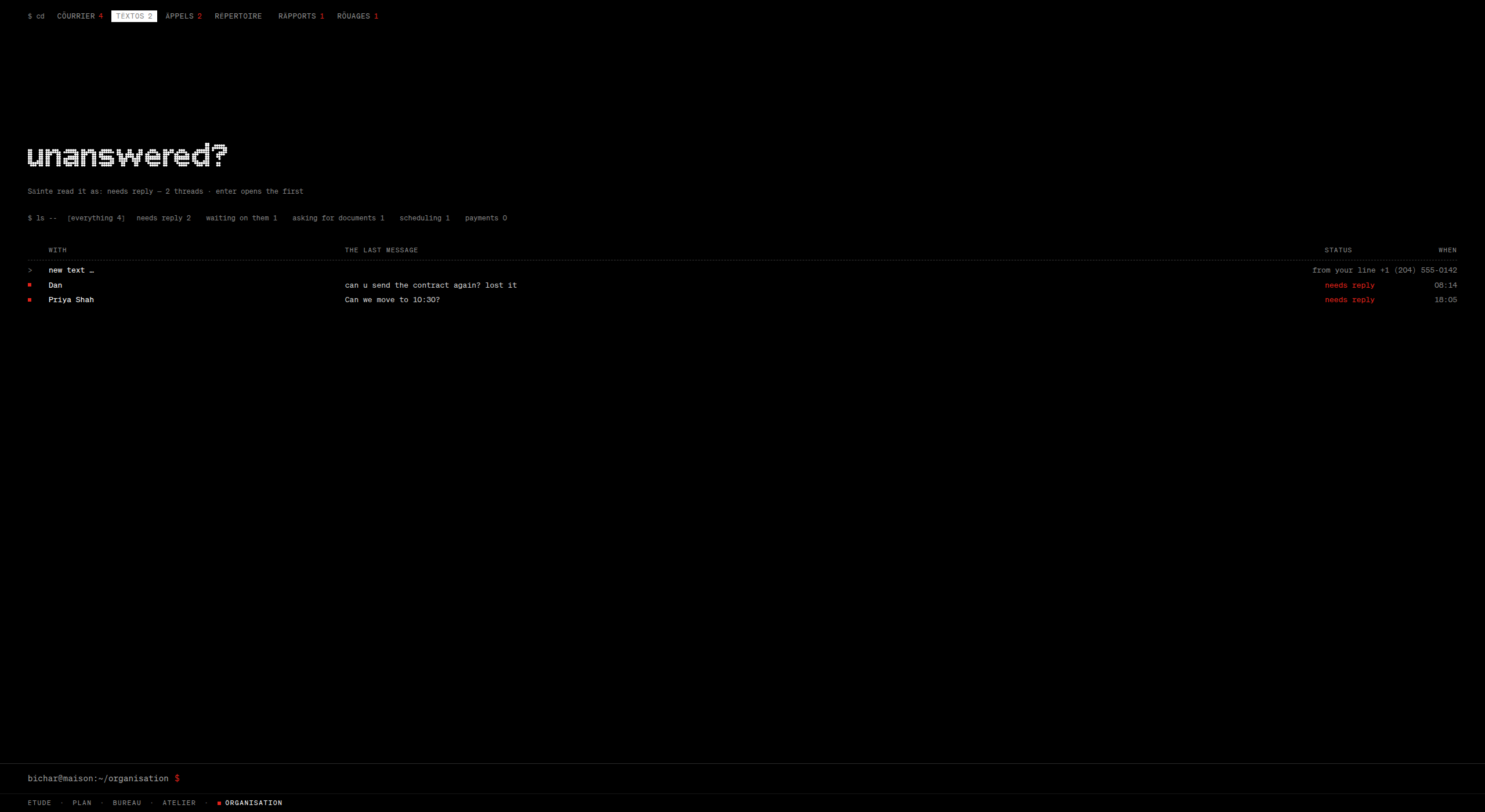
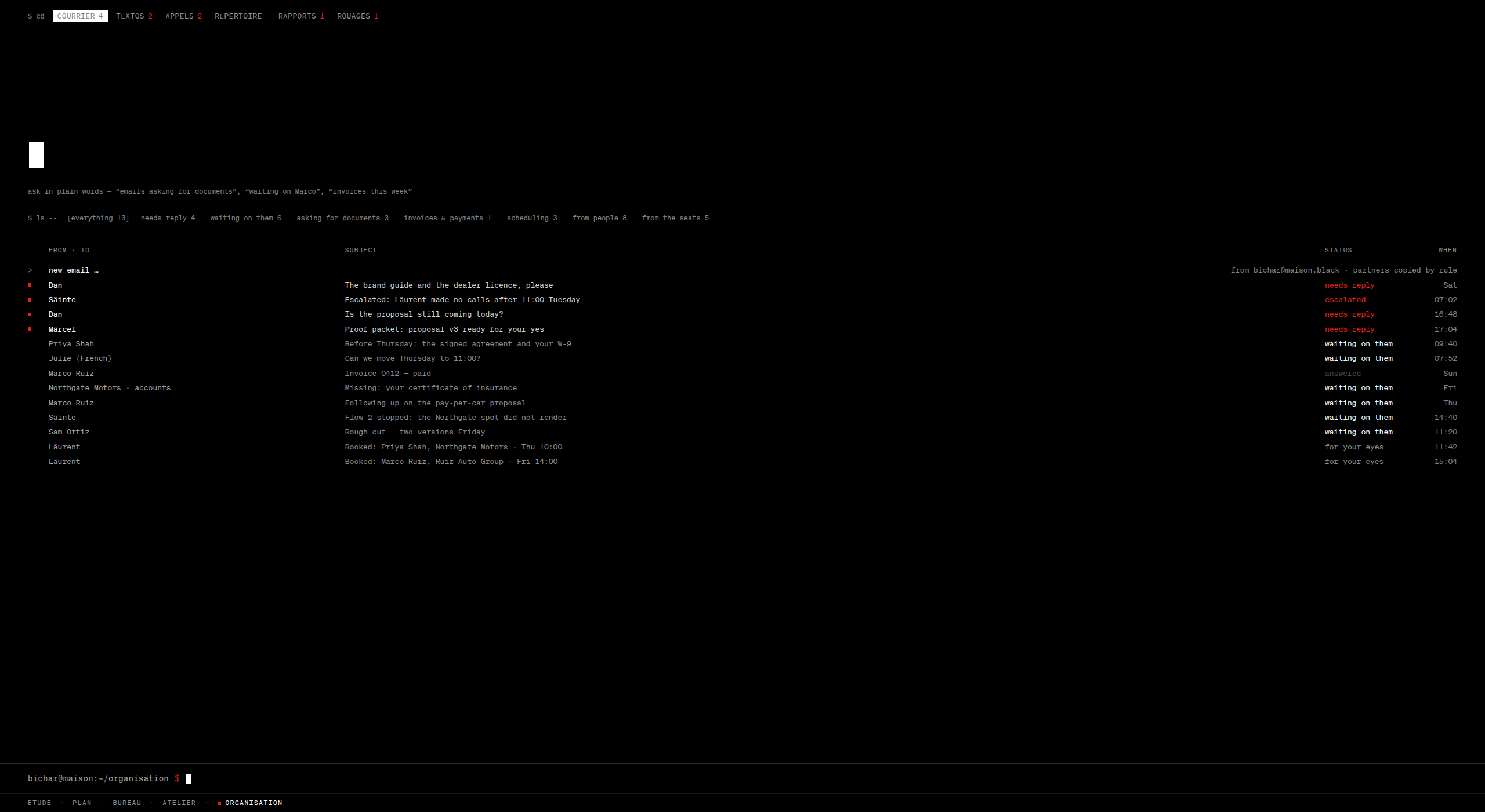
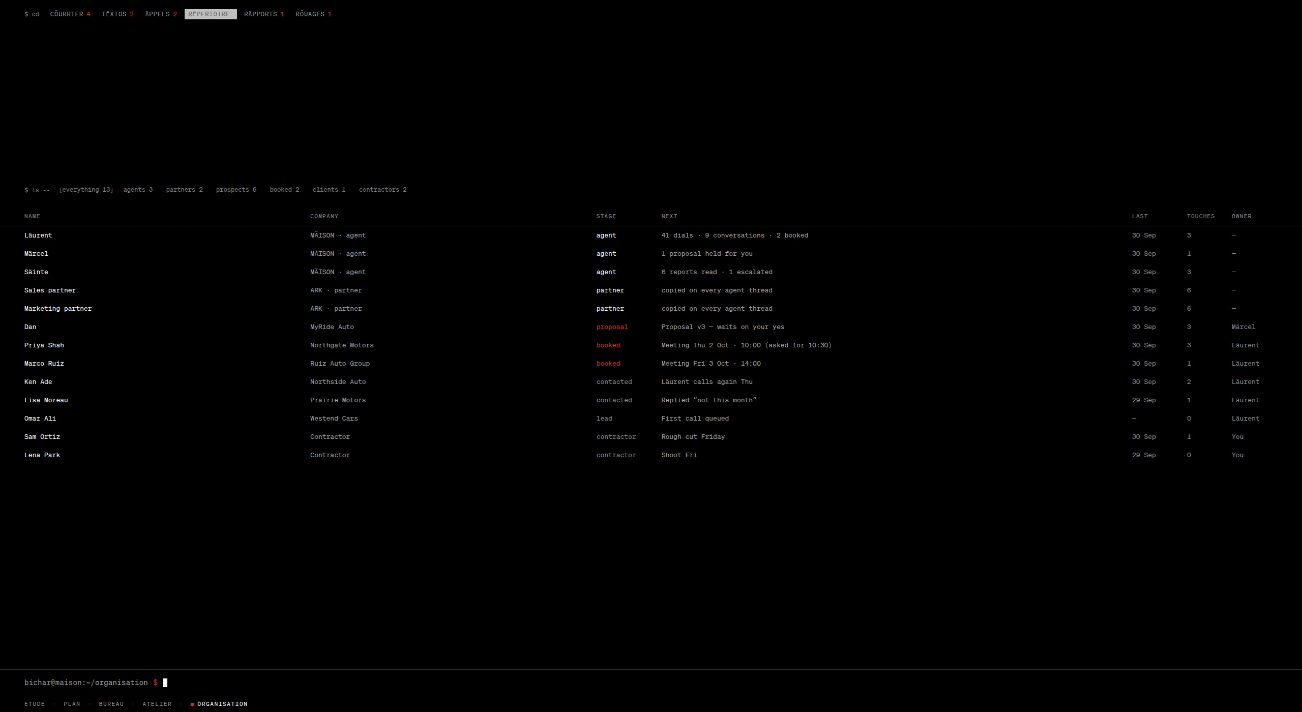
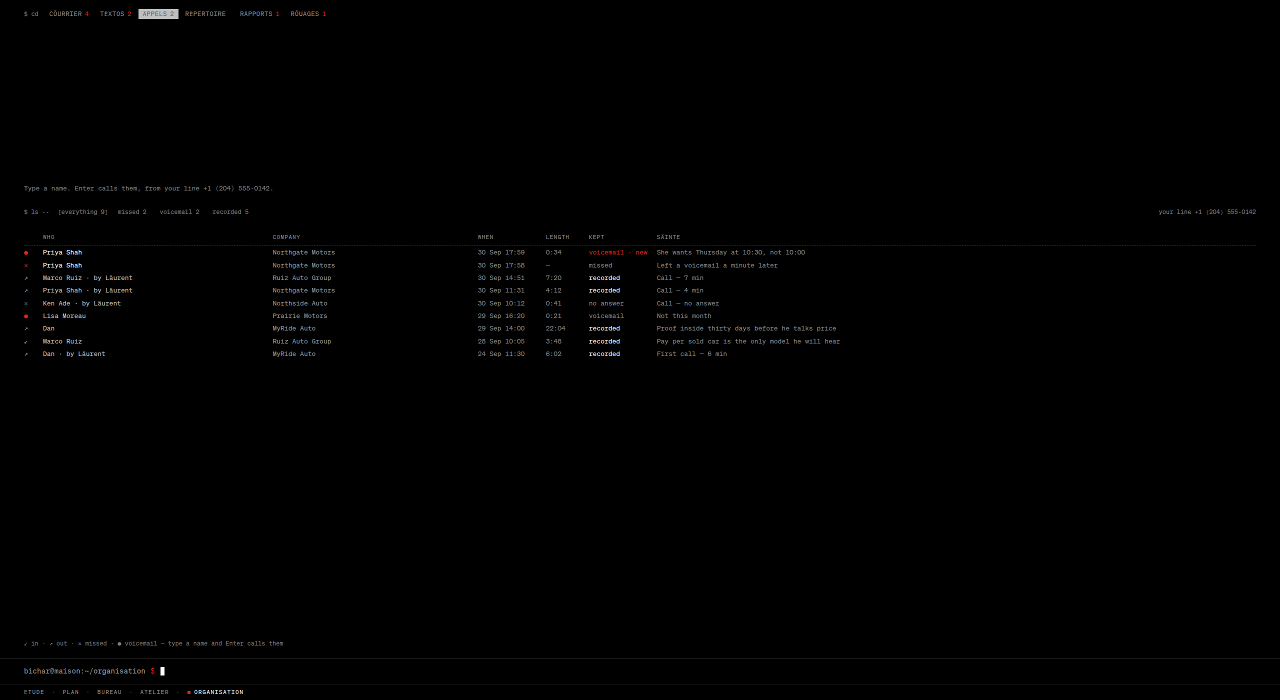
“unanswered?” And beneath it: Säinte read it as: needs reply. 2 threads. Enter opens the first. The machine tells you what it thought you meant.Cöurrier.Emails asking for documents. Waiting on Marco. Invoices this week. Views with their counts, and a status on every thread: needs reply, escalated, waiting on them, for your eyes.Rëpertoire. Look at the first three rows. The colleagues are in the people list, with a stage, a next step and a last touch. They are people of the house, not features in a menu.Äppels is the phone. Type a name and Enter calls them from my line. Each call has what was kept, and one line from Säinte: Proof inside thirty days before he talks price.
07 · The three
Three colleagues. Never a fourth.
The question for an AI-native organisation is not how many agents you can run. It is how many colleagues one person can actually work with.
A year ago I designed a system with forty-six agents. Every feature had its own. It was impressive, and it was dead. HQ had eight. On the third day of this week I folded all of them into three. A fourth was proposed and scrapped the same day.
The tell that I had been wrong before was simple. With eight agents I had to remember who did what. With three, I just talk.
Märcel
Läurent
Säinte
Desk
Direction
Execution
Intelligence
The one right
Decide, and act on it
Act
Perceive
Looks
Outward: trends, new fields, tested with real people
At the markets we already sell to
Inward: clients, campaigns, my own notes
Every day
The frontier note, three lines at most
The work, and a report on it
One finding, with evidence and an experiment
Model
Claude Opus 5.5. Few calls; each one matters
Claude Sonnet 5.5. Long, many-step tool use
Claude Haiku 4.5 for the many small reads; Claude Fable 5.1 when the work goes deep. The only seat that alternates
Never
Breaks the laws of the house
Acts beyond an approved boundary
Changes anything
The roles are the permission model
This is the part I am proudest of. You can tell what each colleague is allowed to do from what it is for. Säinte knows everything she is allowed to read and changes nothing: she proposes. Läurent acts, but only inside a boundary that was approved. Märcel decides within a ceiling and brings me whatever is above it. I did not bolt a permissions system onto a cast of characters. The cast is the permissions system.
Five laws, in code and not in prompts
Money past a ceiling, signatures, publishing in my name, deleting anything: ask me.
Consent. Calls only where consent allows. An opt-out on any channel stops every channel.
Honesty. Each speaks as itself or as a business with an approved card. Never as me. Never as any real person. It says it is an assistant when asked.
My calendar. Meetings are booked into hours I have opened, never over protected ones.
Privacy. Health data never leaves my own view.
A prompt is a request. A hook before every tool call is a law. The design specifies the second.
Abilities are taught, not hired
The first version let me hire an agent from a sentence. I changed it to teach a capability: a described ability becomes a skill of one of the three, a file I can read, or a mission if it has a schedule. Plain machine work, finding leads, verifying them, transcribing calls, runs as unnamed assistants: lowercase names, no inbox, no voice. Processes, not people. The people list always shows three.
The detail that shows the thinking
Läurent can sell by phone. An AI voice on a phone call is, in law, an automated call: the FCC ruled so in the United States in February 2024, and Canada’s rules require express consent for a synthesized voice. So the design says his voice goes, by default, only to people who said yes. Cold lists are opened by email or text where the law allows. And the consent ledger is built before the dialer. That is a design summary and not legal advice, and the document says so at the top.
And when a campaign has no list, he does not wait. Finding is reading, not reaching out, so he builds one himself and reports before anyone is contacted. The specification gives the report he should write: 640 found · 412 verified · 188 may be emailed · 0 may be called yet. That last number is the design working.
08 · The machine
Why Hermes.
I chose the agents’ runtime three times in three days. Each choice is written down with its reason. Here they are.
When
The runtime
Why it changed
Fri 2 Oct
A framework I already used as the switchboard for the named agents, with new autonomous ones on an open-source agent runtime at home, as a pilot.
The first plan. The pilot was to run until 17 October, and the old seats would stay put unless it won.
Sat 3 Oct
The Claude Agent SDK, on the machine at home: skills, sub-agents, a hook before every tool, MCP.
The cast had just folded into three. The log’s reason is four words: one runtime, three seats.
Sun 4 Oct
The house moves online. The machine at home becomes one possible worker, not the house.
Reachable from any computer. One provider, one bill, the agents beside the record.
Sun 4 Oct
Hermes Agent. Three profiles in its official container, in the cloud, beside the record.
Persistent people out of the box, always reachable; local hardware is for assistants.
Three other runtimes were considered and set aside along the way. The prototype’s settings room still shows the day-three answer; on behaviour, the documents are the contract.
What I needed was not an agent framework. It was three persistent people: each with a character, a memory, skills it has been taught, sessions it remembers and a schedule it keeps. Hermes Agent gives each of those as a profile out of the box: a SOUL.md, memory, skills, sessions, cron. Three profiles in its official container, in the cloud, beside the record, always reachable. That is the reason in the build plan, in eight words: persistent people out of the box, always reachable.
A colleague’s character is a text file I can open and read. I wrote the first draft of each. Märcel’s begins: You speak little; when you speak, it is a decision, a reason, what it costs, and what you found.
The models are Claude, by API key, one per colleague, set in a hidden settings room. The runtime and the models are separate choices on purpose, and the plan keeps a managed version of the runtime as an option if hosting it myself becomes a chore.
Decision 0
Before any code, one sitting, one table. Every row has a reason, and the reasons are short.
Question
Choice
Why
Where the house lives
Online, on Railway: the app, the database, a file bucket and the agents’ container on one private network
One provider, one bill, the agents beside the record. It opens from any computer.
The record
Postgres with pgvector
One record, private to the house, searchable by meaning.
The app
One web app in TypeScript, server-rendered
One codebase for every house on a screen: mine, partners’, contractors’, clients’.
The phone
React Native with Expo, plus small Kotlin modules
The glasses, health data and the phone’s light matrix need native code. Expo keeps the rest in TypeScript.
The agents’ runtime
Hermes Agent, three profiles
Persistent people out of the box, always reachable. Local hardware is for assistants.
The tool gateway
One gateway, over MCP, in front of every outside tool
One place for grants, hooks and the class of actions that is never allowed.
Local compute
A mini PC at home runs a local model and local transcription. More machines pair with a six-digit code.
Local models for plain work. The house never depends on them.
The front door
Cloudflare in front; machines connect out, nothing connects in
No machine of mine faces the internet.
Secrets
A password manager, shown only by their last four characters
No key in a file or a prompt.
Backups
The provider’s, plus a nightly encrypted export I own
Never one company away from losing the house.
Voice is the one thing that never leaves home. Calls, voicemail and the glasses are transcribed on a machine in my own room. The settings screen says it in four words: never leaves the house.
A phone call needs an answer in under a second, and a full agent loop is too slow for that. So a live call runs in three parts. Before it, Läurent writes a brief: who, why now, what we know, the one goal. During it, a fast voice layer works from only that brief, with three tools: check the calendar, book, hand to a person. After it, Läurent takes the recording, updates the record, scores the call and writes the note. The slow mind prepares and reviews. The fast one talks.
09 · The language
It never sounds like software.
I wrote a constitution for the words on the first day. Where a word on a screen and the constitution disagree, the constitution wins.
It begins with a fiction, because a voice needs somewhere to come from. Imagine a design bureau on the rue de Sèvres and its sister office in Montréal, both founded before the war, both working in two languages without comment, which in 1981 quietly built an operating system for their own use. Minitel is on the desk. The typewriters are Olivettis. Nobody has ever written an exclamation mark in a memo.
From that, three registers, and one rule for each.
Register
Language
Carries
Example
Identity
French, with one umlaut
The names of rooms, tools and the three colleagues
ËTUDE · Piëces · Säinte
Instruction
English, as a well-edited magazine of 1981 would write it
Everything that tells, sorts or asks
Awaiting, not pending. Set aside, not paused. Wednesday, 30 September.
State
The terminal
What the machine is doing
bichar@maison:~/bureau $ · [ OK ] · $ ls --
The umlaut
Every word of the house’s own vocabulary carries exactly one. If the French word had an accent, the umlaut takes its place: ÉTUDE becomes ËTUDE. If it had none, the umlaut sits on the first vowel: MAISON becomes MÄISON. One per word, never two.
It is not French and it is not German. It is a mark. And the reason is in the type: the umlaut’s two dots rhyme with the dot-matrix face. The name of the product is spelled in its own typeface.
The reversal
By the third day, French was on everything: every tab, every filter, every status. It was charming and it was slow. On the fifth day I wrote the rule that fixed it, and rewrote a glossary of fifty labels in one pass. Töus became everything. Ättente became awaiting.
The test is one sentence long, and it ended a hundred small arguments: if a word names a place you can go, a tool you can open, or one of the three, it is French. If it tells you something, sorts something or asks you something, it is English.
The French makes the house a house. The English means you never have to decode an instruction.
The faces
Three typefaces, each with one job. Array, a dot-matrix face, for the one thing on a screen that should be read from a distance. Söhne Mono for everything read or typed. Courier Prime for the private journal and nowhere else, because a journal should feel like a typewriter. There was a serif. It retired on the second day.
And the languages underneath
TypeScript, end to end, for the web app and most of the phone. Kotlin, in small modules, only where the phone’s hardware demands it. SQL for the record. And Markdown for the two things that matter most: a colleague’s character is a SOUL.md, and everything it has been taught is a SKILL.md. The most important files in the system are written in plain sentences, and I can read all of them.
10 · The week
Five days.
I design in a working prototype, not in frames, so every decision is something I can feel by the afternoon. Then I live in it. Then I cut.
Thu 1 Oct
A language, then a day. The constitution for the words is ratified. The calendar, the thoughts, the writing, the notebook, the journal and the routines are each designed from first principles, one at a time. One conversation follows me across every screen.
Fri 2 Oct
The other four modes, and the big removals. Projects, the canvas, the people. The status bar and every notification are removed, as a rule. Scrolling is removed. Rounded corners are removed. The serif retires. The umlaut is ratified. I call this the close of the first build.
Sat 3 Oct
The day everything got simpler. The whole cast of agents folds into three. Red is returned to one meaning. The home screen becomes two halves. The door is designed four times. The client portal is designed light, then dark. The thesis is written down: three motions, and why › under everything.
Sun 4 Oct
The machine. A build plan from zero, in eleven phases, each ending in a gate I have to pass by living in it. The runtime moves to Hermes, in the cloud. Machines at home become optional. The phone is specified. The three colleagues get their characters, their lines, and the law they call by.
Mon 5 Oct
The polish that changed the product. Two languages instead of one. The door’s window grows into the terminal. Red shrinks to the bar and the title. The person’s sheet fits one page. The colleagues begin to write. The library is rebuilt for thousands. A hidden 900-pixel floor comes out from under two rooms, so a laptop fits.
Each change was written as a small, ordered transformation of the screens, so the design can be replayed like a log. The prototype is built by a generator, and it went from generation 123 to generation 387, staying interactive through all of them: working links between rooms, a working door, live replies, the keyboard grammar, the motion. Every change was checked in a real browser at several sizes before it stood.
The design ends in documents an engineer, or an AI coding agent, can build from. A build plan in eleven phases. A specification for the three colleagues. The language constitution. A build spec for the phone. And a one-page rulebook that ends with a list titled Never.
11 · Everything in the house
The whole list.
By room. All of it is in the prototype you can open.
The shell
A command bar at the foot of every screen
Five modes on one bar
Places as $ cd tabs; filters as $ ls --
Three motions: around, in and out, language
Every search finds the thing or makes it
Säinte at the command bar, one conversation across every screen
Hidden settings, reached by typing settings
An idle screen that turns red when something new is yours
The door
One login for four kinds of user
One-time link by email or text; passkey
A greeting, and the latest public piece in two lines
The window grows into the terminal
Public writing inside one full-screen terminal
Plain-words search over the pieces
A reading meter written as flags
Ëtude
The first thought, typed large
Four ways to be answered
Several colleagues at one table; @name gives the floor
Colleagues open threads; nothing is pushed
Säinte’s daily finding; Märcel’s frontier note
Open a note beside the talk and share it in
A reading of your own practice, with why ›
PLÄN
A portfolio that is red only where you are needed
A project as a terminal session
Questions one at a time, then silence
Work in three hands: you, agents, with us
A message board with threads and private lines
A card table, a file library, a worklog
Meetings: one link is the invitation, the room and the record
The project’s people, and a live call bar
Bureau
A home in two halves, red or grey
Dëcisions: the one thing in full ink
A calendar where zoom is the view
Thoughts, sifted with single keys
Writing, with shelves and a public page
A notebook built like an engineer’s editor
A journal that seals; no agent reads it
Routines at three distances: today, three weeks, the year
A reader, a shelf, and a library for thousands
Ätelier
A canvas that pans and zooms
gather a goal from across the house
Windows of any kind, joined to the goal
Makers summoned by name
A master and its renders, with drift
A manifest for every made thing
A council of readers; a tutor for skills
Örganisation
Mail and texts in two inboxes that hold everything
Writing fills the whole screen
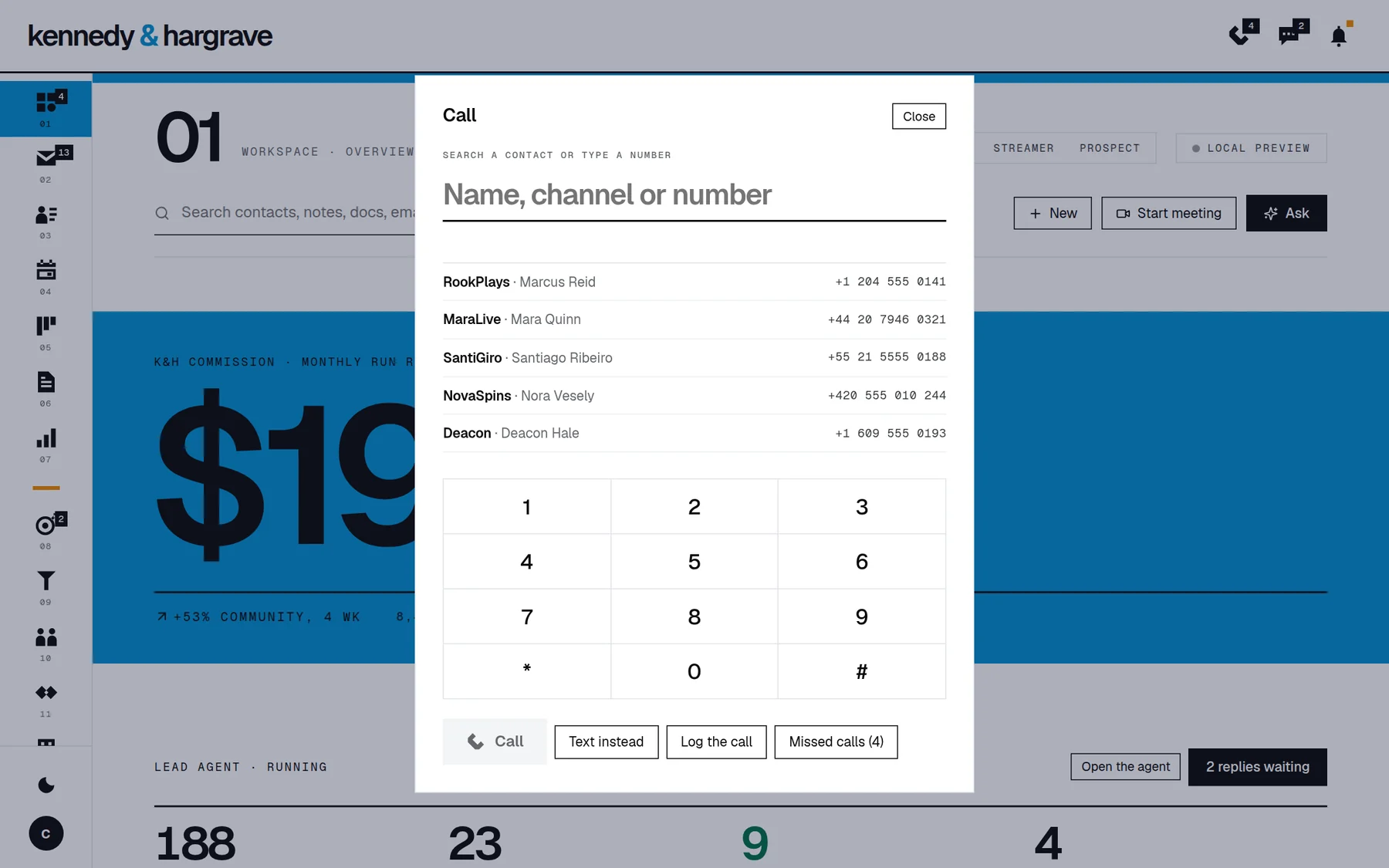
The phone: type a name, Enter calls
Voicemail transcribed at home, with the points
A person’s sheet on one page
Every exchange one level in; any exchange in full
Promises, tracked until kept
Daily reports, each read by Säinte
Automations described in a sentence, switched on with a yes
The colleagues
Three seats; roles as permissions
Five laws enforced before every tool call
Capabilities taught as readable files
Unnamed assistants on machines you pair
Procedures versioned with evidence
Notes resurfaced for today’s work, with why
A consent ledger before a dialer
A knowledge graph: every fact with source, date and confidence
The other houses
Partners: their own wing, approvals to a ceiling
Contractors: only the projects they were invited to
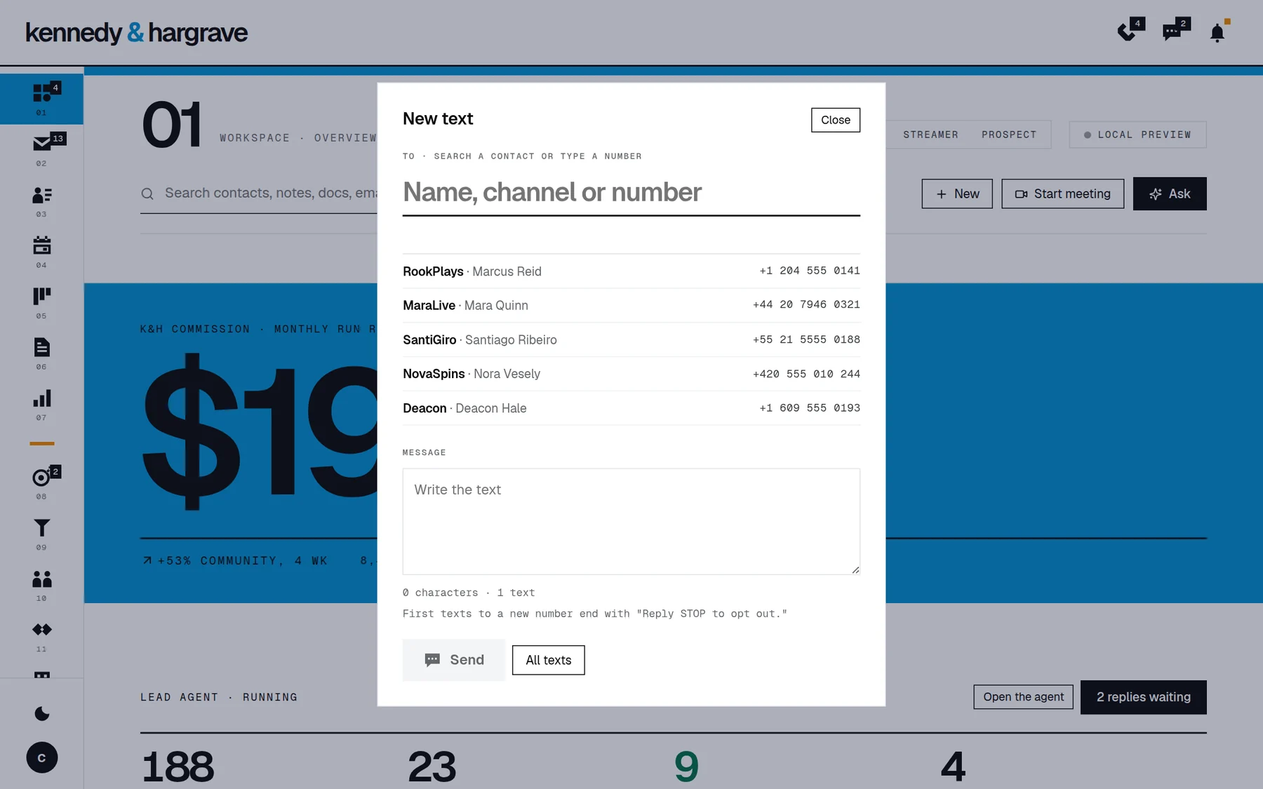
Clients: the Sälon, a calm app to ask, chat and approve
One conversation in many windows
The phone: keyboard-native, with glasses for capture
Health against work, as tendencies, never advice
Four houses, one door
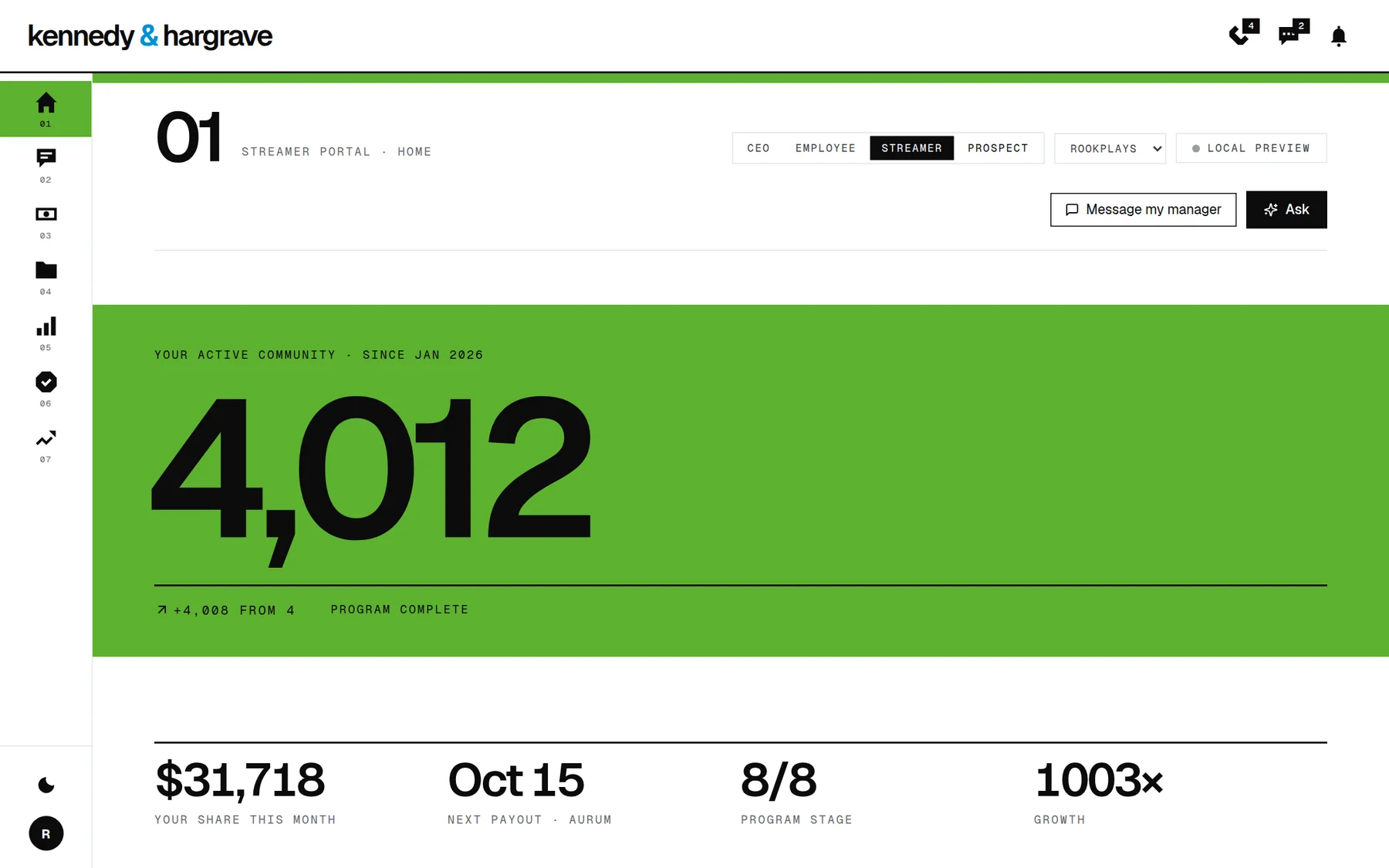
The same product serves four kinds of people, and each gets a house shaped to them rather than a permission-trimmed copy of mine.
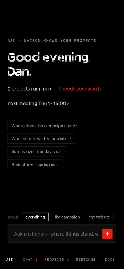
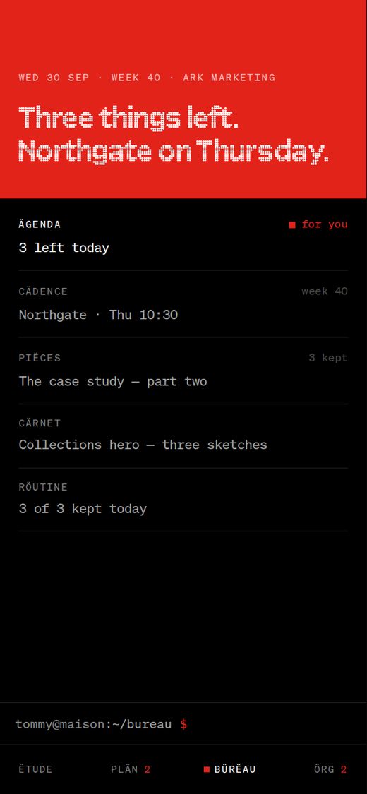
Three of the four houses, on a phone. A client’s Sälon: a calm app with an AI to ask, a chat with people, their projects and documents. A partner’s pocket: his own wing, approvals up to a ceiling, never my journal or the money. And mine. Contractors get only the projects they were invited to. Same product, same grammar, different rooms.12 · What I cut
Most of the design is removal.
The second principle in the design document is three words: cut, don’t add. The reversals show the reasoning better than the final screens do.
First version
What it became, and why
Forty-six agents, then eight
Three. New abilities are taught to one of the three; a fourth person diluted every role.
A status bar and notifications
Removed, as a rule. Nothing interrupts; what needs you lives where you go on purpose.
Scrolling pages
Pages, or one level deeper. The window holds the screen.
A red door
A black one. Red is not spent before anything has happened.
A login page, then the product
One terminal. The login window grows into the one you work in.
A six-digit login key
A one-time link, or a passkey.
The whole email page red while unanswered
Only the bar and the title band. You should read calmly even when it is urgent.
Green and yellow for state
One accent and four marks: red square, white square, hollow square, nothing.
French on every label
French for names, English for everything else, and a one-sentence test.
Two morning notes on the home screen
Threads in the conversation room, where they can be answered.
A margin full of a note’s statistics
Three things in the margin; the rest one level in.
Shift-scroll turning pages
Withdrawn the same day. One gesture, one meaning.
A white frame and a hairline as motion cues
Nothing drawn over the screen. The dot type redraws itself in six steps.
A paid CRM
None. I will never read a CRM, so the house pays for none; the sales colleague keeps his own record.
The design is complete and the prototype works. Open it and use it; nothing on this page is a mock-up. What it cannot show yet is the thing that matters most for an operating system: a month of real life run through it.
So the rebuild is planned in the order that tests it soonest. First the record. Then the day. Then the projects. Then the colleagues, who arrive only when there is a house for them to live in. Every phase ends in a gate, a sentence that is true or false: you open MÄISON in the morning and it tells you, truthfully, whether anything is yours today. Not true, not finished.
Three questions are open, and I am watching them: whether Säinte’s findings stay true enough to trust, whether the colleagues’ freedom holds inside the laws, and whether red stays rare as the product grows.
I’d like to do this with a team.
I have been the only designer on everything on this page. I want what a team gives: critique, a design system I didn’t write, and engineers who push back. If your team is building products with AI in them, I’d like to talk.
Every decision I made designing MÄISON, from 1 to 5 October 2026, and why. Where I wrote the reason down, it is here. Where I didn’t, I say so.
1,048decisions in five days
260with a reason written down at the time
137reversed or withdrawn, most the same day
597small calls, made by eye
How to read it
Each line is a choice: a rule adopted, a thing removed, a name changed, an earlier choice undone. The reason beside it is the one my design log gives, shortened. Each line ends with the document and line it came from.
A line that says gut instinct, a hunch or by eye has no written reason. I am not going to invent one now. Taste is part of the work, and so is saying when that is all it was.
Struck lines were reversed. The numbered ones, D-153 to D-194a, are product decisions; the rest come from the dated design log. Early entries use the names of the old cast of agents, which folded into three on the third day.
Show
Day
Where
Decisions are the work.
The screens come after. If you would like someone who writes the reasons down, and admits when there wasn’t one, write to me.
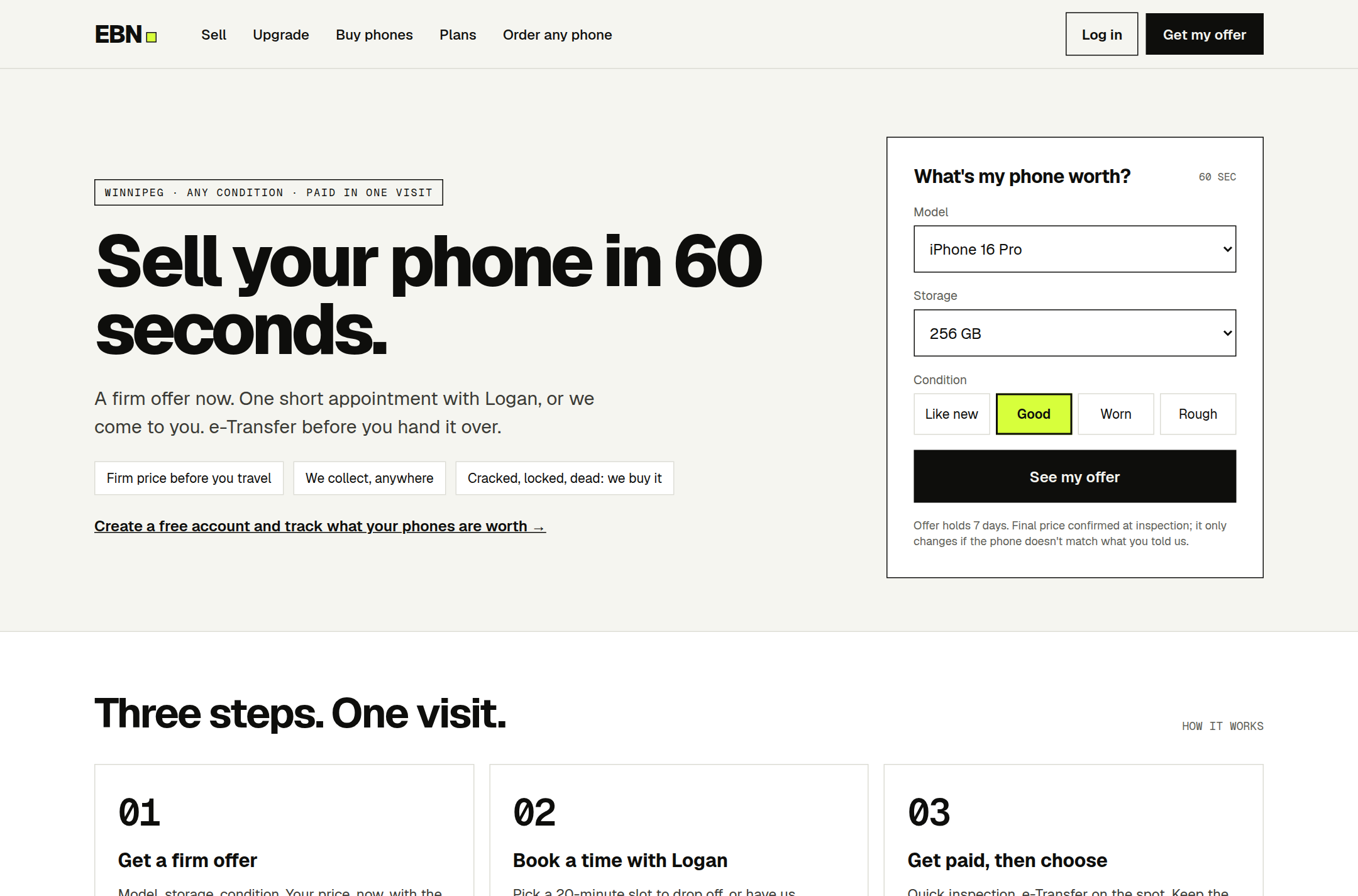
A close friend buys used phones and flips them. I designed the company that could grow out of that: the name, the brand, the business model, a price engine, and every screen for the people on each side of a deal.
Role
Brand, business concept, product design, specification
Team
Me, with Claude as a pair. The business is a close friend’s
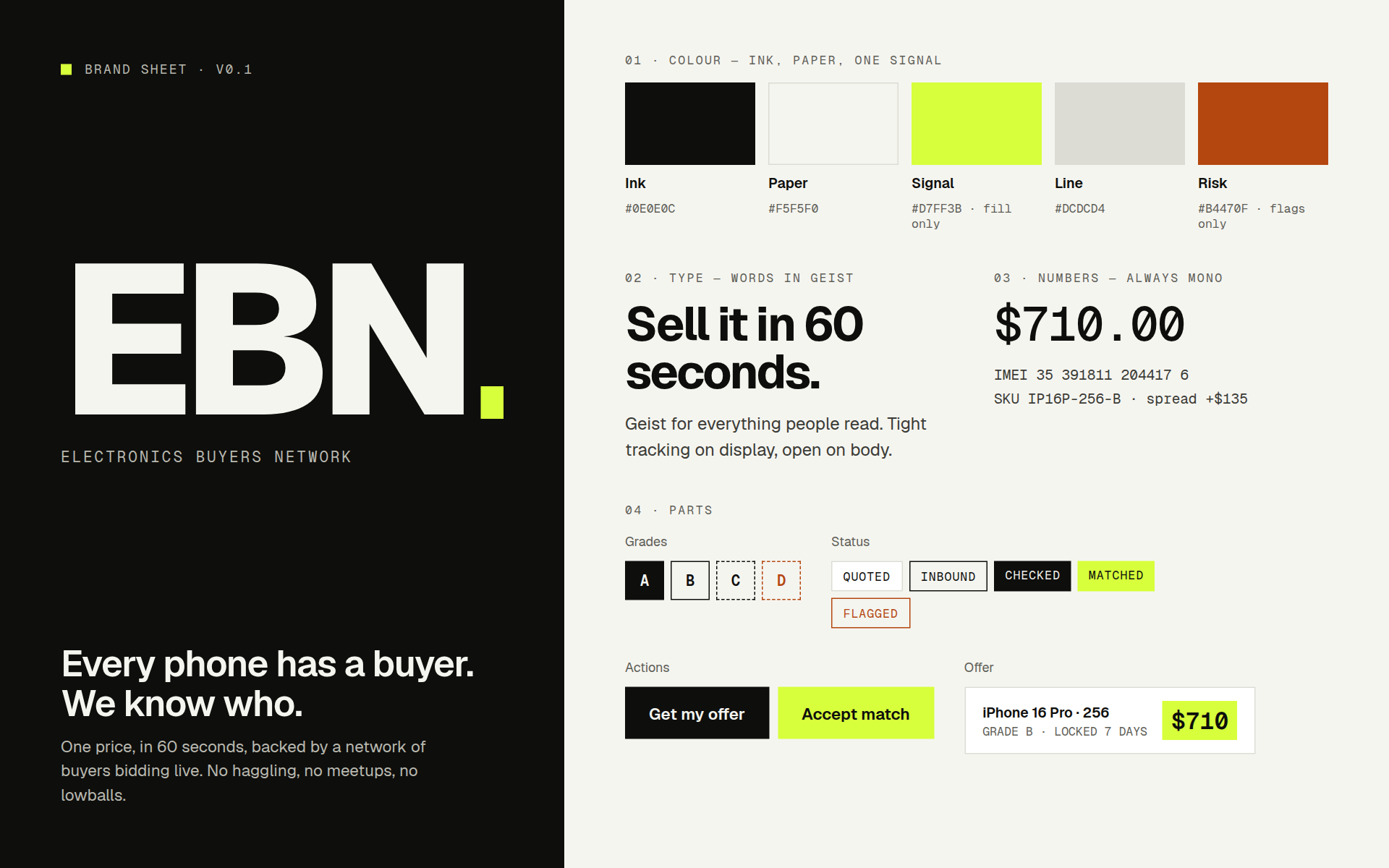
The brand sheet. EBN: Electronics Buyers Network. Ink, paper and one signal colour. Words in Geist, numbers always in mono. And the line the whole business is built to make true: Every phone has a buyer. We know who.
The starting point
Buying a phone on Marketplace and selling it for more is a real business, and it has a ceiling. The price is whatever one person can haggle, every deal depends on that one person, and nothing compounds: the hundredth phone is as much work as the first.
I did not start with screens. I started by asking what the business actually sells, and the answer I proposed was not a phone.
EBN sells an ownership cycle, not a phone.
Buy the old one. Sell the replacement. Buy that one back in two or three years. A flip happens once; a cycle comes back. Everything below follows from that sentence: the price engine, the pre-orders, the cash-out screen, the buyback promise on the receipt.
64artboards, desktop and phone
5surfaces, one record
9tests that define “working”
12hours in the build plan
01 · The model
Everything is an order.
A seller, a buyer, a reseller and a customer who wants to swap are four different people. I made them one kind of record.
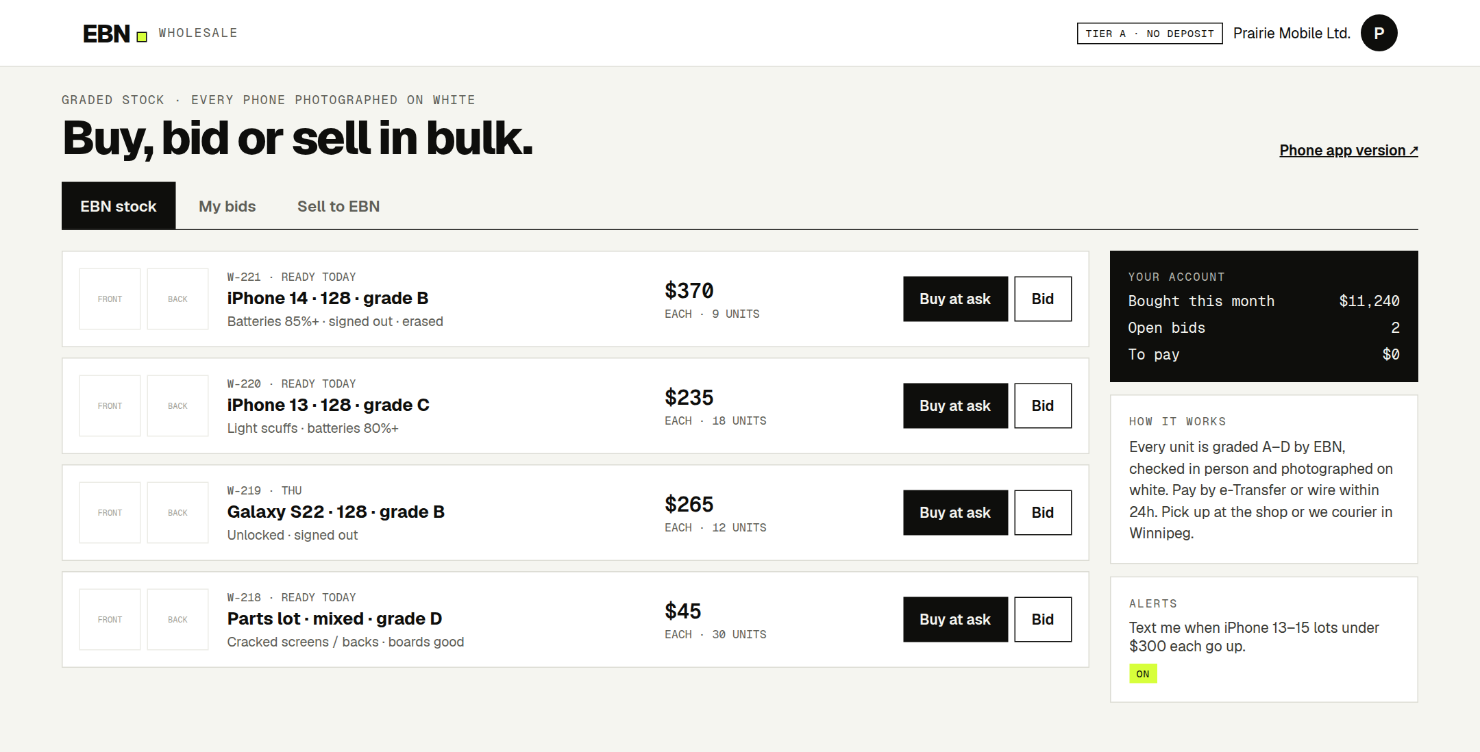
A Sell says: I’ll sell this phone at this price, if it is what I told you. A Buy says: I want this spec at this price, and here is my money on hold. A Bid is a reseller’s standing offer for twenty units. An Upgrade is a Sell and a Buy joined by one condition: swap my 13 Pro for a 15 Pro if I pay $300 or less. A deal is two orders matched.
The second idea is firmness. Every order sits on one of four levels: watching, confirmed, accepted, completed. Only some of them count as money, and only an accepted order can set a price. It sounds like bookkeeping. It is the thing that keeps the business honest about demand: one buyer watching five models counts once.
And EBN is a dealer, not a marketplace. It buys every device and sells every device; customers never trade with each other. That one decision means every phone passes through one inspection and one ledger.
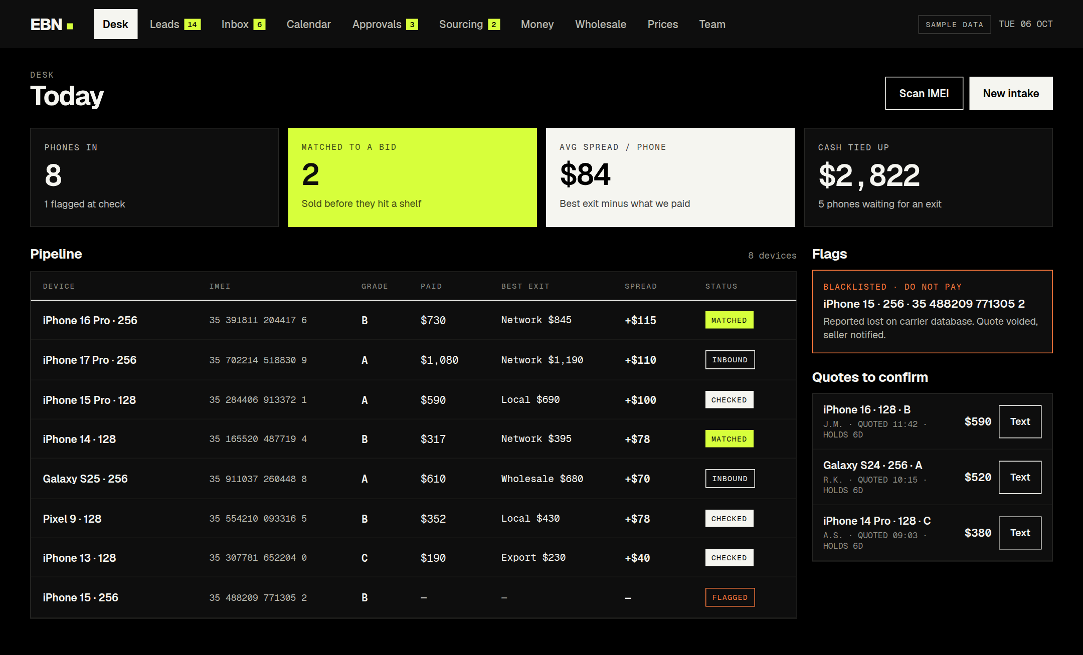
The desk. Eight phones in, two already matched to a bid before they reach a shelf. Every row carries what was paid, the best place to sell it, and the spread. One phone is flagged: reported lost, quote voided, do not pay.02 · The price
An offer you can explain.
A haggled price is an opinion. I wanted every number a customer sees to be arithmetic they could check.
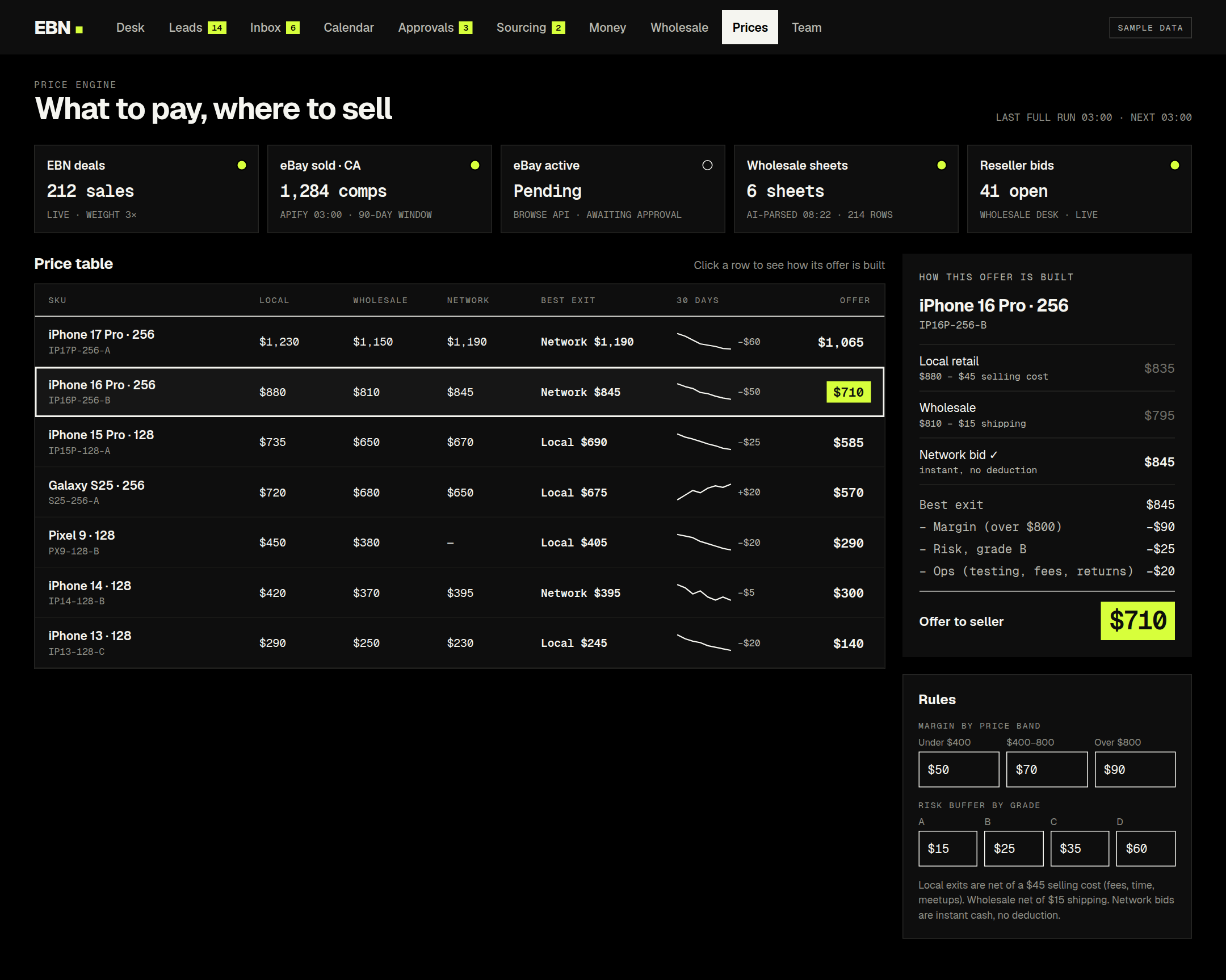
The offer is the best place the phone can be sold, minus everything it costs to get it there. Five lines: the best exit, a margin by price band, a risk buffer by grade, an allowance for testing and fees, and the cost of the handoff. For an iPhone 16 Pro in good condition with a live reseller bid of $845, that is 845 − 90 − 25 − 20, which is $710 if the customer drops it off.
Each exit is priced on its own terms. Local retail pays more and takes six days. Wholesale pays less and takes three. A reseller’s bid pays today. So every exit also carries a holding cost per day of waiting, and a slower exit has to pay more to win.
Three guards
No number without fresh data. A price is firm only with enough recent sales behind it. Otherwise the page says we’ll confirm by text within the hour instead of guessing.
A floor. No deal is offered below a minimum contribution after the handoff is paid for.
A swing check. An offer that moves more than 8% from yesterday waits for the owner’s approval instead of going live.
And a rule I would put in any system that reads outside data: nothing fails silently. A broken price source turns red and keeps the last good prices. It never zeroes them.
What to pay, where to sell. Five sources across the top, each with its health. One row selected, and on the right the whole calculation: best exit $845, less margin, risk and ops, offer to seller $710. Every rule underneath is a setting the owner can change.
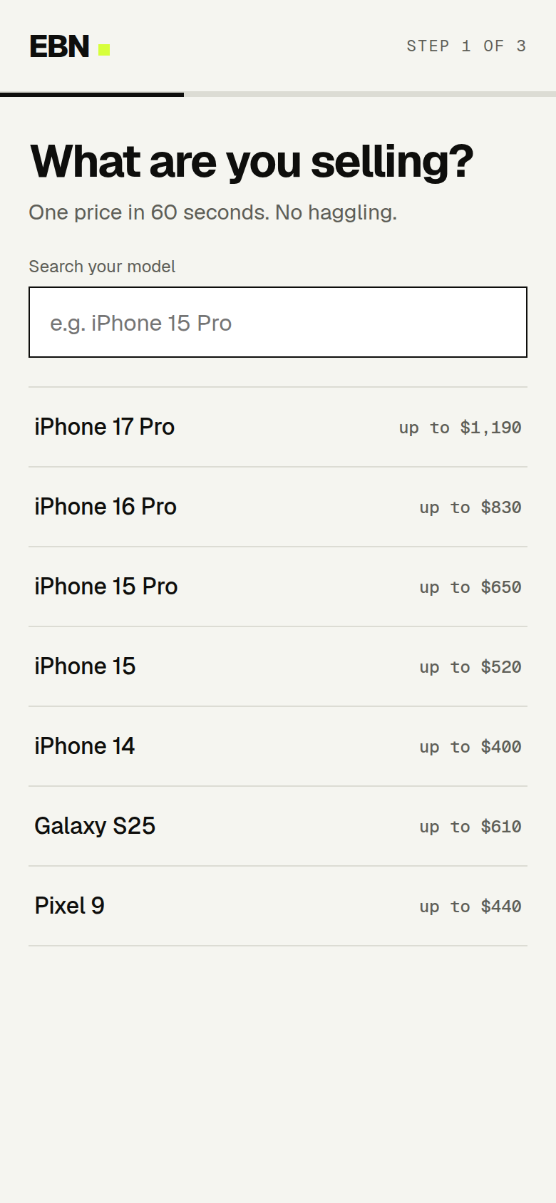
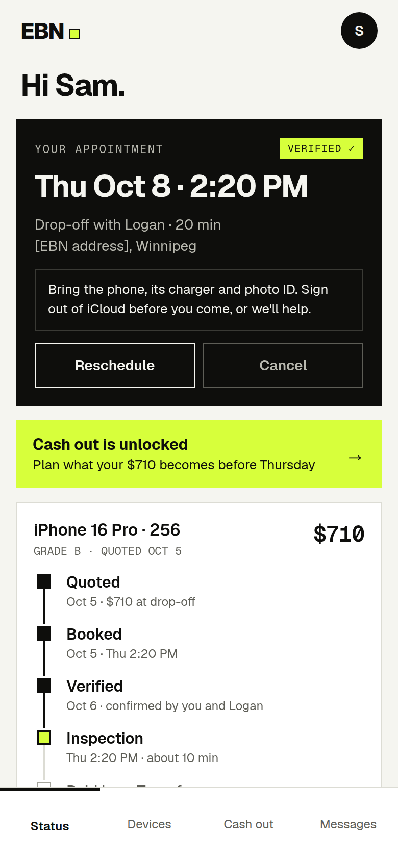
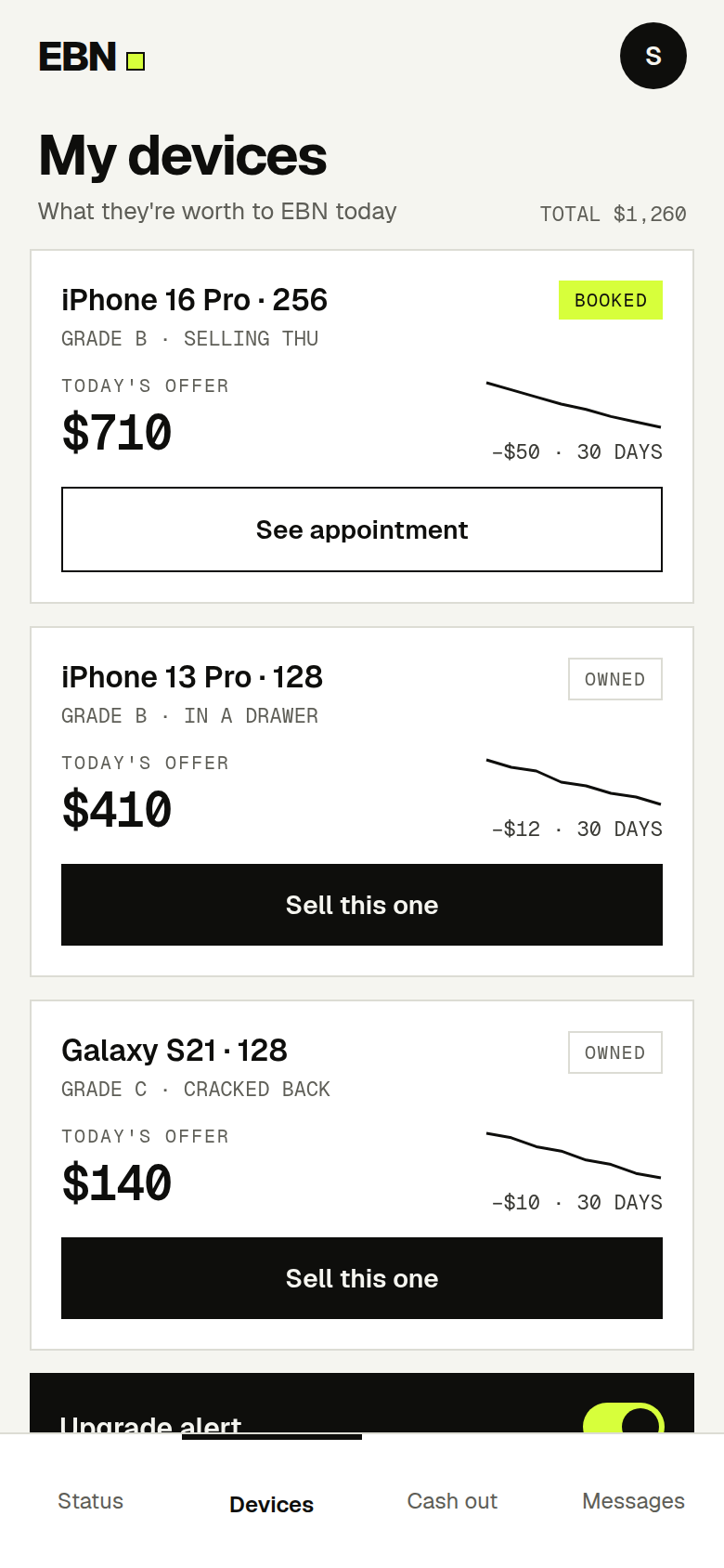
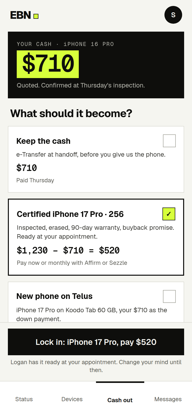
The customer’s side, on a phone. An offer in sixty seconds. A status page with one next step. Every phone they own, with what it is worth today. And the screen the whole business turns on: what should your $710 become?
03 · The moment
The payout is the next sale.
The best time to sell someone their next phone is the minute they are holding cash for their old one. So I designed that minute.
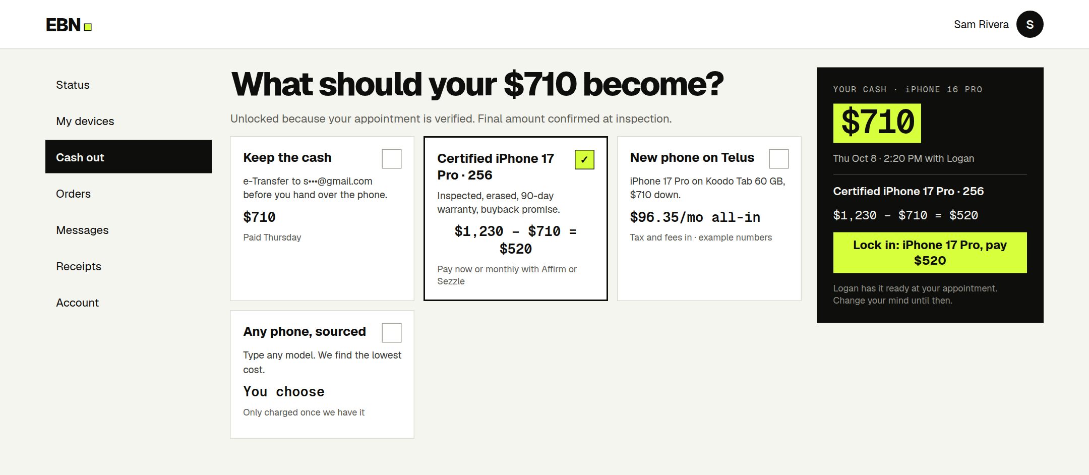
The cash-out screen unlocks once the appointment is verified by both sides, before the handoff. The quoted cash is shown as the down payment on whatever comes next. Four paths: keep the cash, take a certified used phone, take a new phone on a carrier plan, or type any model and have it sourced. The customer arrives with the next phone already chosen, and the upgrade happens in one visit.
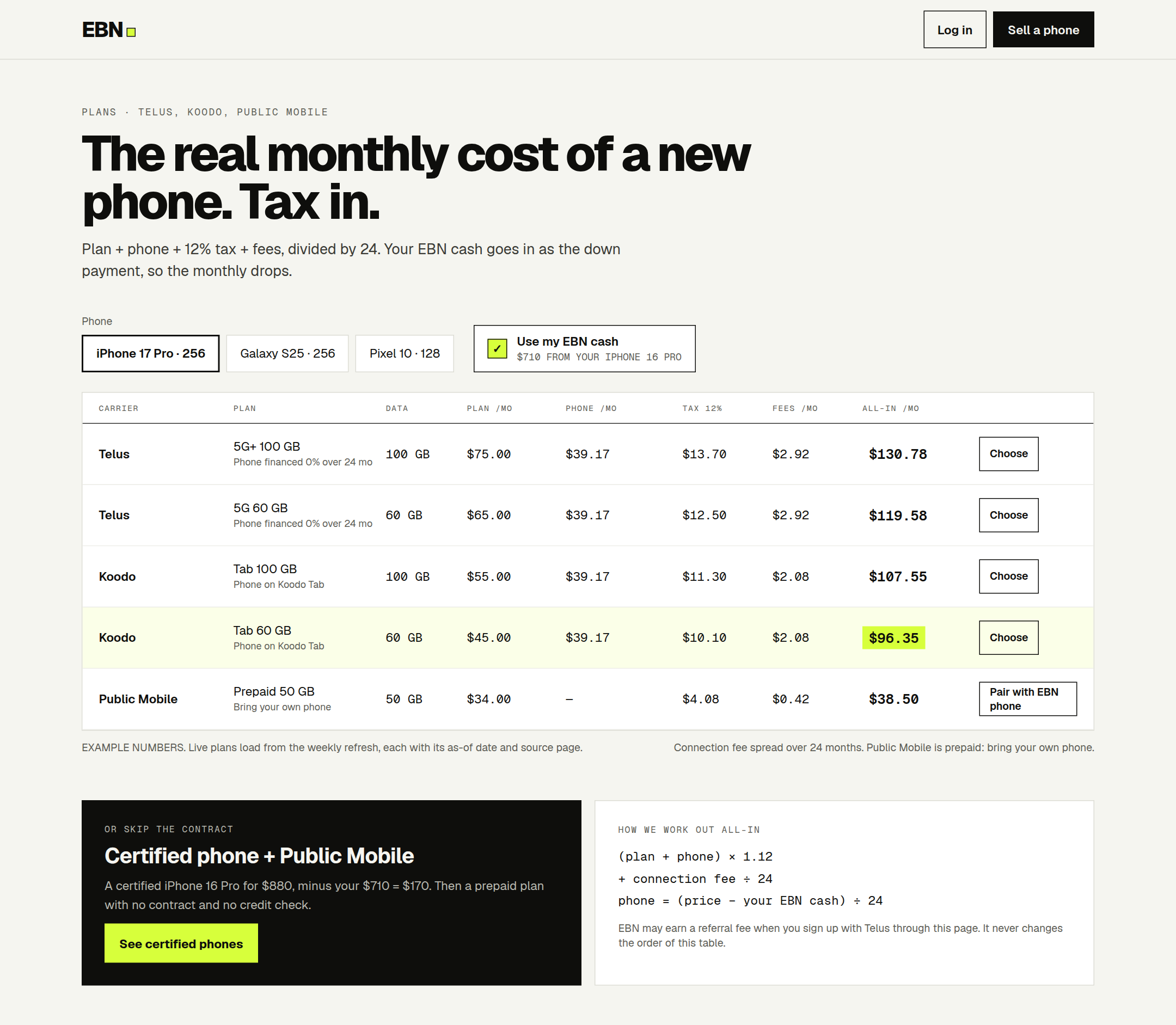
Every path is shown as one all-in monthly number, with tax and fees included. Carrier pages rarely add it up for you. This one does.
Cash before inventory
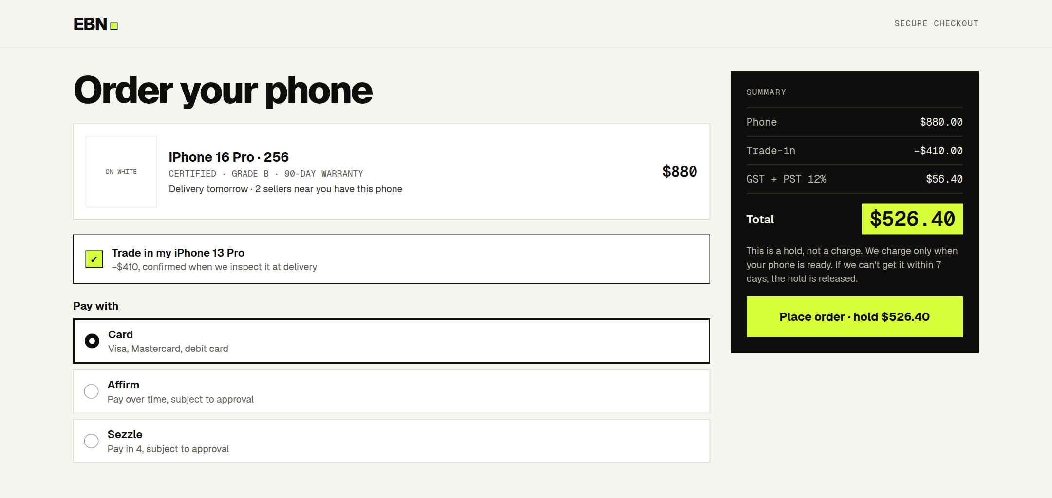
A buyer can pay for a phone before EBN owns it. The payment is authorised, not captured: the money is held, and it is only taken once the phone has been sourced. If sourcing fails inside seven days, the hold is released and the buyer was never charged. It takes inventory risk and working capital close to zero, and a paid order is the strongest signal of demand the engine has.
The wait is honest. The page says delivery tomorrow only when a matching phone is already in stock or in the pool of quoted sellers. Otherwise it gives the real estimate.
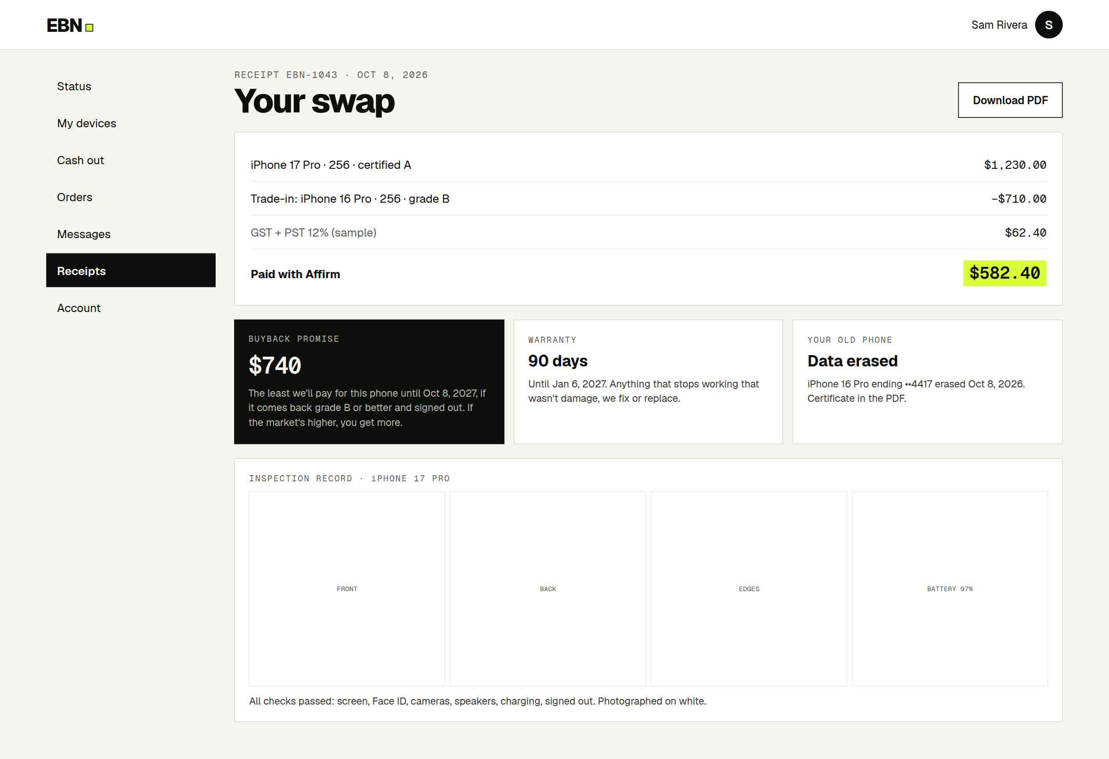
Cash out, then choose. $1,230 − $710 = $520. The sum is on the screen, not in a salesperson’s head.A hold, not a charge. The button says what it does: Place order · hold $526.40.
The real monthly cost, tax in. Five plans, one honest column on the right. Beneath it, the formula in three lines, and a note that a referral fee never changes the order of the table.04 · The handoff
Trust, designed as a checklist.
The business cannot grow if the owner has to be at every handoff. So the question became: what would have to be true for someone else to pay out his money?
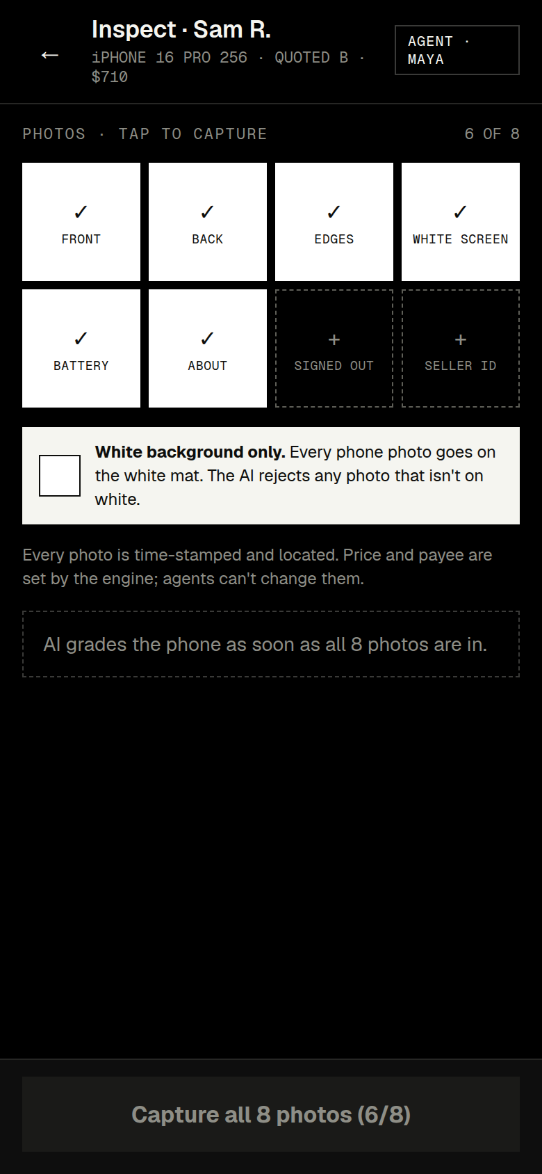
A field agent meets the seller and takes eight photographs, every one on a white mat: front, back, edges, a white screen, two settings screens, the signed-out account, the seller’s ID. An AI reads them and returns a grade and a confidence. Then the deal is green or amber.
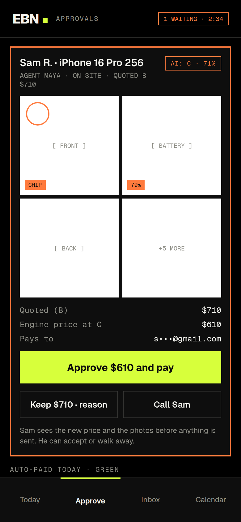
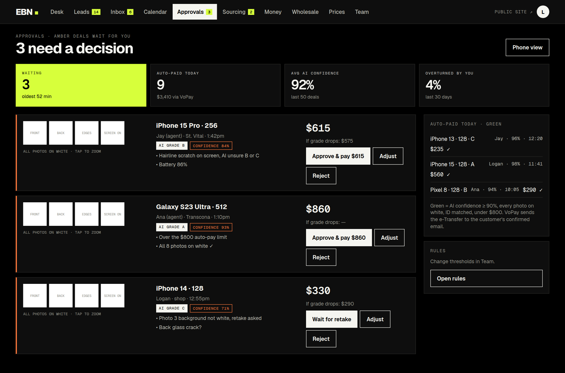
Green pays itself. The grade matches the quote, confidence is 90% or higher, the price is under the auto-pay limit, the payee is confirmed. Amber waits for the owner, who sees the photos with the AI’s marks and three buttons: approve the new price and pay, keep the quoted price with a reason, or call.
The rule underneath is the one I would defend first: no payout without an inspection record. An agent cannot change a price, a grade or a payee. The customer sees any new price and the photos before anything is sent, and can walk away.
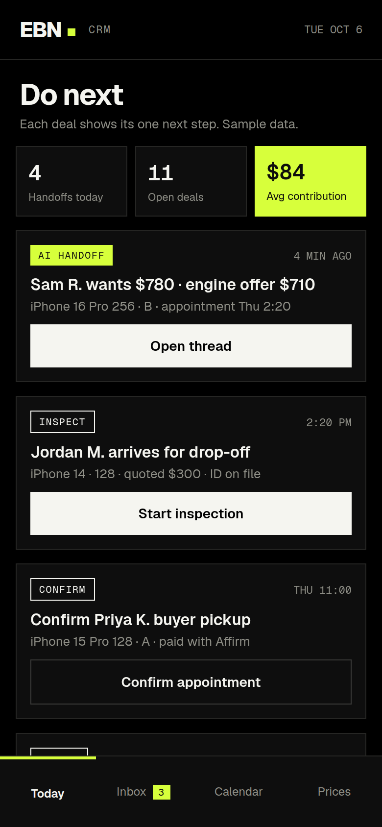
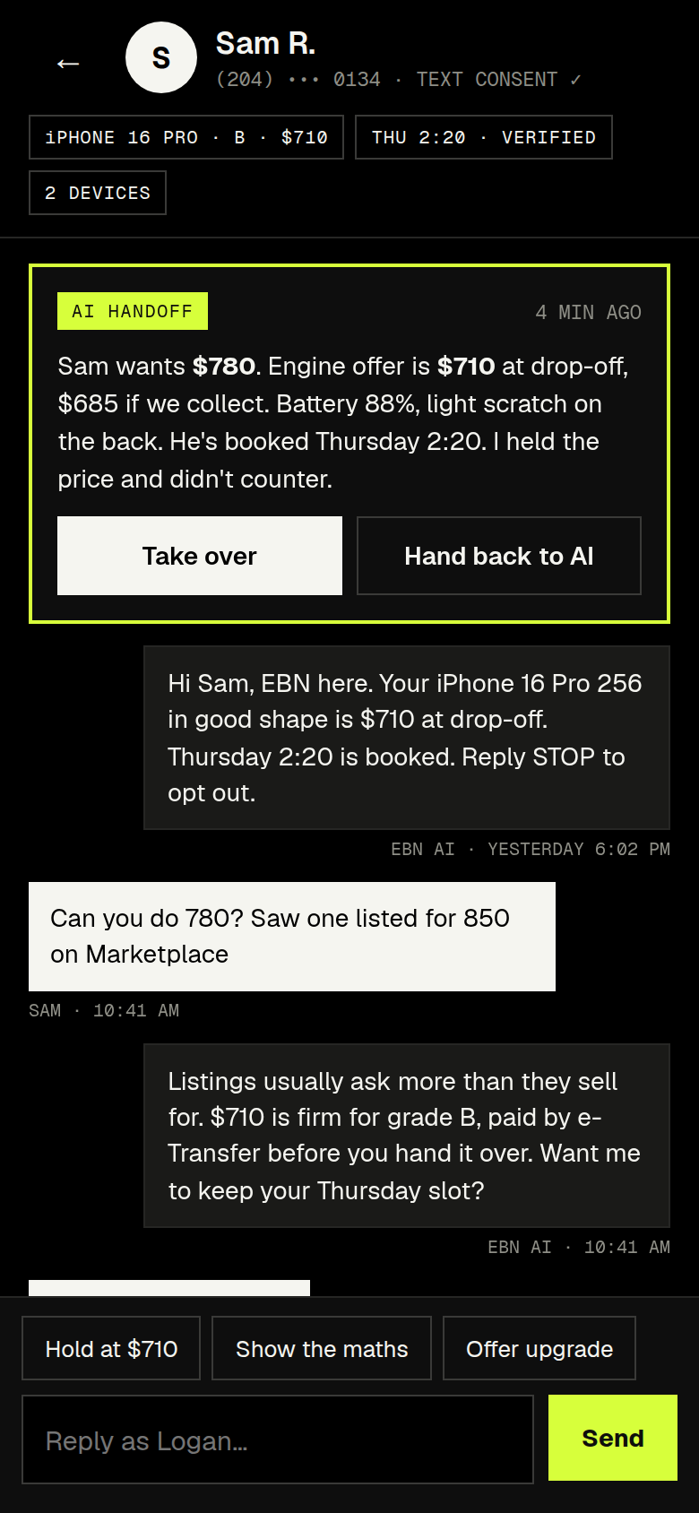
The operator’s side, on a phone.Do next: each deal shows its one next step. A thread where the AI held the price and handed over with a summary. Eight photos on white. And an amber deal, with the evidence and three ways to answer.
Three need a decision. Nine others paid themselves today. Each amber deal says why it is amber: the AI is unsure between B and C; the price is over the auto-pay limit; photo three was not on white.
The AI has a job description
One text number, answered around the clock. It can quote a phone, ask for photos, offer times, and book the handoff. It never promises a final price before inspection, never goes above the engine’s offer, never confirms a payment, and never argues. Its price is the engine’s price. When a seller wants more, or someone is upset, or it is not sure, it hands over with a one-paragraph summary and goes quiet on that thread.
Texts only go to people who agreed to them, and stop works instantly. The consent ledger is part of the data model, not a setting.
05 · The brand
One signal, and numbers in mono.
A resale business is judged on whether you believe the number. So the brand is built around numbers.
The name. EBN, Electronics Buyers Network. It says what the company is and what makes it different from one person with a Marketplace account: a network of buyers behind every offer.
The colour. Ink, paper, and one signal: a sharp lime, used as a fill and never as text. It marks the number you are being offered and the thing that just matched. A second colour, a burnt orange, exists only for risk. If you see it, something needs a human.
The type. Geist for everything people read. Geist Mono for every number, every time: prices, grades, IMEIs, dates. A price set in a monospaced face reads as a figure from a ledger, not a figure from a pitch.
The photograph. Every phone on white. It is an inspection rule first, because the AI rejects any photo that is not on the white mat, and a brand rule second. The storefront and the evidence are the same picture.
The front door. The quote form is above the fold and asks three things. Under it, the promise in three steps, and the idea that turns a seller into a customer: Trade in. Pay only the difference.06 · Why it compounds
Every phone sold comes back cheaper to buy.
That is the loop, and it is why this is a company and not a side business.
When EBN sells a phone, its inspection, its price history and its owner are already in the system. So three things become possible that a flipper cannot offer. A certificate: inspection record, warranty, proof the data was erased. A guaranteed buyback: a written minimum price for twelve months, printed on the receipt. And a public price index, built from real sales, that becomes the place a city looks up what a used phone is worth.
Put together, the offer is one sentence: trade in, pay the difference over time, guaranteed buyback when you’re ready for the next one. A phone subscription without the subscription.
None of that is in the first build. It is phased, and it starts only once the engine has fifty completed deals behind it. I wrote it down now because it changes what the first build has to record.
The receipt carries the promise.The least we’ll pay for this phone until Oct 8, 2027. If the market is higher, the customer gets more.The wholesale desk. Resellers buy graded lots, bid on them, or offer their own. Their bids are live prices, and they feed the engine.
What “working” means
I did not want done to be a feeling. The spec opens with nine sentences, and each one is either true or false on the day it launches.
Every offer can be explained.
No number without fresh data.
No payout without an inspection record.
Every open deal has exactly one next action, and one person who owns it.
Demand is counted in people, at the right firmness.
The money balances. Contribution is computed, not typed.
Texts only go to people who agreed to them.
Nothing fails silently.
A seller can get an offer on their phone in under 60 seconds.
Behind those sits a test plan of more than thirty scenarios, written before any code: two customers trying the same slot at once; a lead arriving at 11pm; a phone that drops a grade at inspection; a payout that bounces. Launch happens when every box is ticked on production, with real phones and real texts.
What I cut
The tempting version
What I chose, and why
A marketplace where sellers meet buyers
A dealer. EBN is on the other side of every deal, so every phone passes one inspection and one ledger.
Scraping local listings for prices
Off. It needs a logged-in social account. Sold prices come from a source that needs no login, plus the business’s own deals.
Comparing every carrier
One carrier family that covers three kinds of customer. Nothing else gets added until someone beats it on setup time.
A shop platform for the storefront
No. It would add a second inventory, a second customer list and a second checkout beside the engine’s own.
Upgrades proposed automatically
Suggested by the engine, confirmed by hand. Auto-proposals come after the first twenty swaps.
Financing the customer directly
A lender carries it. The business is paid up front and holds no loans.
Passwords
The phone number is the account. A code by text, and a lead who texted already has one.
A scaled platform in the first build
One city and one kind of device. The first twenty real deals are walked through by hand before any rule is loosened.
What is proven, and what is not
This is a design and a specification. Nothing here has been built yet, and nothing has met a customer. Every number on every screen is sample data, and the screens say so.
The pricing rules are starting points. They have to be calibrated against the business’s real deals, and two questions still block the first hour of the build: which twenty models it trades most and what it actually paid and got for each. The parts that touch law, such as texting consent and record-keeping, are written as design rules and need a lawyer’s answer before launch. The spec says so in plain words.
What I can show is the thinking: a buy-and-flip taken apart to what it sells, rebuilt around a record, a price you can explain and a promise on a receipt, and drawn for every person who would touch it.
I’d like to do this with a team.
I did this one alone, for a friend. I would rather do the next one with designers who will tell me where it is weak and engineers who will tell me what it costs.
Where each one came from — a thing I saw, a hunch, a reference — then the options, the mechanics, and what it cost. The screens come after; the decisions are the work.
1 · A dead zone between 32 and 40 pixels
Four voices, each with a territory — and the gap between 32 and 40px where none of them is allowed.
Where it came from. Josef Albers, not a typographer: in Interaction of Color two near colours fight and two distant ones rest. I kept seeing the same thing in type — a 36px sans heading over a 32px sans sub-heading reads as an error, while 72 over 15 reads as two voices. Bringhurst's modular scales gave the vocabulary; Müller-Brockmann's grids gave the permission to be strict. The hunch was that the pairing of two sans-serifs (Excon for display, Switzer for interface) would only ever read as intentional if they were never allowed near each other.
The options. One sans for everything (safe, anonymous). A serif display face to avoid the clash (wrong voice for an operator's company). Or the two sans faces with an enforced gap. We chose the gap and wrote it as law: Excon never below 40px, Switzer never above 32px, and nothing between. If a heading wants 36px the heading is wrong — move it to 40 or 32.
The mechanics. The weights follow from the files. Excon ships 300/400/500/700 — no 600. CSS font-weight: 600 doesn't fail; the browser smears 700 and it looks exactly like that. So Hero and Page Title share 700 and separate by size (96 against 64), and the Section Opener drops to 500 rather than reaching for a weight that isn't there. Negative tracking on Excon above 48px (−0.02 to −0.03em) because its default spacing reads loose at scale. Erode's floor is 16px — its softened edges lose definition below. Sometype Mono has no light weight, so quiet data can't come from weight; it comes from the muted token and a size step — a constraint kept on purpose, because hierarchy built from six mono weights always reads noisy. And the one that gets missed: font-variant-numeric: tabular-nums on Switzer wherever it touches a number; the drift is invisible until a table has twenty rows.
What it cost. A few headlines I would have liked at 36px. They are better at 40.
2 · One hue, three sages, nine tokens, no night
One canvas, one hue. Paper near white, a sage you feel rather than see, and black type doing the work.
Where it came from. Kenya Hara's White — emptiness as a container, and white as something you tune rather than default to. Muji's paper. The first version tinted the canvas visibly green because sage was the brand colour, and the moment I turned the tint down to a tenth the whole family stopped looking like an eco brand and started looking like paper — and the accent got stronger as the canvas got whiter. That was the hunch confirmed: a colour reads against a ground, not on its own. Rams: as little design as possible, which for colour means as few tokens as can still name every job.
The options. A numbered grey ramp with brand colours on top (the industry default; it never ends). A single sage value. Two editions. We chose five neutrals named by job, one accent in three values, one exception, one edition.
The mechanics. Paper #FAFAF7; surface pure white and above paper, because a tinted surface this close to white is indistinguishable from it — separation is the five-point gap plus a 1px --rule. Ink #151613, never #000, which reads cold on tinted paper. Sage in three because one couldn't do the job: #6B8354 is about 3.9:1 on paper and fails as text by design, so it lives on borders and active states; #3D4C2E is the sage you read, ~10:1; #DDE5CE is the fill behind ink text — 2px/6px padding, zero radius, ~13:1 — and the emphasis mechanism of the whole system, because the contrast comes from the ink, not the sage. Success uses the same highlight as emphasis, deliberately; a separate success green would be invisible against the first. Clay #8C4630 is the one break and is scoped to errors and destructive actions: green reads as confirmation across every convention there is, and a sage-bordered failure reads as success for half a second. Clay is sage's warm complement — ink on aged paper rather than a browser alert — and works as text and border at ~6.3:1 with one value. The most-at-risk token is --muted at ~5.1:1, the AA floor; someone will lighten it to make a page airier, so it is locked with a lint rule.
What it cost. Night mode, which the previous system mandated. Two editions double every decision for websites nobody reads at midnight. The software gets dark; the sites get one canvas.
3 · One family, four arguments — and a method for stealing
The same family, a different argument: Sales opens on a timer, because speed to lead is the product.
Where it came from. Publishers. Condé Nast's magazines share a corporate spine and not a look; each title has one voice because it has one reader. And the way musicians sample — take the break, not the song. The structural hunch was that ARK's three companies needed four different first sentences, so the sites would differ in structure while sharing type, colour and grid. The method: for each site, three studios the partner admired; for each, one line on what it does best — not what it looks like — and one line on what ARK takes, in a table that opens the design document so the borrowing is visible and the reasoning outlives me.
The options. One site for all three (says everything to everyone). Four unrelated sites (four companies). Or one family, four arguments.
The mechanics. Marketing is the clearest case. From ET Studio: radical reduction — a one-paragraph homepage, three nav items, a loading counter, an archive that scrolls sideways. From Basis: work floods first, eighteen pieces before a sentence, the positioning line after you've seen the work, a captioned studio feed, founders named in the footer. From Alright: images at native ratio in one stream, captionless tiles, a flat type hierarchy where nearly every line is the same size. The combination is exact: work that floods, at its own ratio, words suppressed to two sizes, and a counter reading 0 / 348 because volume is the argument. Sales inverts: the first element is a timer, 00:00:08, because speed to lead is the product, and the page proves it with the follow-up text most dealers send beside the one ARK sends. Operations has to feel engineered — changelog, status line, real search — or the claim to rebuild machinery is hollow. The holding company unfolds like a document because its buyer is deciding whether these people understand companies. The content architecture carries a business argument too: Automotive · Real Estate · Commercial as a ladder of asset markets — things people drive, own, and that produce money — each financed, so one market-making machine compounds. Commercial over Finance (too narrow once you broker an HVAC company) and Business (“ARK Business — Business”). Nomenclature is design.
What it cost. One site that could have said everything. Four that each say one thing are harder to maintain and easier to believe.
The brief
ARK Business is a holding company with three operating companies — Marketing creates demand, Sales converts it, Operations makes the business work better — each with its own partner and its own buyer. One shared website would have had to say everything to everyone. Four unrelated websites would have looked like four companies.
One family, four arguments.
The design problem was a family resemblance strong enough that a dealer principal moving from one site to the next knows he is still talking to ARK, with each site free to make the single case its buyer needs to believe.
What each site has to prove
I started from the visitor, not the layout. For each company I wrote down the one sentence a buyer should think after thirty seconds, then designed the site as the evidence for it:
Site
The visitor should think
So the site…
ark.business
These people understand companies.
Unfolds like a document: three companies, three industries, one film on how ARK thinks. The words carry it.
arkmarketing.ltd
These people have taste — and know why the work exists.
Inverts the order: work floods first, words interrupt. One paragraph, three nav items, the archive as a sideways contact sheet.
arksales.ltd
These people know how to convert demand.
Opens on a timer — 00:00:08 — because speed to lead is the product. Shows the follow-up text they'd send against the one most dealers send.
arkoperations.ltd
They can rebuild the machinery under the business.
Has to feel engineered itself: a changelog, a status line, a real search; case studies told as operating systems.
A method for borrowing well
For every site I took three reference studios the partner admired, wrote down what each did best — not what it looked like — and took only that. For Marketing: Basis's work-before-words, Alright's native-ratio image river and flat type hierarchy, ET Studio's one-paragraph homepage and contact-sheet archive with its 0 / 348 counter, because volume is the argument. Each design document opens with a table of what was taken and from whom, so the borrowing stays honest and the reasoning survives the designer.
arkmarketing.ltd — one paragraph, three nav items, and the work as a strip you open. Words interrupt the work, not the other way round.
The fixed foundation
Four voices, each with a territory. Excon for display, never below 40px; Switzer for interface, never above 32px; Erode for anything read; Sometype Mono for numbers, labels and buttons. Between 32 and 40px is a dead zone: nothing lives there, because two sans-serifs at 36px read as a mistake rather than a pairing. The hierarchy is done by the jump from Excon 700 at 72px to Erode at 17px — wide enough that a page still reads with every colour removed.
One edition, nine tokens. No night mode. Near-white paper with a green cast you feel rather than see, white surfaces that lift off the page, and a sage accent split into three values because one mid-tone stops reading as colour at 10px. Emphasis is a sage highlight behind ink, not coloured text. One colour breaks the family — clay — and only for errors, because a green-tinted failure message reads as success for the half-second that matters.
Rules you can lint. Zero radius, no gradients, no tenth token, tabular-nums on Switzer wherever it touches a number. Each rule ships with a checklist, so a contractor can verify a page without me in the room.
Show, don’t claim: the text most dealers send, and the one ARK sends, side by side.
The industries as an architecture
The content structure carries a business argument. ARK's three industries — Automotive, Real Estate, Commercial — are a ladder of larger asset markets: things people drive, things people own, things that produce money. Each one is financed (car and loan, property and mortgage, business and acquisition financing), so the same machinery compounds. The sites show Automotive as active and the other two as future focus, which makes the roadmap legible on the homepage instead of hidden in a deck. I argued for Commercial over Finance (too narrow) and Business (“ARK Business — Business”).
arkoperations.ltd — a case study told as an operating system: “Cars Selected, Not Sold”, seventeen minutes on the system behind a dealership.Operations tells its case studies as operating systems — and the site itself has a changelog and a status line.
The fifth system: software
Products are not websites. For ARK's software I wrote a separate system — ARK OS — that keeps the family's discipline but changes what a tool needs: light and dark, three type roles (editorial numbers, IBM Plex for detail, Plex Mono for data), an icon rail, status colours with real meaning, and a page structure that reads editorial at the top and functional below. It became the system for the dealer and broker operating systems in this portfolio.
What I cut
First version
What it became, and why
A previous system with a yellow accent and a mandatory day and night edition
One edition, one hue. Two editions doubled every decision for a website nobody reads at midnight.
A visibly tinted paper
A tint at a tenth of the strength. Visible green read as “eco brand”; a faint cast reads as paper.
A single sage value
Three — fill, line, text — because sage either fails as text or disappears as a hairline.
A shared homepage for all three companies
Four sites. Each buyer needs a different first sentence.
A tinted dark theme for the software
Achromatic neutrals with sage on the primary action only. The tint made a tool feel like a lifestyle app.
Software for two car dealerships, designed from how each one actually makes money — an operating system for every role, a training academy, and a pitch that changed the question.
Role
Business model, product design, prototyping, sales
Team
Me, with Claude as a pair
Scope
NOTT OS · NOTT Academy · ZIGGY OS · a pitch site · seven roles
Where each one came from — a thing I saw, a hunch, a reference — then the options, the mechanics, and what it cost. The screens come after; the decisions are the work.
1 · One record, seven lenses
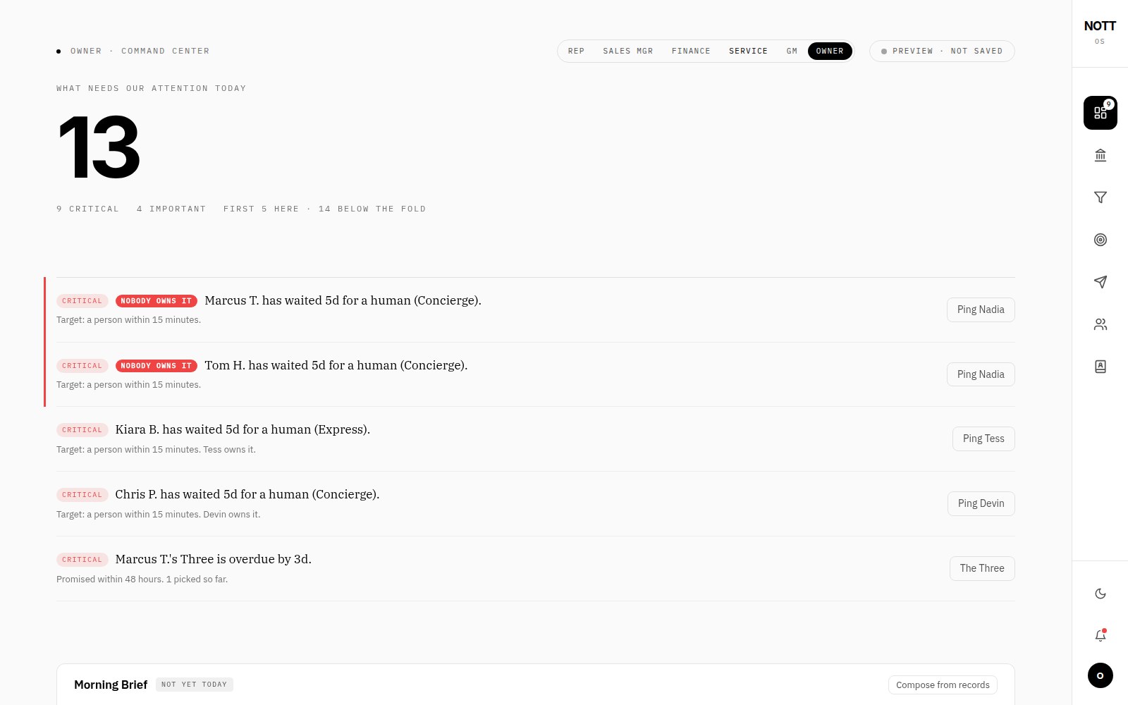
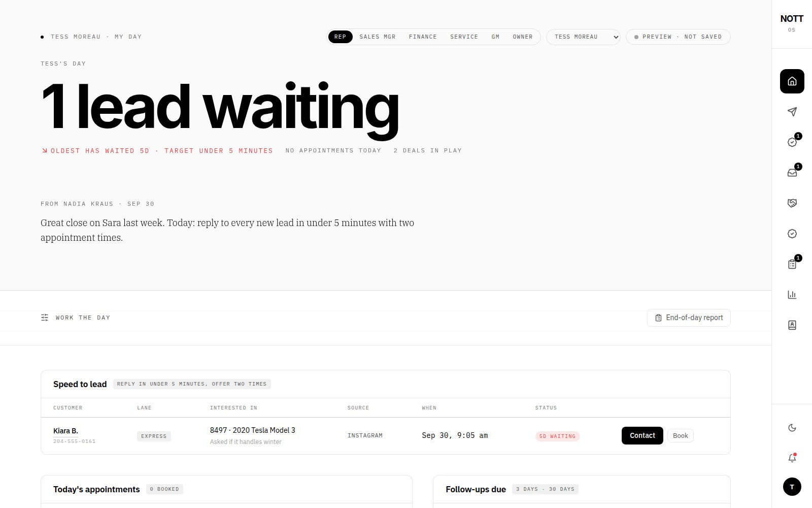
The owner’s lens on the one record: not charts — what needs attention today, who owns it, and a verb.
Where it came from. A hospital chart. One patient record; the nurse, the surgeon, the pharmacist and the billing office each read a different page of the same thing, and nobody is handed a copy with the parts they're not allowed to see blacked out. Dealer software is organised around the car because the DMS was built to invoice cars. But NOTT earns six ways — owned retail, consignment, finance and leasing, service, detailing and wraps, an EV experience — and the money is in the person who crosses departments over years. Each department's tool could see its slice and nobody could see the person. The hunch: model the customer, and let every role be a lens on the same record.
The options. Integrate the existing tools (the slices stay slices). A master dashboard with permissions (everyone sees a trimmed copy of the owner's screen). Or one record and seven views, each shaped to the day it serves.
The mechanics. The record starts with the customer and a journey of stages — service → lead → appointment → bought → first service → car lab → next change — with department history and lifetime gross. The rep's lens is her day: appointments, the oldest waiting lead with its age, deals in play, follow-ups due, and the manager's note above the work it is about. The sales manager sees the floor and the desk. Finance sees files and what each waits on, and is RESTRICTED from the rest — the one place the permission model has to be designed rather than assumed. Service sees repair orders and dollars open. The GM and owner share a lens: what needs our attention today — a count, then critical / important / below the fold, each line carrying the breach, the target it broke, who owns it (or “Nobody owns it”, the worst state and so the loudest) and one verb: Ping Tess. The charts exist — lifetime gross by customer, the clock on the lot — but under the customers lens and in the Academy, where interpreting is the job.
What it cost. The comfort of separate tools, and the owner's charts, which he asked for. A chart asks him to interpret at 7 a.m.; a list with verbs asks him to act.
2 · Promises as state, with age
A rep’s day. The promise — reply in under five minutes with two times — sits directly above the table that measures it.
Where it came from. Being the customer. I have asked about a car and waited five days. And two systems that made a promise visible: the airport board that shows minutes late rather than average punctuality, and Toyota's andon cord, where the line stops and the problem is named where it happened. The hunch: a promise becomes real when it has a clock, an owner and a place it shows up when broken.
The options. Metrics with averages (“average response 3.2h” — a report). Alerts (ignored by Thursday). Or promises as state with age, surfaced where the person who can fix them is looking.
The mechanics. Each promise has a target, a clock that starts on the customer's act, an owner and an escalation. A person within fifteen minutes; The Three — best fit, best value, a wild card — within forty-eight hours of asking for help; follow-ups only with consent, contact hours and a reason. A breach reads as a sentence with age and partial state: “Marcus T.'s Three is overdue by 3d · promised within 48 hours · 1 picked so far.” Sort is severity then age, so the oldest breach of the hardest promise is first. The rep's view carries the same promise as coaching — “reply to every new lead in under 5 minutes with two appointment times” — above the speed-to-lead table, so the instruction and the evidence share a screen. In the Ziggy model the four lanes are promises segmented by the customer's situation rather than demographics: Express (“I found the car” — a person in 15 minutes, numbers clear before arrival), Concierge (“help me choose” — The Three in 48 hours, curated, never padded), Explore (“just looking” — members, not leads; nobody calls until asked), Seller (“sell or trade mine” — an honest range, then an offer, trade or consignment). A lane is a promise with a path; the OS is what makes the promise checkable.
What it cost. Averages, which everyone trusts and which hide the one customer who has waited five days.
3 · The pitch as a model you can argue with
The pitch opens on his problem, restated, and promises to check it with him before arguing anything.
Where it came from. A mechanic's estimate — the good ones show the assumptions and let you change your mind. And Amazon's six-page memo, read in silence before anyone talks: argument on paper, not slides. Ziggy's owner had asked about moving to Vancouver. The hunch was that the right answer was to a question he hadn't asked — what is the showroom for? — and that arguing with his question would lose him before the page started.
The options. Pitch the software (easier to show, harder to say yes to). Pitch against the move (an argument with a man who has already half-decided). Or restate his two sentences, promise to check them, then take the problem apart.
The mechanics. Five first principles, each a sentence he can disagree with: the showroom is a cost, not the product; low traffic is a symptom; a move changes rent and rivals, not the reason; every car on the lot is a clock; one customer, many sales. Then the model — four lanes instead of one front door — and the math, deliberately simple and deliberately illustrative with the assumptions on the page: holding cost as 7.5% interest on the money in each car, about 11% a year in lost value, $8 a day for the lot; consigned cars earn a smaller fee and tie up no capital; the new model sells faster (60 → 40 days on the sample) and consigns a share (25%). The sliders are the argument: cars a month, gross per car, average cost, days to sell, consignment share, lift from the lanes. On the sample, a year's gross after holding costs moves from $258k to $450k and the cash tied up in cars halves — and the page says sample five times, because a pitch that pretends to know his numbers loses the right to use them on the call. The move becomes a reversible sixty-day test: sell into Vancouver from where he is, read cost per funded deal by lane against home, then decide — move, add a delivery point, or stay and sell further — with the inter-provincial licensing caveat stated before any ad runs. The ZIGGY OS demo sits at the end as proof the model can be operated, not as the thing being sold.
What it cost. The chance to lead with software. It would have been easier to show and harder to say yes to.
The problem
Dealership software is built around the car: inventory, deals, paperwork. But a dealership doesn't make money from a car. NOTT Autocorp, a Winnipeg dealer, earns six ways — owned retail, consignment, finance and leasing, service, detailing and wraps, an EV experience — and the real money is the customer who comes back for five of them over years. No tool they used could see that customer. Each department saw its own slice.
Design the business before the screens.
So I started with a model of how NOTT earns, then designed one record that every role reads from — the rep, the sales manager, finance, the service writer, the general manager, the owner — each seeing their day, not a permission-trimmed copy of someone else's.
The Academy’s first lesson is the business model — six lines of revenue, the cost of a car sitting on the lot, and the flywheel from audience to the next car.
Principles
Every role gets a day, not a dashboard
The rep opens on Tess's day: appointments, the new lead waiting, deals in play, and a note from her manager — “reply to every new lead in under five minutes with two appointment times.” The sales manager sees the floor and the desk. Finance sees files waiting on documents. Service sees repair orders and dollars open. The owner and GM see one thing: what needs our attention today, sorted critical, important and below the fold, each with who owns it and a button to ping them.
Promises are measured, not hoped for
The system is built on commitments a customer can feel: a person replies within fifteen minutes; The Three — a best fit, a best value and a wild card — arrive within forty-eight hours of asking for help. When a promise slips, it surfaces on the owner's screen as “Marcus T.'s Three is overdue by 3 days”, not in a monthly report.
The customer, across every department
The customers view follows a person through the journey — service, lead, appointment, purchase, first service, detailing, the next change — with lifetime gross and every department they've touched. It turns the flywheel from a slide into something a manager can sort by.
Every customer, every department — lifetime gross, not the last deal.
Training that matches the business
New reps learn the business before they learn a script. The Academy opens on how NOTT makes money and the clock on the lot — a 2017 Audi R8 that has sat 140 days has cost almost $11,000 to hold. Then role-play: AI customers built from NOTT's real inventory — an EV-curious commuter, a Porsche owner who wants to consign, a first-time buyer who needs financing, an out-of-province buyer for the R8 — each with a goal, and a score on discovery, product knowledge, honesty, the next step and the flywheel. A deal desk lets a rep see what a deal is actually worth once finance, protection and the trade are in.
Role-play with customers built from the real lot, scored on the things that make an advisor rather than a salesperson.The deal desk — what a deal is worth, not just what the car sells for.
The pitch: change the model, not the city
Ziggy Motors' owner told us two things: getting people through the door was hard, and he was thinking about moving to Vancouver. I didn't pitch software. I wrote a page that took his problem apart from first principles — the showroom is a cost, not the product; low traffic is a symptom; a move changes rent and rivals, not the reason — and proposed a different model: four lanes instead of one front door. Express (“I found the car”), Concierge (“help me choose”), Explore (“just looking”, members not leads) and Seller (their car becomes inventory without Ziggy's cash in it).
The move became a reversible sixty-day test — sell into Vancouver from where he is, read cost per funded deal by lane, then decide. And a calculator showed the change in a year's gross after holding costs when cars sell faster and more of the lot is consigned. The ZIGGY OS demo, adapted from NOTT, sat at the end of the page as proof the model could be run.
Four lanes instead of one front door — each with a promise a person keeps.The move as a reversible sixty-day test, with the decision at the end backed by cost per funded deal by lane.
What I cut
First version
What it became, and why
A dashboard of charts for the owner
A list of what needs attention today, with owners and actions. Owners don't want to interpret; they want to act.
Separate tools for sales and service
One record, seven views. The money is in the customer who crosses departments.
Training as product knowledge
Training as the business model first. An advisor who knows how the store earns sells differently.
Pitching software to a dealer thinking of moving
Pitching a model, with the software as proof. The question he had wasn't about tools.
7roles reading one record
6revenue lines modelled
15 minpromise to a person
48 hpromise for The Three
The prototypes run on sample data shaped from NOTT's real business; the next step is connecting them to the dealership's actual records.
A talent agency for streamers in which I hold a minority stake. My partner had built the business and hit a plateau. I designed the firm it scales into: the strategy, the name, the identity, the pictograms, the software it runs on, the website and the address. One working day.
My partner runs the agency day to day. My part is a minority stake and the systems I built for it. The roster and the team are under NDA. Claude as a pair for research and build
Scope
Business model · charter · name · identity · pictograms · the Office (14 rooms, 4 roles) · design board · website · domain
When
6 October 2026. Eight hours. Working prototypes on sample data
The cover of the brand kit. Lowercase, one colour, and a line that says which side the agency is on: On your side of the table.
The starting point
My partner did not start from nothing. When he took me on he already had a working business: employees, payroll, contractors and a delivery system. He grows streamers’ communities and places them with sponsors, and he is good at it: one of his streamers went from four people in chat to four thousand. But the business had hit a plateau, and he brought me in to help it scale.
A month ago I designed the software for that business, a broker’s operating system. It is in the archive now. A better tool for the same business was not going to move it. A different kind of firm might.
He wanted the first serious talent agency for streamers, the way CAA is a serious agency for actors, and he wanted it to look as if it had been there for fifty years. He runs the agency day to day. My part is a minority stake and the systems I have built for it.
Two constraints shaped everything. The agency had to be clean by design, in a sponsor economy known for hidden deals and opaque contracts. And it had to be remote: no office, no local shoots. So the software is the office.
I had one day. I spent the first part of it on the business, not the logo.
8hours, one working day
9public commitments in the charter
14rooms in the Office, four roles
3working prototypes you can open
The Office
The software the agency runs on. Fourteen numbered rooms, four roles, a lead agent with rules it cannot override.
The day started with one question: who pays the agency? The answer decided the name, the colour of a button and what an AI is allowed to write in an email.
The analogy that almost misled us
The first instinct was real estate. Streamers as agents, viewers as buyers, sponsors as houses, the agency as the broker. It was a useful frame until I pulled it apart. In this market the sponsor is the buyer, not the house. The scarce thing is the streamer’s audience and its trust. That makes the business a talent agency, not a brokerage.
The difference is the revenue model. A broker can take a margin from both sides. An agency cannot, without becoming untrustworthy. Hollywood already ran this experiment: the writers’ guild forced every major agency to give up packaging fees from studios by 2022, because being paid by the buyer is a conflict with the talent. We started where Hollywood was forced to end up.
It also killed my own idea. The old system ended on a page called From broker to network: pool the roster and sell operators access to it. Read against this rule, that page is a packaging fee with a nicer name. It did not survive the day.
Three inheritances
I studied three institutions and borrowed from each on purpose.
CAA, 1975. Five agents left William Morris and designed a culture before they had clients. No names on doors, no private client lists, pay tied to the agency’s results, and two rules: be a team player and return calls promptly. I took the team structure and the shared information. I left the management by fear.
Ogilvy. Research before creativity. He trained at Gallup and wrote down what his agency learned. So research is a department here, and every clip and sponsor read is tagged with its result.
Sterling Cooper. The pitch as theatre. The signing pitch became a produced moment: a sixty-second reel cut from the streamer’s own footage, delivered over video.
The charter
The strategy condensed into nine commitments, in plain words. They are public, and every later decision was checked against them.
We are paid only by our streamers.
Full deal visibility. The streamer sees every term of every offer.
Real money only. Sponsorship is disclosed on stream.
Licensed operators only.
Adults only.
Responsible-gambling messaging as standard.
No predatory terms.
The streamer owns their community and their likeness.
Exit freely.
A charter is easy to write and easy to ignore. The rest of this page is what it looks like when the software, the website and the outreach are built to keep it.
Before. A broker’s operating system, September. The record underneath is sound. The headline reads Broker cut, and nothing about the screen says whose side it is on.After. The Office, 6 October. The same record and the same number, now called commission, in a firm that is paid by one side only.
02 · The name
Two streets, no founder on the door.
We wanted a partner-name firm in the tradition of Ogilvy & Mather. The first proposal was our own surnames and the word Consulting. I argued against my own name.
Three reasons. Surnames would tie the clean agency to my partner’s other business by name. Consulting is the wrong promise to make to talent. And CAA kept names off its doors deliberately, so that clients belonged to the firm and not to a person.
The answer came from the two of us: Kennedy & Hargrave, after two streets that matter to us. It has the cadence of a partner firm without a founder on the door. It also carried two coincidences that went into the brand story. Kennedy is the era Mad Men opens in. And a Thomas J. Hargrave ran Eastman Kodak, the company Don Draper pitches the Carousel to.
I searched for existing businesses with the name and recommended trademark checks in Canada and the United States before anything is printed.
03 · The identity
White paper, black type, Munich 1972.
The industry this agency works in is neon. The brand had to sit as far from that as it could and still be warm. It had to feel like a firm.
The direction is editorial and Swiss. My partner dislikes serifs and loves Söhne. He asked for colour from “the German Olympics”, which meant Otl Aicher’s identity for Munich 1972: the first fully systematic Olympic design programme, led by a bright sky blue and white. Aicher left black and red out of his palette as the colours of power. He also co-founded the Ulm School of Design, the school widely seen as the successor to the Bauhaus. That lineage became the backbone of the brand.
Colour. Every colour has one job. Blue leads and belongs to the ampersand. Green is talent, orange is new business, light orange is reporting, violet is research, silver is business affairs.
Token
Value
Its job
Paper
#FFFFFF
The ground. About four fifths of every page.
Ink
#0B0B0C
Type only. Never a large field.
Olympia blue
#0091D2
The lead. The ampersand, fields, Representation.
Light green
#5DB12F
Talent, growth, the Studio.
Dark green
#00704A
Positive numbers, where the colour has to carry text.
Orange
#EE8A00
New business, attention, the live indicator.
Light orange
#F9C27A
Reporting and callouts.
Violet blue
#2E3A8C
Research.
Silver
#B5BAC0
Business affairs.
Deep
#1A2056
Dark fields and the stream plate, in place of black.
Three rules, straight from Aicher
Black is for type, not for fields. The dark theme is deep Munich blue, not black, for the same reason.
No red anywhere. Not even for the live dot. Orange does that work.
Fields are flat. No gradients, no tints of tints, never two accents fighting on one surface.
Every pairing of text and field was checked for contrast: black type on the bright fields, white type only on dark green, violet blue and deep. The hex values are close screen approximations of the 1972 standard, and the kit says so. They are not official references.
Type. One family, one job each: Söhne for words, Söhne Mono for labels and figures. Söhne is a commercial face, so the system ships Geist as an open stand-in with Söhne first in every stack. Install the licence and everything switches.The logo. Lowercase, tracked tight, one colour: the blue ampersand. Lowercase is a nod to Aicher, who argued for it. The descriptor reads Talent & Creative, Est. 2026, an echo of CAA’s first advertisement, which said only Established 1975.
Display type is semibold, tight and always flush left. No serifs and no italics: emphasis comes from weight, size, colour or position. Corners are square everywhere except the live dot and portraits. The whole identity lives as tokens for two themes, nine text styles, a spacing scale and a voice guide with words to use and words to avoid.
04 · The pictograms
Drawn, not downloaded.
The software needed navigation icons. A stock set would have made it look like every other dashboard. So I drew my own, in the grammar Aicher used for the Munich pictograms.
Eighteen pictograms on the board. Each is numbered, and the number matches the large page number on the screen it opens. When a section is active, the whole tile fills with that section’s colour and the pictogram stays ink.
The grammar is short enough to memorise.
A 24-unit square grid.
Solid fills and no outlines, with a two-unit gap where a line would normally be.
Edges only at 0, 45 and 90 degrees.
Circles only for heads and dots.
Bars 2.5 units wide.
So the inbox is an envelope whose flap is separated from the body by a diagonal gap. The lead agent is a target with a 45-degree signal and a square marker for found. Deals are two interlocking diamonds. Operators are a building with square windows.
These are original drawings in the spirit of the 1972 system. Aicher’s own pictograms are licensed artwork, and I did not copy them.
05 · The Office
Software that looks like the firm’s printed matter.
The old tool was a dashboard like any other: cards, grey panels, a rail of icons. The brief I gave myself was to make it run a whole agency and look like nothing else.
I rebuilt the shell as a Swiss poster. The wordmark sits top left. Three pictogram buttons sit top right: call, text and notifications. A narrow numbered rail runs down the left, and the active room is filled in its colour. A strip in the same colour runs across the top of the page. Then the page’s one headline figure, set at poster scale in black on a full-width field.
No cards. Content sits in open sections under a two-pixel black rule with small mono labels. Tabs are underlined, not boxed. Status labels are flat blocks of colour. The colour of a room follows the division that owns it: blue for the workspace, orange for new business, green for talent and deals, light orange for reporting.
I did not rebuild the record. The deal matcher, the baseline every streamer is measured from, the decisions that arrive with their evidence: those were right in the old system and they came across whole. What changed is whose side the record is on.
10 · Talent. The active community across the roster, with growth measured from each streamer’s baseline on the day they signed.11 · Deals. Money held in escrow, and which deal is not funded yet. Under it, a proof packet for each streamer, built from tracked numbers.12 · Operators. Where every $1,000 goes: $600 stays with the operator, $320 goes to the streamer, and $80 of the streamer’s share is our commission. The first charter line, as a bar.13 · Deal matcher. Operators rank themselves by what they will actually pay over twelve months, discounted for how reliably each one pays. Operators not licensed in the streamer’s market drop out of the list.
The lead agent, and the rules it cannot override
The agency runs an AI agent in the background. It reads public channels, finds streamers who fit, writes to them, and puts every reply in front of a person. I designed its control room: a funnel from found to booked with the conversion at each step, a queue with a fit score and the reason for it, the three-email sequence, a live log and a pause switch.
On the sample data the funnel reads 1,240 found, 212 qualified, 188 emailed, 23 replied, 9 positive, 4 calls booked. The poster number is not the 1,240. It is the 9: positive replies this week. That is the number a person has to act on.
08 · Lead agent. Nine positive replies this week. Running, 38 of 60 sends used today, two replies waiting in the inbox. Underneath, the whole funnel from a public channel to a booked call.
The part I care about is a panel titled Guardrails the agent cannot override.
At most 60 first emails a day, from the agency’s own domain, spread across working hours.
Only to business addresses a streamer publishes for enquiries, and only about representation. No casino offers, codes or links in outreach.
Every email names the agency and a person, gives a mailing address and carries a working unsubscribe. A stop on any channel suppresses that person everywhere.
Adults only. A channel whose creator or audience reads as under 18 is skipped and never stored.
New or edited templates wait until a person says yes.
It stops itself if bounces pass 3% or unsubscribes pass 1%.
Every reply is handed to a person. The agent never books, promises or negotiates on its own.
The guardrails are design, not decoration. They are written to keep outreach inside Canada’s anti-spam law and United States email law, and they are what lets the agency say clean by design and mean it. The log shows them working: Suppressed 2 addresses after unsubscribe requests. Skipped 3 channels whose audience reads as under 18.
The queue. Every lead carries its growth, a fit score and a sentence of reasons, so a person can disagree with the machine.Sequence, log and guardrails. Three emails over ten days, a log anyone can read, and the rules printed on the same screen as the machine they bind.
One inbox
Agent replies, email, every text and every missed call land in one inbox, from known contacts or not. The agent labels each reply Interested, Question or Not now. Texts are threads, with the agency’s side on Olympia blue. Missed calls and voicemails are tagged, transcribed and called back from the same screen. A number that replies STOP is locked everywhere.
That is CAA’s second rule, return calls promptly, turned into a room. A missed call is a decision somebody needed.
02 · Inbox, texts. A streamer asks to move a call, the agency answers in eight minutes. One unknown number has replied STOP and is locked.02 · Inbox, missed calls. Call back, text back, mark returned, log it. Four answers, none of them ignore.The dialer. One field for a name, a channel or a number. A square keypad. It opens from the phone pictogram in the header, which carries the count of unreturned calls.A new text. The same field, a message, and a line that reminds whoever is typing what a first text to a new number has to say.
Four roles, one record
The same system is four different products depending on who signs in. The owner sees commission, risk and the decisions that need him. An employee sees their own work. A streamer sees a portal about themselves. A prospect sees one thing: a way to apply.
The streamer’s side. Their community, their share this month, the date of the next payout. Charter line two, full deal visibility, as a home screen.The prospect’s side. Four short steps, and a promise: you see a projection of your own numbers before you talk to anyone.
06 · The board
Everything on one canvas.
A brand that lives in one person’s head is not a brand. So the kit and the software sit side by side on a single board.
The top row is the brand kit: cover, logo suite, colour, typography, pictograms and applications. The second row is an exact capture of every room in the Office, plus the dialer and the text composer. The design system is installed on the board, so the colours and text styles are available to anyone who edits it. It is for my partner today and for whoever joins us next.
On stream and in correspondence. When a streamer signs, their stream gets a quiet credit: a six-second name strap and a small corner mark. It never covers chat, a face or a sponsor disclosure.07 · The website
A field, not a page.
I design to a rule: nothing scrolls. The website is where that rule is kept without exception.
The work is scattered across a white field around one headline: Talent and creative agency for streamers. On your side of the table. You drag it, use a trackpad, or press the arrow keys. The page never scrolls. Tab moves from piece to piece and the field glides to each one.
The departments are Munich colour blocks. The charter is a typographic poster. The growth story is a light-orange field that says 4 to 4,000. The Office appears as real screens. And between them are the people the agency is for.
Detail sheets that always fit. Picture on the left, short text on the right, Next and Back for anything longer. If the window is too small for the copy, the type shrinks. There is never a scrollbar.
Filters. All, Agency, Studio, Office, Brand, Streamers. The site opens on Agency, with everything else faded back.
Chrome in black and white. The four navigation buttons carry the colour: green for About, orange for the Charter, violet for the Office and solid black for Apply. Blue stays reserved for the ampersand.
The opening view. The headline in the middle of a field of work. The info window makes the whole pitch in one paragraph and ends on the charter’s first line: We are paid by our streamers. Only.
All. Every piece at full strength. Clips are set one and two-thirds the size of stills, so the moving pictures lead and the stills fill in.A sheet. Anything you click opens like this and fits the window. Previous and Next piece walk the whole field without going back.The charter. Nine commitments, three to a step. It has its own button in the navigation, in orange, because it is the thing a streamer should read first.Apply. Six fields and an age check. The form validates. Then it says plainly that this preview cannot send yet.
The people on the field
An agency site needs faces. So five clips and six stills sit among the departments: podcasters, music streamers, DJs, gamers, essayists and cooks, each in the kind of room that work is made in. The clips play in place and do not open. They are atmosphere, and the pieces around them are the argument.
The interview podcastThe video essayist
The two-host gaming podcastThe couch podcast
The music streamer’s roomThe synth producer
The cooking streamerLate-night just chatting
The round-table talk showThe chess streamer
The rooftop DJ
Podcasters, music streamers, DJs, gamers, essayists and cooks: the range the agency is built to represent. Clips are set one and two-thirds the size of stills, on the site and here.
08 · The address
khtalent.haus
Short, no “and” in it, and an uncommon ending that still looks clean.
We worked through kh.tv, kh.studio, kh.house and others before my partner found khtalent.haus. It works on three levels. It is short. Talent says what the agency does before anyone clicks. And .haus points back to the Bauhaus, the school whose successor Aicher co-founded. The address and the identity share the same roots.
What I cut
The tempting version
What I chose, and why
A brokerage with a margin from both sides
An agency paid only by its streamers. Being paid by the buyer is the conflict Hollywood spent years removing.
The network model from my own earlier design
Gone. Selling operators access to a pooled roster is a packaging fee with a nicer name.
Our surnames, and the word Consulting
Two streets. No founder on the door, so a streamer belongs to the firm and not to a person.
The neon look of the industry
White paper, black type and the Munich palette. The agency should look like the opposite of the problem.
Black fields and a red live dot
Deep blue and orange. Aicher kept black and red out of his palette, and so do we.
A stock icon set
Original pictograms on a square grid, numbered to match the pages they open.
Cards, shadows and rounded corners
Open sections under a black rule. Square everywhere except the live dot and portraits.
A long scrolling website
A field you pan, with sheets that always fit. If the copy is too long, the type shrinks.
An outreach agent that sends as much as it can
Sixty a day, business addresses only, and a person behind every reply.
What is proven, and what is not
This was made in one working day. I want to be exact about what that produced.
What exists: a business model and a charter, a name, a brand kit, an original pictogram set, a working prototype of the Office, a working prototype of the website, and a board that holds all of it. You can open all three and click through them.
What I am not showing: the business has clients, employees and contractors. The roster and the team are under NDA. So every name and figure in the Office here is sample data, and no client is named on this page. These prototypes are not connected to a real inbox, phone line or platform account. The application form checks what you type and does not send. The outreach rules are design rules, and they need a lawyer’s read before the agent sends anything.
Where the design falls short of its own rules: the no-scroll rule holds on the website and not yet in the Office, where the long rooms still scroll. Söhne is not licensed yet, so what you see is its stand-in. The Munich colours are screen approximations. The trademark checks are recommended, not done.
Eight hours is enough to decide what a company should become and to make that decision visible. Whether it takes the business past its plateau is not something a design can prove. That part comes next.
What I would point to
A business model expressed as design.Paid by streamers only is visible in the charter, in a bar chart in the Operators room, in the agent’s guardrails and in the first paragraph of the site. Trust is the product. The design makes it checkable.
A historical system used with discipline. Munich 1972 supplied a palette and a grammar. I kept the rules that came with them and drew everything new.
Software that looks like the brand. Poster-scale numbers, numbered pictograms and a colour for each division make an internal tool feel like the firm’s own printed matter.
My own work, thrown away. The best idea in the old system was the wrong idea for this one, and it went into the archive the same day.
I’d like to do this with a team.
I made this in a day, with no other designer in the room. I would rather do the next one with people who will tell me where it is weak.
The same judgment runs through everything here. This page shows it working — the loop I follow, the instincts I trust, the things I reversed, and a ledger of real decisions with their dates.
The loop
I don't start with screens. I start with how the money moves — the six ways a dealership earns, the cut a broker takes from a cheque, the day a founder actually has — and I write it down until the model is clear enough to argue with. Then I find the promises inside it: the things a customer or a colleague could feel if they were kept, and measure if they weren't. A person within fifteen minutes. Three cars within forty-eight hours. Nothing published without a yes.
Only then do I design the record — what the system has to remember so the promises can be kept — and only then the screens, which are the record seen from one role at one moment. I build the screens as a working prototype so every decision can be felt, not just seen; I live in it; and then I cut. Most of the work is the cutting.
Business → promises → record → screens → live in it → cut.
Instincts I trust
These are not rules I read. They are judgments that kept turning out right, each with the moment it did:
One colour means one thing.
MÄISON has one accent, red, and it means this waits on you. When I let red spread — a whole email page, every history row — it became a mood. I pulled it back to the bar and the title. Information is the smallest area that still can't be missed.
If you have to interpret it, it isn't designed yet.
The dealership owner's first screen was charts. I replaced it with a list of what needs attention today, each line with an owner and a button. He doesn't want to read a trend; he wants to ping Nadia.
Rank by what is true, not what is advertised.
Casinos were ranked by headline commission. A high rate from a house that pays late is a low rate. The deal matcher ranks by twelve-month payout adjusted for reliability, and unlicensed houses don't appear at all.
A name is a place; everything else is an instruction.
The house's rooms are French with one umlaut; everything that tells you something is plain 1981 editorial English. The test is one sentence long, and it ended a hundred small arguments.
Scrolling hides the end of things.
Every screen in MÄISON fits the window and pages when there's more. It forces a decision about what matters now — the thing scrolling lets you avoid.
Borrow the behaviour, never the look.
For each ARK site I took three studios the partner admired and wrote down what each does best — a one-paragraph homepage, work before words, a contact-sheet archive — and took only that, in a table, so the borrowing stays honest.
Emptiness is capacity.
A shelf that is lovely with ten books is noise with a thousand. The answer wasn't a smaller shelf; it was rows that show what fits and count the rest, and a library one level in. Kenya Hara, applied.
Kill the demo features.
The broker's reference had a custom cursor. It looked wonderful for thirty seconds and slowed real work. Gone. A permanent red practice screen: gone. A fourth AI colleague for documents: gone. A gesture that paged and navigated: tried for a day, gone.
Show the work's work.
The colleagues in MÄISON carry sources, versions with evidence, and why it resurfaced. A broker's decision arrives with the statement that caused it. Provenance isn't a feature; it's what makes delegation possible.
One object, door to table.
The login window in MÄISON is the terminal you will work in, small. When the house recognises you it grows into place. The first second should feel like the rest.
Reversals, with evidence
Taste is mostly knowing when you were wrong quickly. Three of the day's reversals, before and after:
Before
After
The whole page red while an email waited — a mood. Only the bar and the title — information. Same afternoon.
Before
After
One row for ten books. Three rows that work at ten thousand, with a library one level in.
Before
After
A margin that had become a dashboard. The margin kept three things; the rest moved one level in.
A ledger, not a mood board
Every product decision in MÄISON is written down with its date, and its reason where I had one — 193 numbered so far — so the design can be replayed and argued with. The whole ledger is public. A dozen, verbatim in spirit:
D-172
One door, no passwords. The field turns red for 0.7 seconds when the house recognises you — everyone, not just the founder.
D-172a
The door asks first: read or login? An address or a phone gets a one-time link. The six-digit key is retired.
D-172d
The door's window grows into Ëtude's terminal; founder and partners land at the table. Clients and contractors fade to their own page.
D-178a
No leads, no waiting: Läurent builds his own lists before he asks for one.
D-179a
Säinte researches every day and leaves one finding, with evidence and an experiment, before the founder wakes.
D-181 withdrawn
Posting to two personal sites from inside the house. Integration I didn't need; the sites are kept by hand.
D-184
Names in French, everything else in 1981 editorial English — with a glossary of fifty labels rewritten in one pass.
D-185a
A person's sheet fits one page, without a stage track; the record of every exchange is one level in.
D-187
No frames drawn over the screen. The dot type is the cue.
D-189b
In Cöurrier, red is the bar and the title. The body and the reply stay black and white.
D-190a
SOPs the colleagues work from carry a version log with the evidence for every change; the founder's pieces are never revised without asking.
D-193
Lëcture holds a library: three rows to the width of the screen, the rest counted; a lettered, paged index one level in. Thousands, without noise.
The ledger is how I keep taste honest. A decision I can't write down in a sentence with a reason is a decision I haven't made yet.
What this means if we work together
You get someone who will ask how the business makes money before opening a design tool; who will write the promises down and build the record that keeps them; who will prototype in code so the team can feel the decision by Thursday; who will cut his own work without being asked; and who writes his reasons down so that anyone on the team can argue with them.
I'd like to do this with a team.
Four years on my own taught me how to decide. Now I want to learn how a product team ships. Product designer or design engineer, full-time or contract.
I'm Bichar Hamid. I design products and build them far enough to prove they work: the information architecture, the interaction model, the visual system, the copy, and a working prototype — usually in code, usually with AI coding agents beside me.
I have been designing software for four years, on my own and for clients, and I have made hundreds of screens in that time. Most of them I threw away. This site shows only the projects I am actively working on this quarter, and I replace them every quarter.
I came to design through running small businesses, my own company ARK and its clients. That is where one habit comes from: a product isn't finished when it looks right, it's finished when someone can run their day on it.
I have been the only designer on everything I have made. That taught me to decide, to build and to cut. It could not give me what only a team can: critique from designers better than me, a design system I didn’t write, and engineers who push back. That is what I am looking for now.
So I am looking for a product design or design engineering role on a product team, full-time or contract. The level matters less to me than the team.
Working with me
Remote from Winnipeg, Canada — open to roles in Canada, North America or worldwide, full-time or contract. Email me@bichar.ca